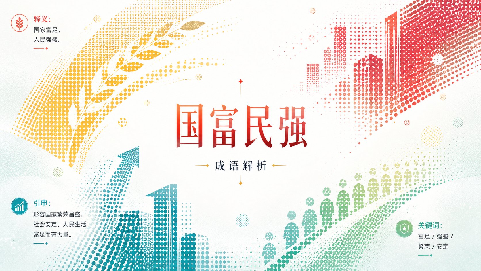
杯水车薪明亮清透半调网点图形设计
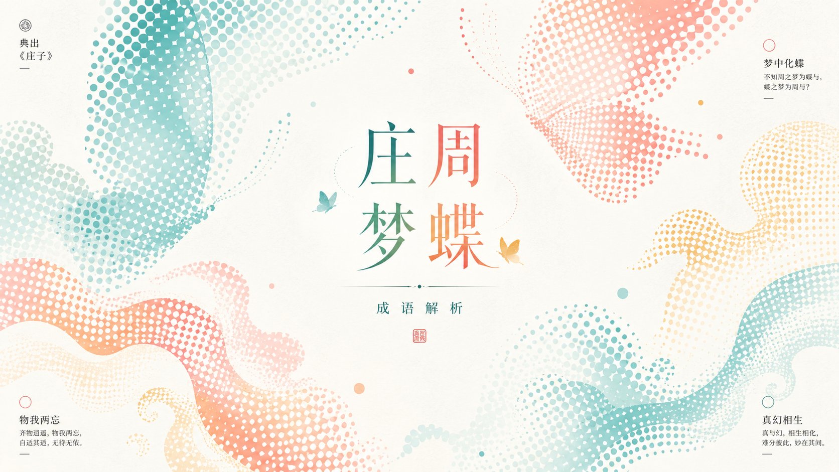
围绕任意主题对象生成一张明亮清透的图形化视觉:主题不以写实完整物体出现,而被转译成大面积半调网点形体,几块放大的局部从边缘切入,形成轻微倾斜的包围与留白压力,中心附近保留安静空场,让小尺度主题符号与标题信息成为第二阅读点。主形体使用规则圆点密度塑造轮廓、材质和明暗,点阵边缘保持清晰但有自然疏密,局部可被裁切、断开或漂浮,制造轻快的呼吸感。背景是高明度、通风感强的干净底场,带很细的纸面颗粒或柔雾质感,但不能变脏、发灰或复古泛黄。色彩从主题自身的材质、季节、情绪和文化信号中提取,映射为大面积浅亮底色、少量高饱和情绪色、清晰结构色和极小面积信息色;保持明亮轻快、清透干净的关系,强调色集中在点阵主形体与标题上,深色只用于微小信息锚点。排版以克制的中心标题和边角小信息构成阅读路径,标题可用细长 serif 或优雅宋体气质,字距舒展、行距从容,信息块小而精确,不能压过主形体与留白。整体像印刷半调、清爽商业版式和轻盈图形实验的结合,最重要的是让放大网点形体与空白场互相塑形,而不是把主题画成普通插画。 主题:杯水车薪 用途:成语解析 画幅16:9
- Category
- Charts & Infographics
- Model
- ChatGPT
- Creator
- @xiaoxiaodong01
- Source language
- zh-CN
- Source ID
- 15994
- Published
- Jun 16, 2026
Full prompt
Generate a bright and clear graphical visual around any theme subject: the subject does not appear as a realistic, complete object, but is translated into large areas of halftone dot forms; several enlarged partial sections cut in from the edges, forming a slight tilted encirclement and negative space pressure, with a quiet open space preserved near the center, allowing small-scale theme symbols and title information to become the second reading point. The main forms use regular dot density to shape contours, textures, and light/shadow, with halftone edges remaining clear but having natural density variations; parts can be cropped, broken, or floating, creating a light sense of breathing. The background is a high-brightness, highly airy clean field, with very fine paper grain or soft mist texture, but it must not become dirty, gray, or vintage yellow. Colors are extracted from the theme's own materials, seasons, emotions, and cultural signals, mapped into large areas of light and bright base colors, a small amount of high-saturation emotional colors, clear structural colors, and very small areas of informational colors; maintaining a bright, light, clear, and clean relationship, with emphasis colors concentrated on the halftone main forms and titles, and dark colors used only for tiny informational anchor points. Typography consists of a restrained center title and small corner information to form a reading path; titles can use slender serif or elegant Songti temperament, with relaxed letter spacing and composed line spacing; information blocks are small and precise, and must not overpower the main forms and negative space. The overall look is a combination of print halftone, refreshing commercial layout, and light graphical experimentation; most importantly, let the enlarged halftone forms and the empty field shape each other, rather than drawing the subject as a common illustration. Theme: An insufficient effort (杯水车薪). Purpose: Idiom analysis. Aspect ratio 16:9.
Translations
杯水车薪明亮清透半调网点图形设计
enGenerate a bright and clear graphical visual around any theme subject: the subject does not appear as a realistic, complete object, but is translated into large areas of halftone dot forms; several enlarged partial sections cut in from the edges, forming a slight tilted encirclement and negative space pressure, with a quiet open space preserved near the center, allowing small-scale theme symbols and title information to become the second reading point. The main forms use regular dot density to shape contours, textures, and light/shadow, with halftone edges remaining clear but having natural density variations; parts can be cropped, broken, or floating, creating a light sense of breathing. The background is a high-brightness, highly airy clean field, with very fine paper grain or soft mist texture, but it must not become dirty, gray, or vintage yellow. Colors are extracted from the theme's own materials, seasons, emotions, and cultural signals, mapped into large areas of light and bright base colors, a small amount of high-saturation emotional colors, clear structural colors, and very small areas of informational colors; maintaining a bright, light, clear, and clean relationship, with emphasis colors concentrated on the halftone main forms and titles, and dark colors used only for tiny informational anchor points. Typography consists of a restrained center title and small corner information to form a reading path; titles can use slender serif or elegant Songti temperament, with relaxed letter spacing and composed line spacing; information blocks are small and precise, and must not overpower the main forms and negative space. The overall look is a combination of print halftone, refreshing commercial layout, and light graphical experimentation; most importantly, let the enlarged halftone forms and the empty field shape each other, rather than drawing the subject as a common illustration. Theme: An insufficient effort (杯水车薪). Purpose: Idiom analysis. Aspect ratio 16:9.
杯水车薪明亮清透半调网点图形设计
zh-CN围绕任意主题对象生成一张明亮清透的图形化视觉:主题不以写实完整物体出现,而被转译成大面积半调网点形体,几块放大的局部从边缘切入,形成轻微倾斜的包围与留白压力,中心附近保留安静空场,让小尺度主题符号与标题信息成为第二阅读点。主形体使用规则圆点密度塑造轮廓、材质和明暗,点阵边缘保持清晰但有自然疏密,局部可被裁切、断开或漂浮,制造轻快的呼吸感。背景是高明度、通风感强的干净底场,带很细的纸面颗粒或柔雾质感,但不能变脏、发灰或复古泛黄。色彩从主题自身的材质、季节、情绪和文化信号中提取,映射为大面积浅亮底色、少量高饱和情绪色、清晰结构色和极小面积信息色;保持明亮轻快、清透干净的关系,强调色集中在点阵主形体与标题上,深色只用于微小信息锚点。排版以克制的中心标题和边角小信息构成阅读路径,标题可用细长 serif 或优雅宋体气质,字距舒展、行距从容,信息块小而精确,不能压过主形体与留白。整体像印刷半调、清爽商业版式和轻盈图形实验的结合,最重要的是让放大网点形体与空白场互相塑形,而不是把主题画成普通插画。 主题:杯水车薪 用途:成语解析 画幅16:9