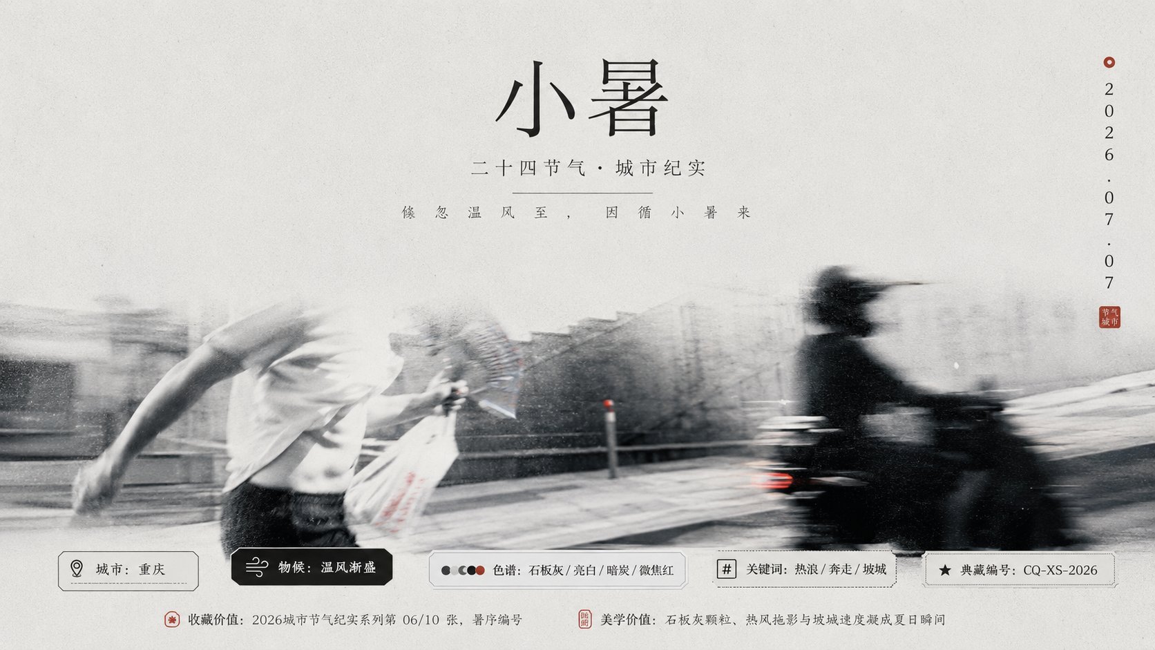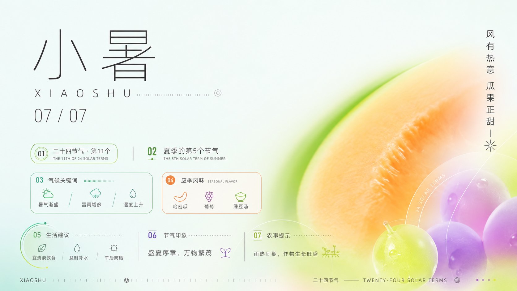
小暑节气现代极简视觉海报
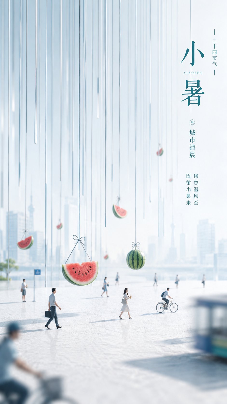
围绕任意主题对象生成一张高明度、清透、干净的现代信息视觉:上方保留大面积通风感浅色场,让画面先读到安静和秩序;主要视觉重量从下方或一侧涌入,以主题派生的巨大柔边色场承载情绪,边缘像雾化光晕一样渐隐进背景,形成强烈但不拥挤的色块冲击。信息层保持克制,使用细线、窄字距、轻量级无衬线数字或标题字与少量竖向文字节奏,沿一条稳定阅读轴排列,文字不是装饰堆叠,而是像标尺一样建立时间感、仪式感和尺度。色彩从主题自身的材质、季节、情绪或品牌语义中提取:大面积底色保持高明度与洁净空气感,主题主色承担最大的情绪色场,辅助色在底部或边缘形成清晰过渡,文字与细线使用冷静深色或纯净浅色建立可读层级,少量强调色只在关键信息处出现;整体保持明亮轻快、清爽有生气,透明层次和柔和渐变要清晰,避免脏灰、陈旧、烟雾感和厚重纹理。构图强调负空间、非对称留白、信息密度控制和商业海报式精确排版,让主题内容被抽象成一个鲜明的色彩气候与秩序化信息系统。 —————— 画面主题: 小暑节气海报,主色灵感来自:夏日甜品和西瓜的配色,保留配图对象清爽留白和彩色柔边场 发布场景: 朋友圈用图 文案保留: 日期、节气名和一句短竖排夏日文案 尺
- Category
- Charts & Infographics
- Model
- ChatGPT
- Creator
- @xiaoxiaodong01
- Source language
- zh-CN
- Source ID
- 17197
- Published
- Jul 1, 2026
Full prompt
Generate a high-brightness, transparent, and clean modern information visual around any subject theme: The upper part retains a large area of airy, light-colored field, allowing the screen to first convey tranquility and order; the main visual weight flows in from below or one side, using a massive soft-edged color field derived from the theme to carry emotions, with edges fading into the background like an atomized halo, forming a strong but not crowded color block impact. The information layer remains restrained, using thin lines, narrow character spacing, lightweight sans-serif numbers or headings, and a small amount of vertical text rhythm, arranged along a stable reading axis; the text is not decorative stacking but establishes a sense of time, ritual, and scale like a ruler. Colors are extracted from the theme's own material, season, emotion, or brand semantics: the large-area background color maintains high brightness and a clean air feel, the theme's main color undertakes the largest emotional color field, auxiliary colors form clear transitions at the bottom or edges, text and thin lines use calm dark colors or pure light colors to establish readability levels, and a small amount of accent colors appear only at key information points; the overall effect remains bright, brisk, refreshing, and lively, with clear transparent layers and soft gradients, avoiding dirty gray, stale, smoky feelings, and heavy textures. The composition emphasizes negative space, asymmetrical white space, information density control, and commercial poster-style precise typography, allowing the theme content to be abstracted into a distinct color climate and an ordered information system.

——————

Visual Theme: Minor Heat (Slight Heat) solar term poster, main color inspired by: the color palette of summer desserts and watermelon, retaining the refreshing white space of the subject and the colored soft-edged field.

Publishing Scenario: WeChat Moments image.

Copy Retained: Date, solar term name, and one short vertical summer copywriting line.
Dimensions: Landscape 16:9.

Information Points: At least 5 points introducing this solar term in different forms of expression.
Translations
小暑节气现代极简视觉海报
enGenerate a high-brightness, transparent, and clean modern information visual around any subject theme: The upper part retains a large area of airy, light-colored field, allowing the screen to first convey tranquility and order; the main visual weight flows in from below or one side, using a massive soft-edged color field derived from the theme to carry emotions, with edges fading into the background like an atomized halo, forming a strong but not crowded color block impact. The information layer remains restrained, using thin lines, narrow character spacing, lightweight sans-serif numbers or headings, and a small amount of vertical text rhythm, arranged along a stable reading axis; the text is not decorative stacking but establishes a sense of time, ritual, and scale like a ruler. Colors are extracted from the theme's own material, season, emotion, or brand semantics: the large-area background color maintains high brightness and a clean air feel, the theme's main color undertakes the largest emotional color field, auxiliary colors form clear transitions at the bottom or edges, text and thin lines use calm dark colors or pure light colors to establish readability levels, and a small amount of accent colors appear only at key information points; the overall effect remains bright, brisk, refreshing, and lively, with clear transparent layers and soft gradients, avoiding dirty gray, stale, smoky feelings, and heavy textures. The composition emphasizes negative space, asymmetrical white space, information density control, and commercial poster-style precise typography, allowing the theme content to be abstracted into a distinct color climate and an ordered information system. —————— Visual Theme: Minor Heat (Slight Heat) solar term poster, main color inspired by: the color palette of summer desserts and watermelon, retaining the refreshing white space of the subject and the colored soft-edged field. Publishing Scenario: WeChat Moments image. Copy Retained: Date, solar term name, and one short vertical summer copywriting line. Dimensions: Landscape 16:9. Information Points: At least 5 points introducing this solar term in different forms of expression.
小暑节气现代极简视觉海报
zh-CN围绕任意主题对象生成一张高明度、清透、干净的现代信息视觉:上方保留大面积通风感浅色场,让画面先读到安静和秩序;主要视觉重量从下方或一侧涌入,以主题派生的巨大柔边色场承载情绪,边缘像雾化光晕一样渐隐进背景,形成强烈但不拥挤的色块冲击。信息层保持克制,使用细线、窄字距、轻量级无衬线数字或标题字与少量竖向文字节奏,沿一条稳定阅读轴排列,文字不是装饰堆叠,而是像标尺一样建立时间感、仪式感和尺度。色彩从主题自身的材质、季节、情绪或品牌语义中提取:大面积底色保持高明度与洁净空气感,主题主色承担最大的情绪色场,辅助色在底部或边缘形成清晰过渡,文字与细线使用冷静深色或纯净浅色建立可读层级,少量强调色只在关键信息处出现;整体保持明亮轻快、清爽有生气,透明层次和柔和渐变要清晰,避免脏灰、陈旧、烟雾感和厚重纹理。构图强调负空间、非对称留白、信息密度控制和商业海报式精确排版,让主题内容被抽象成一个鲜明的色彩气候与秩序化信息系统。 —————— 画面主题: 小暑节气海报,主色灵感来自:夏日甜品和西瓜的配色,保留配图对象清爽留白和彩色柔边场 发布场景: 朋友圈用图 文案保留: 日期、节气名和一句短竖排夏日文案 尺寸为横版 16:9 信息点:至少5个,介绍这个节气,不同表现形式