Don’t overwhelm customers with dozens of drink options right from the st...
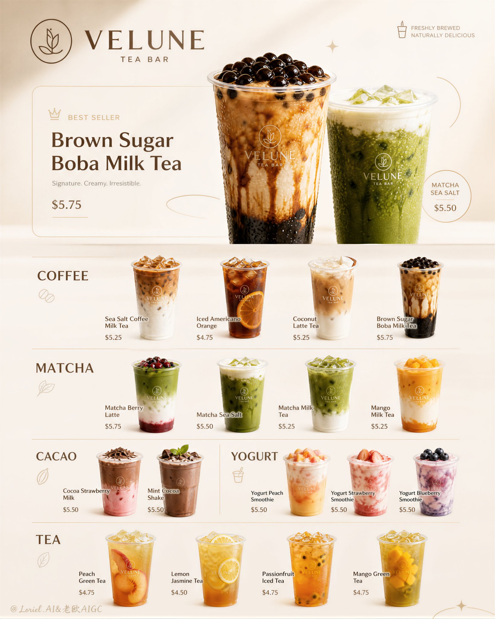
Saved from X post by @ou_zhen599. Don’t overwhelm customers with dozens of drink options right from the start on your beverage menu. First, use the “Top Two Picks” at the top to highlight the best choices, then let
- Category
- 创意图片
- Model
- GPT Image 2
- Creator
- @ou_zhen599
- Source language
- zh-CN
- Source ID
- 2081355591851946178
- Published
- Jul 26, 2026
Full prompt
Don’t overwhelm customers with dozens of drink options right from the start on your beverage menu. First, use the “Top Two Picks” at the top to highlight the best choices, then let the categories below provide the full selection: 饮品餐单别一上来就把几十杯产品平铺给顾客。 先用顶部的“双主推”告诉人最值得点什么,再让下方分类承接完整选择: one featured best-seller zone with 1–2 larger flagship drinks modular category sections with consistent cup spacing short product names, simple price markers ice transparency, condensation droplets, clean liquid separation 主推区负责吸引下单;咖啡、抹茶、酸奶、茶饮等分区负责快速浏览。 每杯都像独立产品图标,但间距、杯型、标签和价格格式始终统一。产品多,餐单也不会乱。 GPT- image 2 prompt Create an ultra-premium ice cream campaign menu poster for a self-created modern dessert brand called “VELUNE GELATO BAR”. The final artwork must preserve a highly structured vertical menu-board logic with multiple realistic ice cream products arranged in a clean editorial system, elevated into a design-annual-quality dessert campaign: refined, minimal, highly readable, product-dominant, playful yet premium. The board must feature multiple realistic ice cream products, clear category sections, elegant English branding, simplified product naming and price labels, very restrained doodle-style accents, and a soft premium background. Creative direction: Combine Milk Cloud Orbit and Cream Halo Transit. Keep the exact premium dessert-menu skeleton, but intensify the most luxurious frozen-product details and reduce non-product distractions. Push cleaner scoop-edge highlights, richer syrup reflections, more refined frozen-surface sheen, and more tactile creamy texture realism. At the same time, reduce the amount of text and decorative doodles inside each section so the desserts dominate more fully and the overall board feels calmer, more expensive, and more editorial. Core layout: Use a tall vertical poster with a clear organized menu structure. The board must include: 1. a top brand/title area, 2. one featured “best seller” or campaign-highlight zone, 3. multiple ice cream categories arranged below in separated modular sections, 4. consistent product spacing and alignment, 5. minimal brand/logo marks, 6. simple product names and prices, 7. only a few restrained playful doodle accents integrated around the layout. The whole composition must feel extremely clean, balanced, easy to scan, and commercially polished. Brand direction: Create a self-invented dessert brand with a premium youthful identity: VELUNE GELATO BAR Brand language: soft, trendy, clean, refreshing, modern, premium, cute-but-refined. Use English-only visible title language. Typography must feel elegant, rounded, and highly readable, never childish or cheap. Add a minimal official logo mark suitable for cups, tubs, cones, and menu branding. Product system: Feature multiple realistic ice cream products in a premium menu-board arrangement, such as: - Vanilla Bean Gelato - Salted Caramel Swirl - Strawberry Cream Scoop - Matcha Milk Gelato - Chocolate Fudge Sundae - Mango Sorbet - Blueberry Yogurt Ice Cream - Pistachio Crunch - Cookies & Cream Cup - Lemon Yuzu Sorbet - Berry Sundae - Espresso Ice Cream Float The board should feel like a rich signature lineup without becoming crowded or messy. Ice cream realism: Render every product with extreme realism and premium tactile detail: smooth creamy scoop surfaces, soft frozen texture, subtle melting edges, glossy syrup ribbons, chocolate drizzle, fruit coulis, nut crumble, waffle cone texture, frosty cup surfaces, cream swirls, berry moisture, pistachio fragments, cocoa dust, and premium frozen sheen. The products must feel cold, fresh, rich, and immediately craveable. Milk Cloud Orbit frozen-detail logic: This is critical. Purify the most convincing dessert zones: scoop-edge highlights, frozen creamy surface sheen, syrup and coulis reflections, frosty condensation on cups, and the clean glossy transitions between toppings and ice cream. Each dessert must feel more luminous, more tactile, and more flagship-like without becoming sugary or artificial. Cream Halo Transit layout logic: Keep the same menu structure, but reduce the amount of visible text and graphic doodles inside each section. Let the ice cream products speak more strongly. The remaining labels and accents must feel more selective, more premium, and more architecturally integrated. The composition should feel cleaner, calmer, and more brand-confident. Product dominance: The ice cream products must remain the absolute heroes. Text, doodles, and menu structure must support the products, never overpower them. Each dessert should feel like a small flagship icon, while the whole board reads as one polished premium brand world. Category logic: Organize the menu into elegant sections such as: CLASSIC FRUIT CREAMY SPECIAL SUNDAE Each section should contain 3-5 products with clean consistent spacing and hierarchy. Category labels must be clear, bold, and premium. Typography and pricing: Use elegant English-only typography for the brand title, section names, product labels, and small price markers. Product names should be short and readable, such as: “Vanilla Bean” “Matcha Milk” “Mango Sorbet” “Salted Caramel” “Berry Sundae” Prices should be simple and modern, integrated cleanly under or beside the names. Typography must feel like a premium dessert identity system. Featured zone: At the top of the board, create one visually stronger “Best Seller” or signature highlight zone with one or two flagship ice cream products rendered slightly larger and more prominently than the rest. This zone should feel like the campaign anchor without breaking the overall system. Background and color system: Use a soft premium minimal background with cream white, pale beige, vanilla ivory, and light dessert-toned accents. The background must stay calm and clean so the ice cream can carry the color. Let the desserts provide the visual variety: vanilla cream, caramel gold, matcha green, berry pink, mango orange, chocolate brown, pistachio green, and blueberry purple. Graphic accent logic: Add only a very small number of refined doodle-like accents: stars, swirls, spoon-line icons, fruit marks, soft loops, or little decorative strokes. These accents must feel clean, cute, and premium, never cluttered or childish. Keep them fewer and more precise than a typical dessert poster. Lighting: Use extremely delicate soft commercial dessert lighting. Let the scoops, syrup, cream, cones, fruit, and frosty textures glow with controlled highlights and beautiful dimensional separation. The lighting must feel fresh, polished, and premium. Surface and finish: Keep the full board crisp, clean, and collector-grade. Every dessert should be sharply resolved with premium packaging design, while the whole poster feels like a luxury seasonal ice cream brand system. Mood: fresh, premium, playful, clean, refreshing, modern, craveable, youthful, graphic, organized, polished, product-dominant Rendering style: ultra-realistic ice cream campaign menu poster, premium vertical product board, self-created brand, multiple realistic dessert cups and cones, elegant English typography, reduced text and doodle clutter, stronger scoop highlights and syrup reflections, soft premium background, refined commercial lighting, 8k, world-class image quality Negative prompt: cheap ice cream flyer, cluttered layout, unreadable text, low-detail scoops, fake frozen texture, plastic fruit, childish doodles, cartoon desserts, muddy lighting, messy menu system, low resolution, weak product focus
Translations
Don’t overwhelm customers with dozens of drink options right from the st...
zh-CNDon’t overwhelm customers with dozens of drink options right from the start on your beverage menu. First, use the “Top Two Picks” at the top to highlight the best choices, then let the categories below provide the full selection: 饮品餐单别一上来就把几十杯产品平铺给顾客。 先用顶部的“双主推”告诉人最值得点什么,再让下方分类承接完整选择: one featured best-seller zone with 1–2 larger flagship drinks modular category sections with consistent cup spacing short product names, simple price markers ice transparency, condensation droplets, clean liquid separation 主推区负责吸引下单;咖啡、抹茶、酸奶、茶饮等分区负责快速浏览。 每杯都像独立产品图标,但间距、杯型、标签和价格格式始终统一。产品多,餐单也不会乱。 GPT- image 2 prompt Create an ultra-premium ice cream campaign menu poster for a self-created modern dessert brand called “VELUNE GELATO BAR”. The final artwork must preserve a highly structured vertical menu-board logic with multiple realistic ice cream products arranged in a clean editorial system, elevated into a design-annual-quality dessert campaign: refined, minimal, highly readable, product-dominant, playful yet premium. The board must feature multiple realistic ice cream products, clear category sections, elegant English branding, simplified product naming and price labels, very restrained doodle-style accents, and a soft premium background. Creative direction: Combine Milk Cloud Orbit and Cream Halo Transit. Keep the exact premium dessert-menu skeleton, but intensify the most luxurious frozen-product details and reduce non-product distractions. Push cleaner scoop-edge highlights, richer syrup reflections, more refined frozen-surface sheen, and more tactile creamy texture realism. At the same time, reduce the amount of text and decorative doodles inside each section so the desserts dominate more fully and the overall board feels calmer, more expensive, and more editorial. Core layout: Use a tall vertical poster with a clear organized menu structure. The board must include: 1. a top brand/title area, 2. one featured “best seller” or campaign-highlight zone, 3. multiple ice cream categories arranged below in separated modular sections, 4. consistent product spacing and alignment, 5. minimal brand/logo marks, 6. simple product names and prices, 7. only a few restrained playful doodle accents integrated around the layout. The whole composition must feel extremely clean, balanced, easy to scan, and commercially polished. Brand direction: Create a self-invented dessert brand with a premium youthful identity: VELUNE GELATO BAR Brand language: soft, trendy, clean, refreshing, modern, premium, cute-but-refined. Use English-only visible title language. Typography must feel elegant, rounded, and highly readable, never childish or cheap. Add a minimal official logo mark suitable for cups, tubs, cones, and menu branding. Product system: Feature multiple realistic ice cream products in a premium menu-board arrangement, such as: - Vanilla Bean Gelato - Salted Caramel Swirl - Strawberry Cream Scoop - Matcha Milk Gelato - Chocolate Fudge Sundae - Mango Sorbet - Blueberry Yogurt Ice Cream - Pistachio Crunch - Cookies & Cream Cup - Lemon Yuzu Sorbet - Berry Sundae - Espresso Ice Cream Float The board should feel like a rich signature lineup without becoming crowded or messy. Ice cream realism: Render every product with extreme realism and premium tactile detail: smooth creamy scoop surfaces, soft frozen texture, subtle melting edges, glossy syrup ribbons, chocolate drizzle, fruit coulis, nut crumble, waffle cone texture, frosty cup surfaces, cream swirls, berry moisture, pistachio fragments, cocoa dust, and premium frozen sheen. The products must feel cold, fresh, rich, and immediately craveable. Milk Cloud Orbit frozen-detail logic: This is critical. Purify the most convincing dessert zones: scoop-edge highlights, frozen creamy surface sheen, syrup and coulis reflections, frosty condensation on cups, and the clean glossy transitions between toppings and ice cream. Each dessert must feel more luminous, more tactile, and more flagship-like without becoming sugary or artificial. Cream Halo Transit layout logic: Keep the same menu structure, but reduce the amount of visible text and graphic doodles inside each section. Let the ice cream products speak more strongly. The remaining labels and accents must feel more selective, more premium, and more architecturally integrated. The composition should feel cleaner, calmer, and more brand-confident. Product dominance: The ice cream products must remain the absolute heroes. Text, doodles, and menu structure must support the products, never overpower them. Each dessert should feel like a small flagship icon, while the whole board reads as one polished premium brand world. Category logic: Organize the menu into elegant sections such as: CLASSIC FRUIT CREAMY SPECIAL SUNDAE Each section should contain 3-5 products with clean consistent spacing and hierarchy. Category labels must be clear, bold, and premium. Typography and pricing: Use elegant English-only typography for the brand title, section names, product labels, and small price markers. Product names should be short and readable, such as: “Vanilla Bean” “Matcha Milk” “Mango Sorbet” “Salted Caramel” “Berry Sundae” Prices should be simple and modern, integrated cleanly under or beside the names. Typography must feel like a premium dessert identity system. Featured zone: At the top of the board, create one visually stronger “Best Seller” or signature highlight zone with one or two flagship ice cream products rendered slightly larger and more prominently than the rest. This zone should feel like the campaign anchor without breaking the overall system. Background and color system: Use a soft premium minimal background with cream white, pale beige, vanilla ivory, and light dessert-toned accents. The background must stay calm and clean so the ice cream can carry the color. Let the desserts provide the visual variety: vanilla cream, caramel gold, matcha green, berry pink, mango orange, chocolate brown, pistachio green, and blueberry purple. Graphic accent logic: Add only a very small number of refined doodle-like accents: stars, swirls, spoon-line icons, fruit marks, soft loops, or little decorative strokes. These accents must feel clean, cute, and premium, never cluttered or childish. Keep them fewer and more precise than a typical dessert poster. Lighting: Use extremely delicate soft commercial dessert lighting. Let the scoops, syrup, cream, cones, fruit, and frosty textures glow with controlled highlights and beautiful dimensional separation. The lighting must feel fresh, polished, and premium. Surface and finish: Keep the full board crisp, clean, and collector-grade. Every dessert should be sharply resolved with premium packaging design, while the whole poster feels like a luxury seasonal ice cream brand system. Mood: fresh, premium, playful, clean, refreshing, modern, craveable, youthful, graphic, organized, polished, product-dominant Rendering style: ultra-realistic ice cream campaign menu poster, premium vertical product board, self-created brand, multiple realistic dessert cups and cones, elegant English typography, reduced text and doodle clutter, stronger scoop highlights and syrup reflections, soft premium background, refined commercial lighting, 8k, world-class image quality Negative prompt: cheap ice cream flyer, cluttered layout, unreadable text, low-detail scoops, fake frozen texture, plastic fruit, childish doodles, cartoon desserts, muddy lighting, messy menu system, low resolution, weak product focus