健身 SaaS 着陆页 UI
一个详尽的大型提示词,用于生成高端健身品牌的完整 Web 和移动端 UI/UX 设计,包含仪表盘及各类界面板块。
- Category
- Charts & Infographics
- Model
- GPT Image 2
- Creator
- Stephen Day | Google AI, Agents & Vibe Coding
- Source language
- en
- Source ID
- 14322
- Published
- Apr 21, 2026
Full prompt
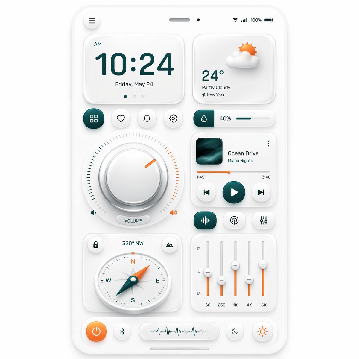
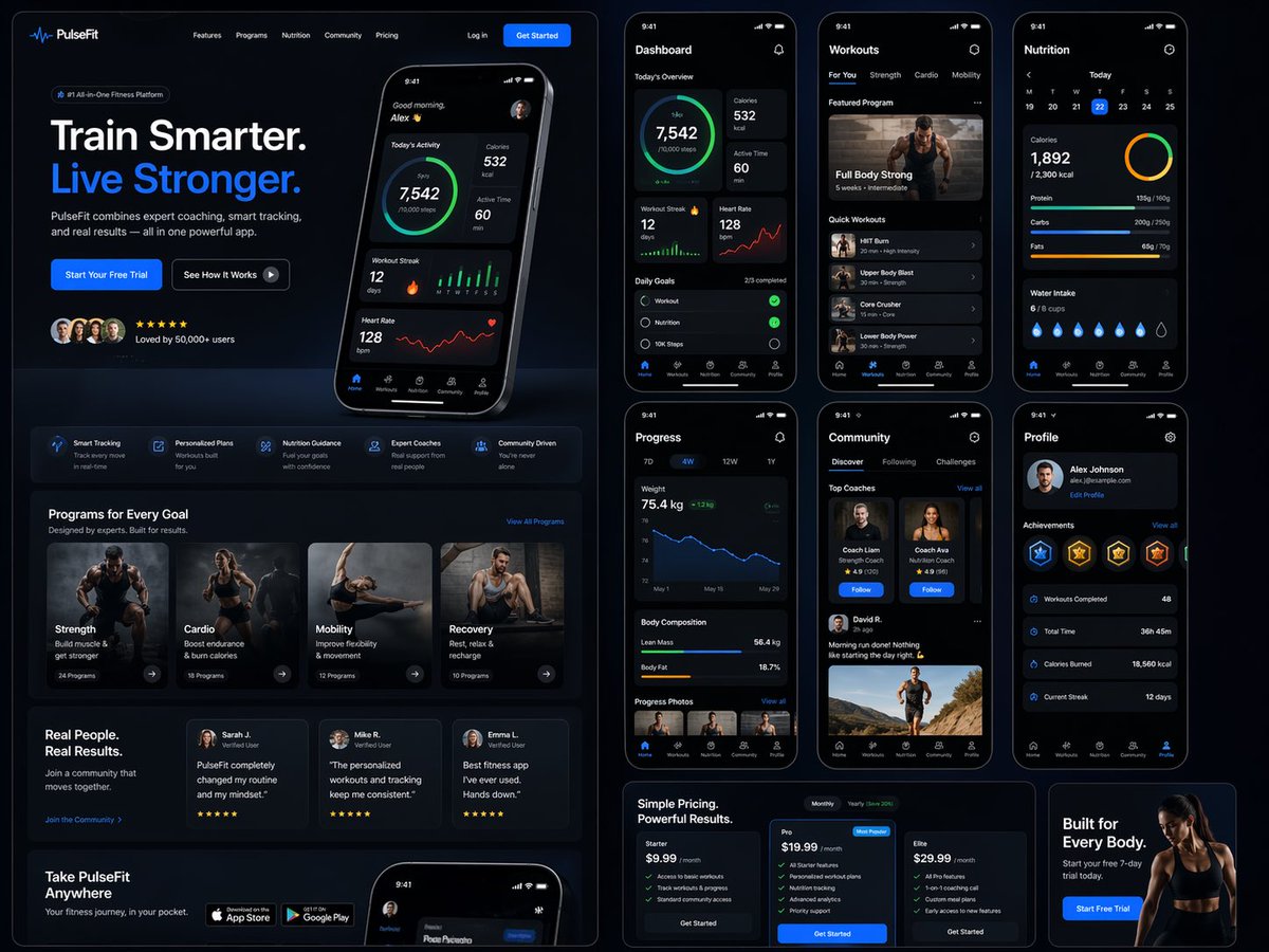
Design a modern, high-end {argument name="app type" default="fitness app"} landing page and product UI for a brand called {argument name="brand name" default="PulseFit"}.

Create a clean web design mockup that looks like a real SaaS fitness platform and mobile companion app. The design should feel premium, motivating, and easy to use, with a polished UI/UX style similar to top-tier health and wellness apps.

Include:
- A hero section with bold headline, short subheadline, strong call-to-action button, and app preview
- Dashboard UI showing daily activity, calories burned, workout streak, heart rate, step count, and progress rings
- Workout program cards for strength, cardio, mobility, and recovery
- Nutrition tracking section with macro breakdown and water intake
- Progress charts and analytics widgets
- Trainer/community section with profile cards and testimonials
- Pricing section and download/app store callout
- Mobile app screens shown alongside the web design for a cohesive product ecosystem

Style direction:
- Sleek, minimal, modern interface
- Premium fitness brand aesthetic
- Smooth spacing, strong hierarchy, rounded cards, soft shadows
- Dark mode UI with energetic accent colors like electric blue, neon green, or vibrant orange
- Crisp typography, realistic charts, polished buttons, beautiful onboarding feel
- Highly detailed, dribbble-worthy, startup-quality product design
- Realistic UX case study presentation, not a cartoon or illustration

Composition:
- Full website homepage mockup
- Multiple UI sections visible in one polished presentation
- Slight perspective or straight-on product showcase
- Clean background with subtle gradients and professional lighting
- Ultra-detailed, sharp text rendering, visually balanced layout

Output:
A stunning, realistic UI/UX design concept for a fitness app website and dashboard that looks ready for development.

Make it look like a real Figma product design presentation for a premium startup.
Translations
健身 SaaS 着陆页 UI
enDesign a modern, high-end {argument name="app type" default="fitness app"} landing page and product UI for a brand called {argument name="brand name" default="PulseFit"}. Create a clean web design mockup that looks like a real SaaS fitness platform and mobile companion app. The design should feel premium, motivating, and easy to use, with a polished UI/UX style similar to top-tier health and wellness apps. Include: - A hero section with bold headline, short subheadline, strong call-to-action button, and app preview - Dashboard UI showing daily activity, calories burned, workout streak, heart rate, step count, and progress rings - Workout program cards for strength, cardio, mobility, and recovery - Nutrition tracking section with macro breakdown and water intake - Progress charts and analytics widgets - Trainer/community section with profile cards and testimonials - Pricing section and download/app store callout - Mobile app screens shown alongside the web design for a cohesive product ecosystem Style direction: - Sleek, minimal, modern interface - Premium fitness brand aesthetic - Smooth spacing, strong hierarchy, rounded cards, soft shadows - Dark mode UI with energetic accent colors like electric blue, neon green, or vibrant orange - Crisp typography, realistic charts, polished buttons, beautiful onboarding feel - Highly detailed, dribbble-worthy, startup-quality product design - Realistic UX case study presentation, not a cartoon or illustration Composition: - Full website homepage mockup - Multiple UI sections visible in one polished presentation - Slight perspective or straight-on product showcase - Clean background with subtle gradients and professional lighting - Ultra-detailed, sharp text rendering, visually balanced layout Output: A stunning, realistic UI/UX design concept for a fitness app website and dashboard that looks ready for development. Make it look like a real Figma product design presentation for a premium startup.
健身 SaaS 着陆页 UI
zh-CN设计一个现代、高端的 {argument name="app type" default="健身应用"} 着陆页及产品 UI,品牌名称为 {argument name="brand name" default="PulseFit"}。 创建一个简洁的 Web 设计模型,使其看起来像一个真实的 SaaS 健身平台及配套移动端应用。设计风格应体现高端感、激励性且易于使用,UI/UX 风格需对标顶级健康与健身应用。 包含内容: - 首屏板块:包含醒目的标题、简短的副标题、强有力的行动号召(CTA)按钮以及应用预览 - 仪表盘 UI:展示每日活动、消耗卡路里、锻炼连续天数、心率、步数及进度环 - 锻炼计划卡片:涵盖力量、有氧、灵活性及恢复训练 - 营养追踪板块:包含宏量营养素分析及饮水量记录 - 进度图表与分析组件 - 教练/社区板块:包含个人资料卡片及用户评价 - 定价板块及应用商店下载引导 - 移动端应用界面:与 Web 设计并列展示,呈现统一的产品生态系统 风格导向: - 时髦、极简、现代的界面 - 高端健身品牌美学 - 舒适的间距、清晰的层级、圆角卡片、柔和阴影 - 深色模式 UI,搭配电光蓝、霓虹绿或活力橙等充满能量的强调色 - 清晰的排版、真实的图表、精致的按钮、美观的引导页体验 - 高度细节化、符合 Dribbble 标准、具备初创公司水准的产品设计 - 真实的 UX 案例研究展示,非卡通或插画风格 构图: - 完整的网站首页模型 - 在一个精致的展示中呈现多个 UI 板块 - 采用微透视或正视的产品展示视角 - 简洁的背景,带有微妙的渐变与专业灯光效果 - 超高细节、清晰的文字渲染、视觉平衡的布局 输出: 一个令人惊艳、逼真的健身应用网站及仪表盘 UI/UX 设计概念,看起来已达到可开发标准。 使其看起来像是一个针对高端初创公司的真实 Figma 产品设计演示。