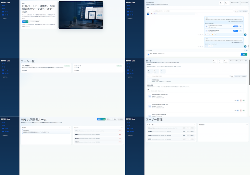
MPLUS Link 现代 UI 重新设计
将现有的密集型日本协作 SaaS UI 转化为简洁的六屏现代模型,用于设计改进演示。
- Category
- Charts & Infographics
- Model
- GPT Image 2
- Creator
- はじめ@AIとDXのひと
- Source language
- en
- Source ID
- 20080
- Published
- May 13, 2026
Full prompt
Using REFERENCE_0 as the source UI, redesign the Teams-like internal/external collaboration system into a cleaner, more modern product mockup while preserving the MPLUS Link brand, the dark navy left sidebar navigation, and the overall set of app functions. Create a polished 2-column by 3-row presentation showing exactly 6 redesigned screens: 1) a welcome/login landing screen with a large hero card, Japanese headline {argument name="headline text" default="社外パートナー連携を、招待制の専用ワークスペースで一元化"}, login tabs/buttons, and a realistic desktop-monitor hero image; 2) a project bridge chat screen with right-aligned chat cards, action chips, and a message composer; 3) a team list screen simplified into two clean team cards; 4) a materials/document list screen with upload controls, search/filter area, and file rows; 5) a shared collaboration room screen titled {argument name="room title" default="MPI 共同開発ルーム"} with a project overview card and compact member/status list; 6) a user management screen titled {argument name="admin title" default="ユーザー管理"} with user rows and an empty detail panel. Make the new mockups much more spacious than the reference: fewer table rows, larger margins, softer dividers, pale blue-gray backgrounds, white rounded cards, subtle shadows, and small blue/green accent buttons. Keep the Japanese enterprise SaaS feel and dummy-data nature, but remove the dense micromanaged tables and replace them with simplified, presentable mock UI suitable for a design-improvement comparison. Use brand name {argument name="brand name" default="MPLUS Link"} in the sidebar, keep the sidebar consistent on every screen, and avoid adding unrelated features, watermarks, or decorative clutter.Translations
MPLUS Link 现代 UI 重新设计
enUsing REFERENCE_0 as the source UI, redesign the Teams-like internal/external collaboration system into a cleaner, more modern product mockup while preserving the MPLUS Link brand, the dark navy left sidebar navigation, and the overall set of app functions. Create a polished 2-column by 3-row presentation showing exactly 6 redesigned screens: 1) a welcome/login landing screen with a large hero card, Japanese headline {argument name="headline text" default="社外パートナー連携を、招待制の専用ワークスペースで一元化"}, login tabs/buttons, and a realistic desktop-monitor hero image; 2) a project bridge chat screen with right-aligned chat cards, action chips, and a message composer; 3) a team list screen simplified into two clean team cards; 4) a materials/document list screen with upload controls, search/filter area, and file rows; 5) a shared collaboration room screen titled {argument name="room title" default="MPI 共同開発ルーム"} with a project overview card and compact member/status list; 6) a user management screen titled {argument name="admin title" default="ユーザー管理"} with user rows and an empty detail panel. Make the new mockups much more spacious than the reference: fewer table rows, larger margins, softer dividers, pale blue-gray backgrounds, white rounded cards, subtle shadows, and small blue/green accent buttons. Keep the Japanese enterprise SaaS feel and dummy-data nature, but remove the dense micromanaged tables and replace them with simplified, presentable mock UI suitable for a design-improvement comparison. Use brand name {argument name="brand name" default="MPLUS Link"} in the sidebar, keep the sidebar consistent on every screen, and avoid adding unrelated features, watermarks, or decorative clutter.
MPLUS Link 现代 UI 重新设计
zh-CN以 REFERENCE_0 作为源 UI,将类似 Teams 的内部/外部协作系统重新设计为更简洁、更现代的产品模型,同时保留 MPLUS Link 品牌、深蓝色左侧导航栏以及整体应用功能。制作一个精致的 2 列 3 行演示,展示 6 个重新设计的屏幕:1) 带有大型主视觉卡片、日语标题 {argument name="headline text" default="社外パートナー連携を、招待制の専用ワークスペースで一元化"}、登录选项卡/按钮以及逼真的桌面显示器主视觉图像的欢迎/登录落地页;2) 带有右对齐聊天卡片、操作芯片和消息编辑器的项目桥接聊天屏幕;3) 简化为两个简洁团队卡片的团队列表屏幕;4) 带有上传控件、搜索/筛选区域和文件行的资料/文档列表屏幕;5) 标题为 {argument name="room title" default="MPI 共同開発ルーム"} 的共享协作室屏幕,包含项目概览卡片和紧凑的成员/状态列表;6) 标题为 {argument name="admin title" default="ユーザー管理"} 的用户管理屏幕,包含用户行和空白详情面板。使新模型比参考图更宽敞:减少表格行数、增加边距、使用更柔和的分隔线、淡蓝灰色背景、白色圆角卡片、细腻的阴影以及小巧的蓝/绿色强调按钮。保持日本企业级 SaaS 的质感和虚拟数据属性,但去除密集且琐碎的表格,取而代之以适合设计改进对比的简化、美观的 UI 模型。在侧边栏中使用品牌名称 {argument name="brand name" default="MPLUS Link"},确保侧边栏在每个屏幕上保持一致,并避免添加无关功能、水印或装饰性杂物。