韩式妆容分析指南
创建一份奢华韩式美妆杂志风格的妆容分析信息图,包含肖像、特征注释、色彩推荐、评分及综合建议。
- Category
- Charts & Infographics
- Model
- GPT Image 2
- Creator
- Kくん
- Source language
- en
- Source ID
- 20945
- Published
- May 16, 2026
Full prompt
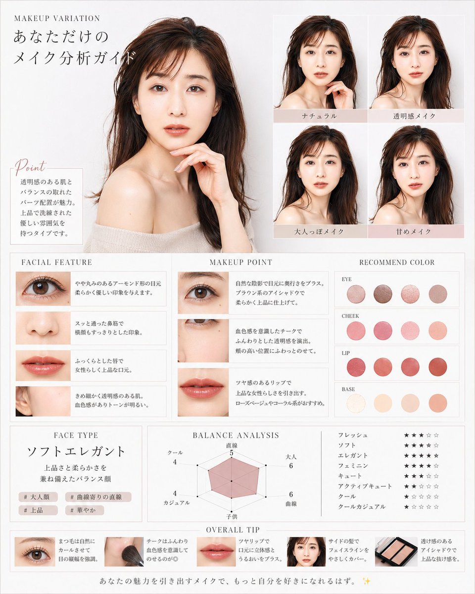
Goal: Create a luxurious Korean-style beauty magazine infographic titled as a personalized makeup analysis guide for {argument name="character name" default="you"}, using a translucent, elegant female model with dewy skin, long dark brown hair, bare shoulders, and soft beige knit styling. The design should feel like a high-end cosmetic consultation sheet in white, ivory, pale gray, blush pink, and warm beige.
Canvas: Vertical poster, approximately 4:5 ratio, clean white-to-light-gray background, thin pale gray borders, delicate serif typography, airy spacing, soft natural lighting, polished editorial photography look.
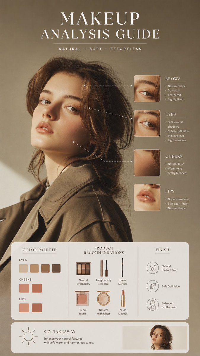
Main layout: Place one large bust-up portrait of the female model on the upper left, occupying about 40% of the canvas width and 45% of the height. She faces forward in a graceful pose with one hand near her chin, glossy brown hair, off-shoulder cream top, luminous skin, and a calm feminine mood. At the top left, add small English text “MAKEUP VARIATION” and a large Japanese headline “あなただけの メイク分析ガイド”.
Point box: Under the large portrait, add a small bordered note box with the script heading “Point” and Japanese body copy describing clear skin, balanced features, pearl placement, and a refined elegant atmosphere.
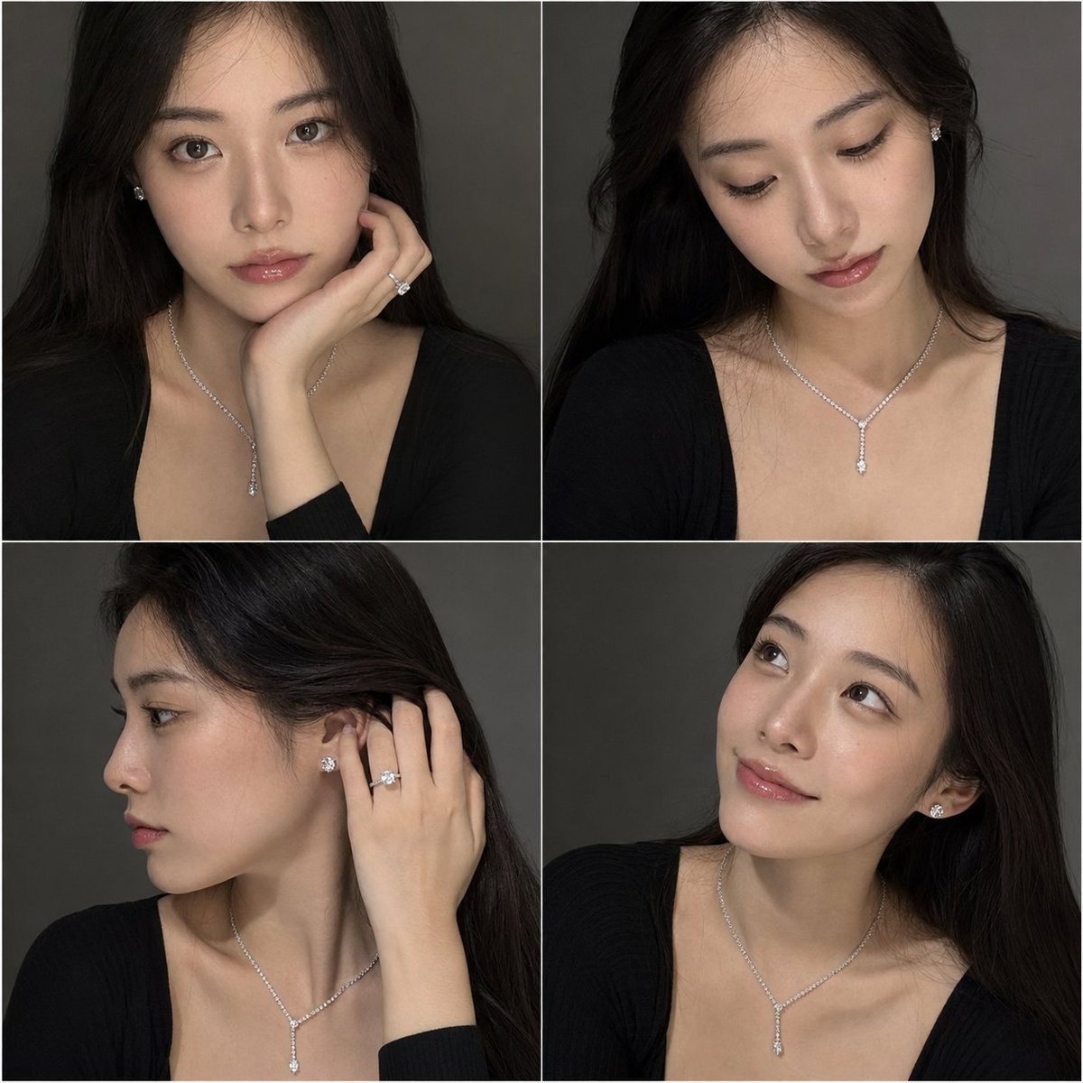
Makeup variation grid: On the upper right, create exactly 4 smaller portrait tiles in a 2×2 grid, each showing the same woman with subtle makeup differences. Add pale blush label bars under each tile with these 4 Japanese labels: “ナチュラル”, “透明感メイク”, “大人っぽメイク”, “甘めメイク”.
Middle analysis area: Create three adjacent boxed columns across the middle.
1. “FACIAL FEATURE” column: exactly 4 horizontal feature rows with close-up photos and Japanese descriptions: one eye close-up, one nose close-up, one lips close-up, one ear/skin-side-face close-up.
2. “MAKEUP POINT” column: exactly 3 horizontal rows with close-up photos and advice text: eye makeup close-up, cheek/under-eye close-up, lip close-up.
3. “RECOMMEND COLOR” column: show exactly 16 circular color swatches grouped into 4 labeled rows with 4 swatches each. The labels are “EYE”, “CHEEK”, “LIP”, and “BASE”. Use muted rosy browns for eyes, soft pink-coral for cheeks, vivid rose-red/coral for lips, and ivory-peach-beige for base.
Lower analysis area: Create three boxed sections.
Left section “FACE TYPE”: large Japanese face type text “ソフトエレガント”, a short Japanese description about a balanced face with elegance and softness, and exactly 4 small hashtag chips: “# 大人顔”, “# 曲線寄りの直線”, “# 上品”, “# 華やか”.
Center section “BALANCE ANALYSIS”: a pink translucent radar chart with exactly 6 axes labeled in Japanese: “直線”, “大人”, “曲線”, “子供”, “カジュアル”, “クール”, with small numeric values around the chart.
Right section: exactly 8 Japanese style rating rows using star icons, labeled “フレッシュ”, “ソフト”, “エレガント”, “フェミニン”, “キュート”, “アクティブキュート”, “クール”, “クールカジュアル”. Use mostly black filled stars and pale gray empty stars.
Bottom strip: Add an “OVERALL TIP” section with exactly 5 compact tip cards in a horizontal row: eye close-up card, makeup brush on cheek card, lips close-up card, small face portrait card, and eyeshadow palette card. Each card includes a tiny image and short Japanese makeup advice text.
Footer: Add a centered Japanese closing sentence along the bottom: “あなたの魅力を引き出すメイクで、もっと自分を好きになれるはず。 ✨”
Visual style: Minimal luxury beauty editorial, Korean transparent-skin aesthetic, soft shadows, thin dividers, blush beige accent bars, elegant serif headings, delicate script for “Point”, realistic cosmetic photography, harmonious spacing, no clutter.
Customizable details: The model should have {argument name="hair color" default="dark brown"} hair, {argument name="skin finish" default="clear dewy translucent skin"}, the overall accent palette should be {argument name="accent color" default="pale blush beige"}, and the face type should read {argument name="face type label" default="ソフトエレガント"}.
Constraints: Keep all Japanese labels legible, use exactly the element counts specified, maintain the same editorial grid structure, avoid logos or watermarks, and do not add extra sections.Translations
韩式妆容分析指南
enGoal: Create a luxurious Korean-style beauty magazine infographic titled as a personalized makeup analysis guide for {argument name="character name" default="you"}, using a translucent, elegant female model with dewy skin, long dark brown hair, bare shoulders, and soft beige knit styling. The design should feel like a high-end cosmetic consultation sheet in white, ivory, pale gray, blush pink, and warm beige. Canvas: Vertical poster, approximately 4:5 ratio, clean white-to-light-gray background, thin pale gray borders, delicate serif typography, airy spacing, soft natural lighting, polished editorial photography look. Main layout: Place one large bust-up portrait of the female model on the upper left, occupying about 40% of the canvas width and 45% of the height. She faces forward in a graceful pose with one hand near her chin, glossy brown hair, off-shoulder cream top, luminous skin, and a calm feminine mood. At the top left, add small English text “MAKEUP VARIATION” and a large Japanese headline “あなただけの メイク分析ガイド”. Point box: Under the large portrait, add a small bordered note box with the script heading “Point” and Japanese body copy describing clear skin, balanced features, pearl placement, and a refined elegant atmosphere. Makeup variation grid: On the upper right, create exactly 4 smaller portrait tiles in a 2×2 grid, each showing the same woman with subtle makeup differences. Add pale blush label bars under each tile with these 4 Japanese labels: “ナチュラル”, “透明感メイク”, “大人っぽメイク”, “甘めメイク”. Middle analysis area: Create three adjacent boxed columns across the middle. 1. “FACIAL FEATURE” column: exactly 4 horizontal feature rows with close-up photos and Japanese descriptions: one eye close-up, one nose close-up, one lips close-up, one ear/skin-side-face close-up. 2. “MAKEUP POINT” column: exactly 3 horizontal rows with close-up photos and advice text: eye makeup close-up, cheek/under-eye close-up, lip close-up. 3. “RECOMMEND COLOR” column: show exactly 16 circular color swatches grouped into 4 labeled rows with 4 swatches each. The labels are “EYE”, “CHEEK”, “LIP”, and “BASE”. Use muted rosy browns for eyes, soft pink-coral for cheeks, vivid rose-red/coral for lips, and ivory-peach-beige for base. Lower analysis area: Create three boxed sections. Left section “FACE TYPE”: large Japanese face type text “ソフトエレガント”, a short Japanese description about a balanced face with elegance and softness, and exactly 4 small hashtag chips: “# 大人顔”, “# 曲線寄りの直線”, “# 上品”, “# 華やか”. Center section “BALANCE ANALYSIS”: a pink translucent radar chart with exactly 6 axes labeled in Japanese: “直線”, “大人”, “曲線”, “子供”, “カジュアル”, “クール”, with small numeric values around the chart. Right section: exactly 8 Japanese style rating rows using star icons, labeled “フレッシュ”, “ソフト”, “エレガント”, “フェミニン”, “キュート”, “アクティブキュート”, “クール”, “クールカジュアル”. Use mostly black filled stars and pale gray empty stars. Bottom strip: Add an “OVERALL TIP” section with exactly 5 compact tip cards in a horizontal row: eye close-up card, makeup brush on cheek card, lips close-up card, small face portrait card, and eyeshadow palette card. Each card includes a tiny image and short Japanese makeup advice text. Footer: Add a centered Japanese closing sentence along the bottom: “あなたの魅力を引き出すメイクで、もっと自分を好きになれるはず。 ✨” Visual style: Minimal luxury beauty editorial, Korean transparent-skin aesthetic, soft shadows, thin dividers, blush beige accent bars, elegant serif headings, delicate script for “Point”, realistic cosmetic photography, harmonious spacing, no clutter. Customizable details: The model should have {argument name="hair color" default="dark brown"} hair, {argument name="skin finish" default="clear dewy translucent skin"}, the overall accent palette should be {argument name="accent color" default="pale blush beige"}, and the face type should read {argument name="face type label" default="ソフトエレガント"}. Constraints: Keep all Japanese labels legible, use exactly the element counts specified, maintain the same editorial grid structure, avoid logos or watermarks, and do not add extra sections.
韩式妆容分析指南
zh-CN目标:创建一份奢华韩式美妆杂志风格的信息图,标题为 {argument name="character name" default="你"} 的个性化妆容分析指南。使用一位皮肤水润、留着深棕色长发、裸露双肩、身着柔和米色针织衫的半透明感优雅女性模特。设计应呈现高端美妆咨询单的质感,配色采用白色、象牙白、浅灰、腮红粉和暖米色。 画布:竖向海报,比例约为 4:5,背景为干净的白至浅灰色,配有细浅灰色边框,采用精致的衬线字体,排版疏朗,光线自然柔和,呈现出精致的编辑摄影质感。 主布局:在左上方放置一张女性模特的大型半身肖像,占据约 40% 的画布宽度和 45% 的高度。她姿态优雅地面对前方,一只手靠近下巴,留着光泽感的棕色长发,身着奶油色露肩上衣,皮肤透亮,气质沉稳柔美。在左上方添加小号英文文本“MAKEUP VARIATION”和大型日文标题“あなただけの メイク分析ガイド”。 要点框:在大肖像下方,添加一个带有边框的小注释框,标题为“Point”,正文用日文描述清透的皮肤、均衡的五官、高光位置以及精致优雅的氛围。 妆容变化网格:在右上角创建一个 2×2 的网格,包含 4 张较小的肖像图,每张图展示同一位女性细微的妆容差异。在每张图下方添加浅腮红色的标签栏,并标注以下 4 个日文标签:“ナチュラル”、“透明感メイク”、“大人っぽメイク”、“甘めメイク”。 中部分析区:在中间并排创建三个带边框的列。 1. “FACIAL FEATURE”列:包含 4 行水平特征行,配有特写照片和日文描述:眼部特写、鼻部特写、唇部特写、耳部/侧脸皮肤特写。 2. “MAKEUP POINT”列:包含 3 行水平行,配有特写照片和建议文本:眼妆特写、脸颊/眼下特写、唇妆特写。 3. “RECOMMEND COLOR”列:展示 16 个圆形色块,分为 4 行,每行 4 个色块。标签分别为“EYE”、“CHEEK”、“LIP”和“BASE”。眼部使用柔和的玫瑰棕色,脸颊使用柔和的粉珊瑚色,唇部使用鲜艳的玫瑰红/珊瑚色,底妆使用象牙白-桃色-米色。 下部分析区:创建三个带边框的部分。 左侧“FACE TYPE”部分:大型日文脸型文本“ソフトエレガント”,一段关于五官均衡、优雅柔和的日文描述,以及 4 个小型标签:“# 大人顔”、“# 曲線寄りの直線”、“# 上品”、“# 華やか”。 中部“BALANCE ANALYSIS”部分:一个粉色半透明雷达图,包含 6 个日文坐标轴:“直線”、“大人”、“曲線”、“子供”、“カジュアル”、“クール”,图表周围带有小数值。 右侧部分:包含 8 行日文风格评分,使用星形图标,标签为“フレッシュ”、“ソフト”、“エレガント”、“フェミニン”、“キュート”、“アクティブキュート”、“クール”、“クールカジュアル”。主要使用黑色实心星和浅灰色空心星。 底部条:添加“OVERALL TIP”部分,横向排列 5 张紧凑的建议卡片:眼部特写卡、脸颊化妆刷卡、唇部特写卡、小脸肖像卡和眼影盘卡。每张卡片包含一张微型图片和简短的日文美妆建议文本。 页脚:在底部居中添加一句日文结束语:“あなたの魅力を引き出すメイクで、もっと自分を好きになれるはず。 ✨” 视觉风格:极简奢华美妆编辑风,韩式通透肌肤美学,柔和阴影,细分割线,腮红米色强调条,优雅衬线标题,“Point”使用精致手写体,写实美妆摄影,和谐的间距,无杂乱感。 可定制细节:模特应拥有 {argument name="hair color" default="深棕色"} 的头发,{argument name="skin finish" default="清透水润的皮肤"},整体强调色调应为 {argument name="accent color" default="浅腮红米色"},脸型标签应显示为 {argument name="face type label" default="ソフトエレガント"}。 约束:保持所有日文标签清晰可辨,使用指定的元素数量,维持相同的编辑网格结构,避免使用徽标或水印,且不要添加额外部分。