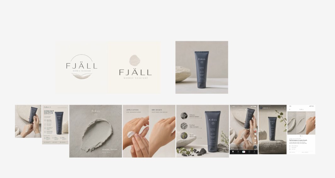
户外品牌工具包展示项目
生成一个方形的代理商风格品牌系统项目,包含户外品牌的 Logo 变体、图标、样机、服装图像、广告、应用界面和社交媒体图块。
- Category
- Charts & Infographics
- Model
- GPT Image 2
- Creator
- Aaditya Barak
- Source language
- en
- Source ID
- 21167
- Published
- May 17, 2026
Full prompt
Goal: Create a clean square brand-kit presentation board showing an AI-generated logo system and marketing variations for {argument name="brand name" default="The North Face"}, combining an uploaded logo, an AI tool logo, and mountain style references into a complete visual identity system.
Canvas: Square 1:1 layout on a light gray/off-white background, designed like a polished agency case-study sheet. Use crisp grid lines, generous margins, and a modern editorial branding style.
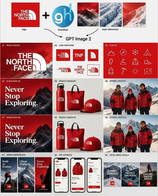
Top input row: Show exactly 5 input elements across the top: 1 red square brand logo tile for {argument name="brand name" default="The North Face"}; 1 large black plus sign; 1 circular blue logo marked “gh” with a small upward arrow and the label “Growthub”; and 3 vertical mountain style-reference thumbnails in red, blue-white glacier, and red snowy mountain palettes. Add small captions under the logo and style references. Beneath this row, draw two curved black arrows pointing down toward the centered text “GPT Image 2”.
Main layout: Below the header, create a 3-column by 4-row grid of exactly 12 brand-kit panels, each with a tiny numbered label in the upper-left corner and a bold section title. The overall palette is red, white, black, ice blue, and mountain gray, with premium outdoor expedition energy.
Panel count and content:
1. “01 Brand Essence”: large red poster-style panel with a snowy mountain background and oversized white {argument name="brand name" default="The North Face"} logo lockup.
2. “02 Logo Variations”: white panel showing exactly 6 logo variations: full red-square logo, red square with “TNF”, red square with arch symbol only, horizontal wordmark with arch, stacked wordmark, and small boxed lockup.
3. “03 Icon Set”: red panel with exactly 12 thin white line icons arranged in a 4-by-3 grid: mountain, compass, snowflake, tent, carabiner, flag, parka jacket, hiking boot, backpack, ice axe, sun, and folded map.
4. “04 Brand Baseline”: dark red mountain poster with large serif white slogan text “Never Stop Exploring.”
5. “05 Product Mockups”: white product mockup panel with exactly 3 red branded items: water bottle, tote bag, and baseball cap.
6. “06 Apparel Lifestyle”: photorealistic outdoor apparel scene with exactly 3 people wearing red and black expedition jackets in snowy mountains.
7. “07 Brand Baseline”: repeat the dark red mountain slogan poster, again reading “Never Stop Exploring.”
8. “05 Product Mockups”: repeat the same white panel with exactly 3 red branded products: bottle, tote, and cap.
9. “06 Apparel Lifestyle”: repeat the same snowy mountain lifestyle panel with exactly 3 red-jacketed people.
10. “07 Urban Campaign Ads”: show exactly 3 tall vertical ad posters with mountain climbers and red logo blocks, titled “Built to Endure.”, “Climb Higher.”, and “Never Stop Exploring.”
11. “08 App Interface”: show exactly 3 smartphone screens for an outdoor shopping app, featuring red jackets, product cards, checkout UI, red buttons, and clean white mobile interface design.
12. “09 Social Media Visuals”: show exactly 3 square social media tiles with snowy mountain backgrounds, red logo blocks, and white text: “SUMMIT SUNDAYS”, “PROTECT OUR PEAKS”, and “EXPLORE. ENDURE. REPEAT.”
Visual style: Mix photorealistic mountain photography with crisp vector logo work, minimal product mockups, thin white iconography, and luxury outdoor-brand art direction. Use red gradient overlays, snow textures, high contrast typography, and neat case-study spacing. Keep the design readable at a glance, with no extra panels, no watermarks, and no unrelated text.Translations
户外品牌工具包展示项目
enGoal: Create a clean square brand-kit presentation board showing an AI-generated logo system and marketing variations for {argument name="brand name" default="The North Face"}, combining an uploaded logo, an AI tool logo, and mountain style references into a complete visual identity system. Canvas: Square 1:1 layout on a light gray/off-white background, designed like a polished agency case-study sheet. Use crisp grid lines, generous margins, and a modern editorial branding style. Top input row: Show exactly 5 input elements across the top: 1 red square brand logo tile for {argument name="brand name" default="The North Face"}; 1 large black plus sign; 1 circular blue logo marked “gh” with a small upward arrow and the label “Growthub”; and 3 vertical mountain style-reference thumbnails in red, blue-white glacier, and red snowy mountain palettes. Add small captions under the logo and style references. Beneath this row, draw two curved black arrows pointing down toward the centered text “GPT Image 2”. Main layout: Below the header, create a 3-column by 4-row grid of exactly 12 brand-kit panels, each with a tiny numbered label in the upper-left corner and a bold section title. The overall palette is red, white, black, ice blue, and mountain gray, with premium outdoor expedition energy. Panel count and content: 1. “01 Brand Essence”: large red poster-style panel with a snowy mountain background and oversized white {argument name="brand name" default="The North Face"} logo lockup. 2. “02 Logo Variations”: white panel showing exactly 6 logo variations: full red-square logo, red square with “TNF”, red square with arch symbol only, horizontal wordmark with arch, stacked wordmark, and small boxed lockup. 3. “03 Icon Set”: red panel with exactly 12 thin white line icons arranged in a 4-by-3 grid: mountain, compass, snowflake, tent, carabiner, flag, parka jacket, hiking boot, backpack, ice axe, sun, and folded map. 4. “04 Brand Baseline”: dark red mountain poster with large serif white slogan text “Never Stop Exploring.” 5. “05 Product Mockups”: white product mockup panel with exactly 3 red branded items: water bottle, tote bag, and baseball cap. 6. “06 Apparel Lifestyle”: photorealistic outdoor apparel scene with exactly 3 people wearing red and black expedition jackets in snowy mountains. 7. “07 Brand Baseline”: repeat the dark red mountain slogan poster, again reading “Never Stop Exploring.” 8. “05 Product Mockups”: repeat the same white panel with exactly 3 red branded products: bottle, tote, and cap. 9. “06 Apparel Lifestyle”: repeat the same snowy mountain lifestyle panel with exactly 3 red-jacketed people. 10. “07 Urban Campaign Ads”: show exactly 3 tall vertical ad posters with mountain climbers and red logo blocks, titled “Built to Endure.”, “Climb Higher.”, and “Never Stop Exploring.” 11. “08 App Interface”: show exactly 3 smartphone screens for an outdoor shopping app, featuring red jackets, product cards, checkout UI, red buttons, and clean white mobile interface design. 12. “09 Social Media Visuals”: show exactly 3 square social media tiles with snowy mountain backgrounds, red logo blocks, and white text: “SUMMIT SUNDAYS”, “PROTECT OUR PEAKS”, and “EXPLORE. ENDURE. REPEAT.” Visual style: Mix photorealistic mountain photography with crisp vector logo work, minimal product mockups, thin white iconography, and luxury outdoor-brand art direction. Use red gradient overlays, snow textures, high contrast typography, and neat case-study spacing. Keep the design readable at a glance, with no extra panels, no watermarks, and no unrelated text.
户外品牌工具包展示项目
zh-CN目标:创建一个简洁的方形品牌工具包展示项目,展示由 AI 生成的 {argument name="brand name" default="The North Face"} 品牌 Logo 系统及营销变体,将上传的 Logo、AI 工具 Logo 和山地风格参考结合成一套完整的视觉识别系统。 画布:方形 1:1 布局,背景为浅灰色/米白色,设计风格如同精致的代理商案例研究页面。使用清晰的网格线、宽裕的页边距以及现代编辑式的品牌设计风格。 顶部输入行:在顶部展示 5 个输入元素:1 个 {argument name="brand name" default="The North Face"} 的红色方形品牌 Logo 图块;1 个巨大的黑色加号;1 个标记为“gh”的圆形蓝色 Logo,带有小向上箭头和“Growthub”标签;以及 3 个垂直的山地风格参考缩略图,配色分别为红色、蓝白色冰川色和红色雪山色。在 Logo 和风格参考下方添加小标题。在此行下方,绘制两个指向中心文本“GPT Image 2”的弯曲黑色箭头。 主要布局:在标题下方,创建一个 3 列 4 行的网格,共 12 个品牌工具包面板,每个面板左上角带有微小的编号标签和加粗的章节标题。整体色调为红色、白色、黑色、冰蓝色和山灰色,充满高端户外探险活力。 面板数量与内容: 1. “01 Brand Essence”:大型红色海报风格面板,背景为雪山,配有超大的白色 {argument name="brand name" default="The North Face"} Logo 组合。 2. “02 Logo Variations”:白色面板,展示 6 种 Logo 变体:全红色方形 Logo、带“TNF”的红色方形、仅带拱形符号的红色方形、带拱形的水平文字标识、堆叠式文字标识以及小型盒装组合。 3. “03 Icon Set”:红色面板,包含 12 个细白线图标,排列为 4x3 网格:山峰、指南针、雪花、帐篷、登山扣、旗帜、派克大衣、登山靴、背包、冰镐、太阳和折叠地图。 4. “04 Brand Baseline”:深红色山地海报,配有巨大的衬线体白色标语“Never Stop Exploring.”。 5. “05 Product Mockups”:白色产品样机面板,展示 3 款红色品牌产品:水壶、托特包和棒球帽。 6. “06 Apparel Lifestyle”:写实风格的户外服装场景,展示 3 名身穿红黑探险夹克的人在雪山中。 7. “07 Brand Baseline”:重复深红色山地标语海报,文字仍为“Never Stop Exploring.”。 8. “05 Product Mockups”:重复相同的白色面板,展示 3 款红色品牌产品:水壶、托特包和帽子。 9. “06 Apparel Lifestyle”:重复相同的雪山生活方式面板,展示 3 名身穿红色夹克的人。 10. “07 Urban Campaign Ads”:展示 3 张高垂直广告海报,包含登山者和红色 Logo 块,标题分别为“Built to Endure.”、“Climb Higher.”和“Never Stop Exploring.”。 11. “08 App Interface”:展示 3 个户外购物 App 的智能手机屏幕,特色包括红色夹克、产品卡片、结账 UI、红色按钮和简洁的白色移动端界面设计。 12. “09 Social Media Visuals”:展示 3 个方形社交媒体图块,背景为雪山,配有红色 Logo 块和白色文字:“SUMMIT SUNDAYS”、“PROTECT OUR PEAKS”和“EXPLORE. ENDURE. REPEAT.”。 视觉风格:将写实的山地摄影与清晰的矢量 Logo 作品、极简产品样机、细白线图标以及奢华户外品牌的艺术指导相结合。使用红色渐变叠加、雪地纹理、高对比度排版和整洁的案例研究间距。保持设计一目了然,无额外面板,无水印,无无关文本。