日语 ES 润色 App 样机设计
一款用于日语 AI 入职申请表(ES)润色 App 的三屏 iPhone UI 概念设计,适用于 App 需求测试及社交媒体推广。
- Category
- Charts & Infographics
- Model
- GPT Image 2
- Creator
- やすし|学生×Web制作
- Source language
- en
- Source ID
- 21605
- Published
- May 19, 2026
Full prompt
Goal: Create a polished marketing mockup for a Japanese mobile app called {argument name="app name" default="ES添削AI"}, an AI entry-sheet/resume critique app for students, shown as three iPhone-style screens side by side on a clean white background.
Canvas: Wide horizontal image, approximately 16:9. Place exactly 3 black-framed modern iPhones with rounded corners, top Dynamic Island, status bar time 9:41, and bottom home indicator. Use bright white UI cards, soft shadows, rounded corners, and a purple-to-blue gradient accent style. Overall look should be like a realistic App Store/SNS concept mockup, clean and trustworthy.
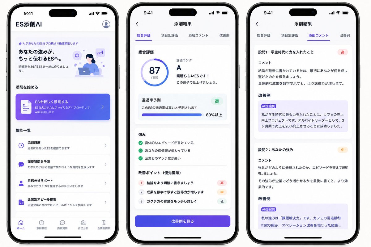
Phone 1, Home screen: Header text at top left reads 「ES添削AI」, with a circular user/profile icon at top right. Hero section includes a small purple sparkle label 「AIがあなたのESをプロ視点で徹底添削します」, a bold headline 「あなたの強みが、もっと伝わるESへ。」, supporting copy 「通過率を上げるESを一緒に作りましょう。」, and a small illustration of a student working on a laptop with purple AI/chat icons. Section title 「添削を始める」. Add one large gradient call-to-action card with a document icon, text 「ESを新しく添削する」 and smaller copy 「ESを入力またはファイルをアップロードして、AIが添削します」 plus a right chevron. Section title 「機能一覧」. Show exactly 4 feature list cards: 1) clock icon, 「添削履歴」, 「過去に添削したESを確認できます」; 2) chat icon, 「面接質問を予測」, 「あなたのESから面接で聞かれそうな質問を生成します」; 3) person icon, 「自己分析サポート」, 「強みやガクチカを整理するお手伝いをします」; 4) building icon, 「企業別アピール提案」, 「志望企業に合わせたアピールポイントを提案します」. Bottom navigation contains exactly 5 items: 「ホーム」 active, 「添削履歴」, 「面接質問」, 「自己分析」, 「企業別提案」.
Phone 2, Results overview screen: Top bar has a back arrow and centered title 「添削結果」. Under it, show exactly 4 tabs: 「総合評価」 active with purple underline, 「項目別評価」, 「添削コメント」, 「改善例」. Main white card title 「総合評価」. Left side has a circular score ring showing {argument name="score" default="87"} and 「/100」. Right side text reads 「評価ランク」, large rank {argument name="grade" default="A"}, 「素晴らしいESです!」, and 「この調子で仕上げましょう。」. Next card title 「通過率予測」, text 「このESの通過率は高いと予測されます」, green badge 「高」, horizontal progress bar, and 「80%以上」. Next card title 「強み」 with exactly 3 green check items: 「具体的なエピソードが書けている」, 「あなたの価値観が伝わっている」, 「企業とのマッチ度が高い」. Next card title 「改善ポイント(優先度順)」 with exactly 3 numbered rows: 1 「結論をより明確に書きましょう」 with red badge 「高」; 2 「成果を数字で示すと説得力が増します」 with orange badge 「中」; 3 「ガクチカの背景をもう少し詳しく」 with gray badge 「低」. At bottom, a large purple-blue gradient button reads 「改善例を見る」.
Phone 3, Detailed comments screen: Top bar has a back arrow and centered title 「添削結果」. Repeat exactly 4 tabs: 「総合評価」, 「項目別評価」, 「添削コメント」 active with purple underline, 「改善例」. Show exactly 2 visible critique sections in stacked white cards. Section 1 heading 「設問1:学生時代に力を入れたこと」 with red badge 「高」, subheading 「コメント」, comment text explaining that the conclusion is written last and should first communicate what the student accomplished, and that numerical results improve persuasiveness. Then subheading 「改善例」 with a light purple suggestion box labeled 「AI提案例」 containing rewritten Japanese text about focusing on increasing sales at a cafe, working as an part-time leader, and increasing sales by 20% in 3 months. Section 2 heading 「設問2:あなたの強み」 with orange badge 「中」, subheading 「コメント」, comment text explaining to support how the strength was demonstrated with an episode and to end with how it can be used at the company. Then subheading 「改善例」 with a light purple suggestion box labeled 「AI提案例」 containing a rewritten example beginning 「私の強みは『課題解決力』です。」 and mentioning cafe congestion and improving operations, cropped slightly at the bottom as if scrollable.
Visual style: Japanese iOS app UI, San Francisco/Noto Sans style typography, purple and indigo gradients, subtle pastel lavender highlights, blue accent icons, soft card shadows, crisp alignment, plenty of white space. Use realistic phone hardware shadows and spacing. Keep text legible and mostly identical to the specified Japanese labels.
Constraints: Show exactly 3 phones, exactly 4 home feature cards, exactly 5 bottom navigation items on the first phone, exactly 4 tabs on each results screen, exactly 3 strengths, exactly 3 improvement points, and exactly 2 visible comment sections. Do not add extra screens, watermarks, logos, or decorative clutter.Translations
日语 ES 润色 App 样机设计
enGoal: Create a polished marketing mockup for a Japanese mobile app called {argument name="app name" default="ES添削AI"}, an AI entry-sheet/resume critique app for students, shown as three iPhone-style screens side by side on a clean white background. Canvas: Wide horizontal image, approximately 16:9. Place exactly 3 black-framed modern iPhones with rounded corners, top Dynamic Island, status bar time 9:41, and bottom home indicator. Use bright white UI cards, soft shadows, rounded corners, and a purple-to-blue gradient accent style. Overall look should be like a realistic App Store/SNS concept mockup, clean and trustworthy. Phone 1, Home screen: Header text at top left reads 「ES添削AI」, with a circular user/profile icon at top right. Hero section includes a small purple sparkle label 「AIがあなたのESをプロ視点で徹底添削します」, a bold headline 「あなたの強みが、もっと伝わるESへ。」, supporting copy 「通過率を上げるESを一緒に作りましょう。」, and a small illustration of a student working on a laptop with purple AI/chat icons. Section title 「添削を始める」. Add one large gradient call-to-action card with a document icon, text 「ESを新しく添削する」 and smaller copy 「ESを入力またはファイルをアップロードして、AIが添削します」 plus a right chevron. Section title 「機能一覧」. Show exactly 4 feature list cards: 1) clock icon, 「添削履歴」, 「過去に添削したESを確認できます」; 2) chat icon, 「面接質問を予測」, 「あなたのESから面接で聞かれそうな質問を生成します」; 3) person icon, 「自己分析サポート」, 「強みやガクチカを整理するお手伝いをします」; 4) building icon, 「企業別アピール提案」, 「志望企業に合わせたアピールポイントを提案します」. Bottom navigation contains exactly 5 items: 「ホーム」 active, 「添削履歴」, 「面接質問」, 「自己分析」, 「企業別提案」. Phone 2, Results overview screen: Top bar has a back arrow and centered title 「添削結果」. Under it, show exactly 4 tabs: 「総合評価」 active with purple underline, 「項目別評価」, 「添削コメント」, 「改善例」. Main white card title 「総合評価」. Left side has a circular score ring showing {argument name="score" default="87"} and 「/100」. Right side text reads 「評価ランク」, large rank {argument name="grade" default="A"}, 「素晴らしいESです!」, and 「この調子で仕上げましょう。」. Next card title 「通過率予測」, text 「このESの通過率は高いと予測されます」, green badge 「高」, horizontal progress bar, and 「80%以上」. Next card title 「強み」 with exactly 3 green check items: 「具体的なエピソードが書けている」, 「あなたの価値観が伝わっている」, 「企業とのマッチ度が高い」. Next card title 「改善ポイント(優先度順)」 with exactly 3 numbered rows: 1 「結論をより明確に書きましょう」 with red badge 「高」; 2 「成果を数字で示すと説得力が増します」 with orange badge 「中」; 3 「ガクチカの背景をもう少し詳しく」 with gray badge 「低」. At bottom, a large purple-blue gradient button reads 「改善例を見る」. Phone 3, Detailed comments screen: Top bar has a back arrow and centered title 「添削結果」. Repeat exactly 4 tabs: 「総合評価」, 「項目別評価」, 「添削コメント」 active with purple underline, 「改善例」. Show exactly 2 visible critique sections in stacked white cards. Section 1 heading 「設問1:学生時代に力を入れたこと」 with red badge 「高」, subheading 「コメント」, comment text explaining that the conclusion is written last and should first communicate what the student accomplished, and that numerical results improve persuasiveness. Then subheading 「改善例」 with a light purple suggestion box labeled 「AI提案例」 containing rewritten Japanese text about focusing on increasing sales at a cafe, working as an part-time leader, and increasing sales by 20% in 3 months. Section 2 heading 「設問2:あなたの強み」 with orange badge 「中」, subheading 「コメント」, comment text explaining to support how the strength was demonstrated with an episode and to end with how it can be used at the company. Then subheading 「改善例」 with a light purple suggestion box labeled 「AI提案例」 containing a rewritten example beginning 「私の強みは『課題解決力』です。」 and mentioning cafe congestion and improving operations, cropped slightly at the bottom as if scrollable. Visual style: Japanese iOS app UI, San Francisco/Noto Sans style typography, purple and indigo gradients, subtle pastel lavender highlights, blue accent icons, soft card shadows, crisp alignment, plenty of white space. Use realistic phone hardware shadows and spacing. Keep text legible and mostly identical to the specified Japanese labels. Constraints: Show exactly 3 phones, exactly 4 home feature cards, exactly 5 bottom navigation items on the first phone, exactly 4 tabs on each results screen, exactly 3 strengths, exactly 3 improvement points, and exactly 2 visible comment sections. Do not add extra screens, watermarks, logos, or decorative clutter.
日语 ES 润色 App 样机设计
zh-CN目标:为一款名为 {argument name="app name" default="ES添削AI"} 的日语移动端 App 创建精美的营销样机。该 App 是一款面向学生的 AI 入职申请表(ES)/简历润色工具。样机需展示三部 iPhone 屏幕并排陈列在纯净的白色背景上。 画布:宽幅横向图像,比例约为 16:9。放置 3 部黑色边框的现代 iPhone,圆角设计,顶部带有灵动岛(Dynamic Island),状态栏时间显示 9:41,底部带有主屏幕指示条。UI 设计采用明亮的白色卡片、柔和阴影、圆角设计以及紫到蓝的渐变色点缀。整体风格应呈现出逼真的 App Store/社交媒体概念样机效果,简洁且值得信赖。 手机 1,主屏幕:左上角标题文字为「ES添削AI」,右上角为圆形用户/个人资料图标。首屏区域包含一个紫色小标签「AIがあなたのESをプロ視点で徹底添削します」,粗体主标题「あなたの強みが、もっと伝わるESへ。」,辅助文案「通過率を上げるESを一緒に作りましょう。」,以及一张学生在笔记本电脑前工作并配有紫色 AI/聊天图标的小插图。分区标题「添削を始める」。添加一个带有文档图标的大型渐变色行动号召(CTA)卡片,文字为「ESを新しく添削する」,下方小字为「ESを入力またはファイルをアップロードして、AIが添削します」,并配有一个向右的箭头。分区标题「機能一覧」。展示 4 张功能列表卡片:1) 时钟图标,「添削履歴」,「過去に添削したESを確認できます」;2) 聊天图标,「面接質問を予測」,「あなたのESから面接で聞かれそうな質問を生成します」;3) 人像图标,「自己分析サポート」,「強みやガクチカを整理するお手伝いをします」;4) 建筑图标,「企業別アピール提案」,「志望企業に合わせたアピールポイントを提案します」。底部导航栏包含 5 个项目:「ホーム」(选中状态)、「添削履歴」、「面接質問」、「自己分析」、「企業別提案」。 手机 2,结果概览屏幕:顶部栏有一个返回箭头和居中标题「添削結果」。下方展示 4 个选项卡:「総合評価」(选中状态,带紫色下划线)、「項目別評価」、「添削コメント」、「改善例」。主白色卡片标题「総合評価」。左侧显示一个圆形分数环,显示 {argument name="score" default="87"} 和「/100」。右侧文字显示「評価ランク」,大号等级 {argument name="grade" default="A"},「素晴らしいESです!」以及「この調子で仕上げましょう。」。下一张卡片标题「通過率予測」,文字「このESの通過率は高いと予測されます」,绿色徽章「高」,水平进度条,以及「80%以上」。下一张卡片标题「強み」,包含 3 个绿色勾选项目:「具体的なエピソードが書けている」、「あなたの価値観が伝わっている」、「企業とのマッチ度が高い」。下一张卡片标题「改善ポイント(優先度順)」,包含 3 个带编号的行:1「結論をより明確に書きましょう」(带红色徽章「高」);2「成果を数字で示すと説得力が増します」(带橙色徽章「中」);3「ガクチカの背景をもう少し詳しく」(带灰色徽章「低」)。底部是一个大型紫蓝色渐变按钮,文字为「改善例を見る」。 手机 3,详细评论屏幕:顶部栏有一个返回箭头和居中标题「添削結果」。重复 4 个选项卡:「総合評価」、「項目別評価」、「添削コメント」(选中状态,带紫色下划线)、「改善例」。在堆叠的白色卡片中展示 2 个可见的润色部分。第 1 部分标题「設問1:学生時代に力を入れたこと」(带红色徽章「高」),副标题「コメント」,评论文字解释结论写在最后,应先传达学生完成了什么,并指出数字化的成果能提高说服力。随后是副标题「改善例」,配有一个浅紫色建议框,标注为「AI提案例」,内容包含关于增加咖啡店销售额、担任兼职组长以及在 3 个月内将销售额提高 20% 的重写日语文本。第 2 部分标题「設問2:あなたの強み」(带橙色徽章「中」),副标题「コメント」,评论文字建议通过具体事例来支撑强项的展示,并以如何在公司中发挥该强项作为结尾。随后是副标题「改善例」,配有一个浅紫色建议框,标注为「AI提案例」,内容包含以「私の強みは『課題解決力』です。」开头并提及咖啡店拥挤和运营改善的重写示例,底部略微裁剪,呈现出可滚动效果。 视觉风格:日语 iOS App UI,San Francisco/Noto Sans 字体,紫色和靛蓝色渐变,微妙的淡紫色高光,蓝色强调图标,柔和的卡片阴影,清晰的对齐,充足的留白。使用逼真的手机硬件阴影和间距。保持文字清晰易读,并与指定的日语标签基本一致。 约束条件:展示 3 部手机,第一部手机上正好 4 张功能卡片和 5 个底部导航项目,每个结果屏幕上正好 4 个选项卡,正好 3 个强项,正好 3 个改进点,以及正好 2 个可见的评论部分。不要添加额外的屏幕、水印、Logo 或装饰性杂物。