日本小学生体育课程宣传单
为小学体育课程生成一张色彩鲜艳的日本宣传单,包含四个身体素质检查板块及赞助商标识。
- Category
- Charts & Infographics
- Model
- GPT Image 2
- Creator
- かたこりくん
- Source language
- en
- Source ID
- 21743
- Published
- May 20, 2026
Full prompt
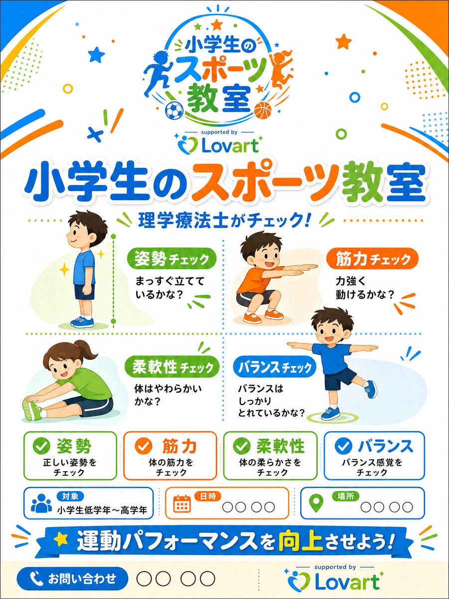
Goal: Create a bright, professional Japanese promotional flyer for a sponsor-supported elementary school sports class, using a cheerful children’s sports-clinic theme.

Canvas: Vertical A4 flyer, 3:4 aspect ratio, white background with rounded colorful corner swooshes in blue, orange, and green. Add playful confetti, stars, dots, circles, motion lines, and small sports icons throughout. Keep the design clean, print-ready, and family friendly.

Main branding: At the top center, place a circular sports-class logo with running and jumping child silhouettes, soccer ball and basketball icons, and the Japanese logo text {argument name="event logo text" default="小学生のスポーツ教室"}. Under it, add small text “supported by” and the Lovart logo in blue and green. Use the Lovart logo again near the bottom right with “supported by” above it.

Headline area: Large bold Japanese headline across the upper middle: {argument name="main headline text" default="小学生のスポーツ教室"}. Use thick rounded lettering with white outline and soft shadow; color the words blue, orange, and green. Beneath it, add the subheadline {argument name="subheadline text" default="理学療法士がチェック!"} in blue with small green accent lines.

Main layout: Divide the central area into a 2-by-2 dotted grid containing exactly 4 illustrated child activity check sections:
1. Posture check, upper left: a boy in blue sportswear standing in side profile, with a green label {argument name="posture label" default="姿勢チェック"} and text “まっすぐ立てているかな?” Add a vertical green dotted measuring line beside him.
2. Strength check, upper right: a smiling boy in orange shirt and shorts doing a squat or reaching pose, orange label “筋力チェック,” and text “力強く動けるかな?”
3. Flexibility check, lower left: a smiling girl in green shirt stretching forward while seated, green label “柔軟性チェック,” and text “体はやわらかいかな?”
4. Balance check, lower right: a smiling boy in blue shirt balancing on one leg with arms out, blue label “バランスチェック,” and text “バランスはしっかりとれているかな?”
Use soft pastel oval background shapes behind each child and a colorful flat vector illustration style.

Bottom information cards: Below the activity grid, place exactly 4 rounded rectangular summary cards in a row, each with a colored checkmark icon and bold Japanese title:
1. Green card: “姿勢,” smaller text “正しい姿勢をチェック.”
2. Orange card: “筋力,” smaller text “体の筋力をチェック.”
3. Green card: “柔軟性,” smaller text “体の柔らかさをチェック.”
4. Blue card: “バランス,” smaller text “バランス感覚をチェック.”

Event info row: Add exactly 3 rounded information boxes beneath the summary cards:
1. Blue people icon, label “対象,” value “小学生低学年〜高学年.”
2. Orange calendar icon, label “日時,” followed by four empty circle placeholders.
3. Green map-pin icon, label “場所,” followed by four empty circle placeholders.

Bottom CTA: Add a wide blue ribbon banner with a yellow star on the left and the Japanese slogan {argument name="bottom slogan text" default="運動パフォーマンスを向上させよう!"}; emphasize “向上” in yellow. At the very bottom left, add a blue rounded contact button with a white phone icon and “お問い合わせ,” followed by four empty circle placeholders.

Visual style: Modern Japanese children’s event flyer, high-quality vector graphics, vibrant blue/orange/green palette, rounded typography, crisp spacing, light shadows, playful but organized. Avoid photorealism, avoid clutter, no extra people beyond the 4 children in the activity grid, no extra cards beyond the specified counts.
Translations
日本小学生体育课程宣传单
enGoal: Create a bright, professional Japanese promotional flyer for a sponsor-supported elementary school sports class, using a cheerful children’s sports-clinic theme. Canvas: Vertical A4 flyer, 3:4 aspect ratio, white background with rounded colorful corner swooshes in blue, orange, and green. Add playful confetti, stars, dots, circles, motion lines, and small sports icons throughout. Keep the design clean, print-ready, and family friendly. Main branding: At the top center, place a circular sports-class logo with running and jumping child silhouettes, soccer ball and basketball icons, and the Japanese logo text {argument name="event logo text" default="小学生のスポーツ教室"}. Under it, add small text “supported by” and the Lovart logo in blue and green. Use the Lovart logo again near the bottom right with “supported by” above it. Headline area: Large bold Japanese headline across the upper middle: {argument name="main headline text" default="小学生のスポーツ教室"}. Use thick rounded lettering with white outline and soft shadow; color the words blue, orange, and green. Beneath it, add the subheadline {argument name="subheadline text" default="理学療法士がチェック!"} in blue with small green accent lines. Main layout: Divide the central area into a 2-by-2 dotted grid containing exactly 4 illustrated child activity check sections: 1. Posture check, upper left: a boy in blue sportswear standing in side profile, with a green label {argument name="posture label" default="姿勢チェック"} and text “まっすぐ立てているかな?” Add a vertical green dotted measuring line beside him. 2. Strength check, upper right: a smiling boy in orange shirt and shorts doing a squat or reaching pose, orange label “筋力チェック,” and text “力強く動けるかな?” 3. Flexibility check, lower left: a smiling girl in green shirt stretching forward while seated, green label “柔軟性チェック,” and text “体はやわらかいかな?” 4. Balance check, lower right: a smiling boy in blue shirt balancing on one leg with arms out, blue label “バランスチェック,” and text “バランスはしっかりとれているかな?” Use soft pastel oval background shapes behind each child and a colorful flat vector illustration style. Bottom information cards: Below the activity grid, place exactly 4 rounded rectangular summary cards in a row, each with a colored checkmark icon and bold Japanese title: 1. Green card: “姿勢,” smaller text “正しい姿勢をチェック.” 2. Orange card: “筋力,” smaller text “体の筋力をチェック.” 3. Green card: “柔軟性,” smaller text “体の柔らかさをチェック.” 4. Blue card: “バランス,” smaller text “バランス感覚をチェック.” Event info row: Add exactly 3 rounded information boxes beneath the summary cards: 1. Blue people icon, label “対象,” value “小学生低学年〜高学年.” 2. Orange calendar icon, label “日時,” followed by four empty circle placeholders. 3. Green map-pin icon, label “場所,” followed by four empty circle placeholders. Bottom CTA: Add a wide blue ribbon banner with a yellow star on the left and the Japanese slogan {argument name="bottom slogan text" default="運動パフォーマンスを向上させよう!"}; emphasize “向上” in yellow. At the very bottom left, add a blue rounded contact button with a white phone icon and “お問い合わせ,” followed by four empty circle placeholders. Visual style: Modern Japanese children’s event flyer, high-quality vector graphics, vibrant blue/orange/green palette, rounded typography, crisp spacing, light shadows, playful but organized. Avoid photorealism, avoid clutter, no extra people beyond the 4 children in the activity grid, no extra cards beyond the specified counts.
日本小学生体育课程宣传单
zh-CN目标:制作一张明亮、专业的日本宣传单,用于赞助商支持的小学体育课程,采用活泼的儿童体育训练营主题。 画布:竖版 A4 宣传单,3:4 宽高比,白色背景,配有蓝色、橙色和绿色的圆角彩色装饰条。在画面中添加俏皮的五彩纸屑、星星、圆点、圆圈、运动线条和小型运动图标。保持设计简洁、适合打印且适合家庭阅读。 主要品牌标识:在顶部中心放置一个圆形体育课程 Logo,包含奔跑和跳跃的儿童剪影、足球和篮球图标,以及日语 Logo 文字 {argument name="event logo text" default="小学生のスポーツ教室"}。在其下方添加小字“supported by”以及蓝绿色的 Lovart Logo。在右下角附近再次使用 Lovart Logo,上方标注“supported by”。 标题区域:中部上方放置醒目的大号日语标题:{argument name="main headline text" default="小学生のスポーツ教室"}。使用带有白色描边和柔和阴影的粗体圆角字体;文字颜色采用蓝色、橙色和绿色。下方添加副标题 {argument name="subheadline text" default="理学療法士がチェック!"},颜色为蓝色,并配有绿色小装饰线。 主要布局:将中心区域划分为 2x2 的虚线网格,包含 4 个儿童活动检查板块: 1. 姿势检查(左上):一名身穿蓝色运动服的男孩侧身站立,配有绿色标签 {argument name="posture label" default="姿勢チェック"} 和文字“まっすぐ立てているかな?”。旁边添加一条垂直的绿色虚线测量线。 2. 力量检查(右上):一名身穿橙色上衣和短裤的微笑男孩在做深蹲或伸展动作,配有橙色标签“筋力チェック”和文字“力強く動けるかな?”。 3. 柔韧性检查(左下):一名身穿绿色上衣的微笑女孩坐着向前伸展,配有绿色标签“柔軟性チェック”和文字“体はやわらかいかな?”。 4. 平衡检查(右下):一名身穿蓝色上衣的微笑男孩单脚站立并张开双臂,配有蓝色标签“バランスチェック”和文字“バランスはしっかりとれているかな?”。 在每个儿童形象后使用柔和的淡色椭圆形背景,采用色彩鲜艳的扁平矢量插画风格。 底部信息卡片:在活动网格下方,横向排列 4 张圆角矩形摘要卡片,每张卡片配有一个彩色对勾图标和粗体日语标题: 1. 绿色卡片:“姿勢”,小字“正しい姿勢をチェック”。 2. 橙色卡片:“筋力”,小字“体の筋力をチェック”。 3. 绿色卡片:“柔軟性”,小字“体の柔らかさをチェック”。 4. 蓝色卡片:“バランス”,小字“バランス感覚をチェック”。 活动信息行:在摘要卡片下方添加 3 个圆角信息框: 1. 蓝色人物图标,标签“対象”,内容“小学生低学年〜高学年”。 2. 橙色日历图标,标签“日時”,后跟 4 个空心圆占位符。 3. 绿色地图定位图标,标签“場所”,后跟 4 个空心圆占位符。 底部行动号召(CTA):添加一条宽大的蓝色丝带横幅,左侧带有一颗黄色星星,并写有日语口号 {argument name="bottom slogan text" default="運動パフォーマンスを向上させよう!"};将“向上”二字用黄色强调。在最左下角添加一个蓝色圆角联系按钮,配有白色电话图标和“お問い合わせ”,后跟 4 个空心圆占位符。 视觉风格:现代日本儿童活动宣传单,高质量矢量图形,充满活力的蓝/橙/绿配色,圆角字体,间距清晰,轻微阴影,活泼且井然有序。避免照片级写实,避免杂乱,除活动网格中的 4 名儿童外不添加额外人物,不添加超出指定数量的卡片。