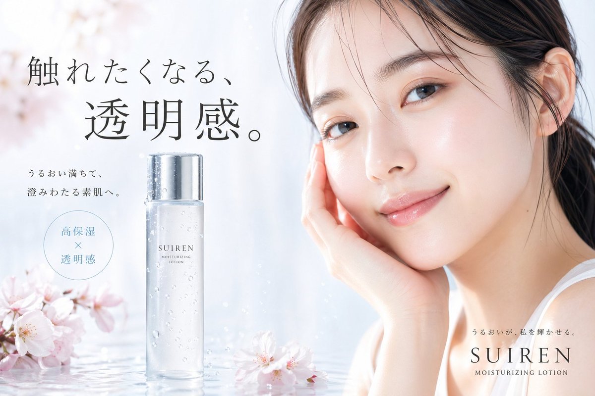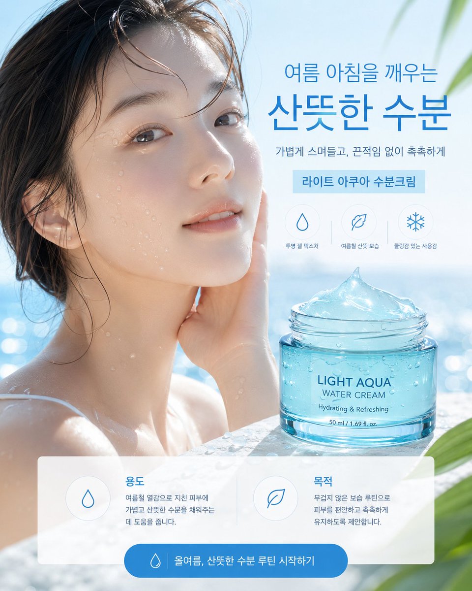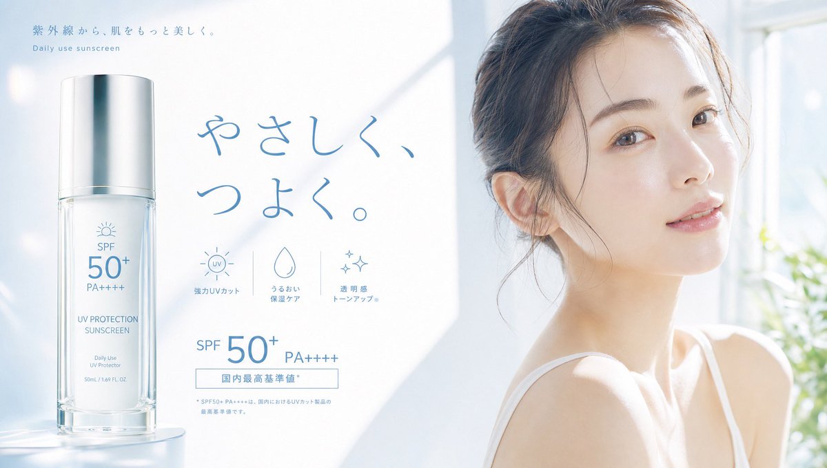
日系防晒霜美妆广告横幅
一张照片级真实感日系护肤广告横幅,包含防晒霜瓶身、SPF 指数说明、功能图标,以及一位面部被遮挡、沐浴在晨光中的模特。
- Category
- Charts & Infographics
- Model
- GPT Image 2
- Creator
- チヒロ/ほっこりAIスタジオ🎨
- Source language
- en
- Source ID
- 21777
- Published
- May 20, 2026
Full prompt
Goal: Create a bright Japanese skincare advertising banner for a daily-use sunscreen, with an airy luxury cosmetic feel and soft morning sunlight.

Canvas: Wide horizontal web banner, 1200×675 px, 16:9 aspect ratio. Use a very pale blue-white color palette, high-key lighting, soft shadows, and a clean minimalist Japanese beauty-ad aesthetic.

Layout: Split the composition into three main zones: left product hero, center typography and feature icons, right lifestyle model. On the left, place one tall transparent cylindrical pump bottle standing on a glossy reflective surface, occupying about 25% of the width. In the center, place large handwritten Japanese headline text in soft blue. On the right, show a young woman in a white camisole near a bright window, cropped from chest upward, turned slightly toward the camera; her face is covered by a large opaque beige square privacy block, while hair, ear, neck, shoulders, and upper chest remain visible. Background should be a sunlit white room with blurred window frames and a hint of green plant on the far right.

Product details: The bottle is clear glass/plastic with a frosted white sunscreen liquid inside, a shiny silver cylindrical cap, and delicate blue label typography. The bottle label should include: “SPF 50+”, “PA++++”, “UV PROTECTION SUNSCREEN”, “Daily Use UV Protector”, and “50mL / 1.69 FL.OZ.” Add a tiny sun icon above the SPF text.

Text content: At the top left, add small Japanese copy “紫外線から、肌をもっと美しく。” with a small English subtitle “Daily use sunscreen” beneath it. Center headline: {argument name="headline text" default="やさしく、つよく。"}. Bottom-center SPF claim: “SPF 50+ PA++++” in large blue text, plus a thin outlined rectangular label reading “国内最高基準値*”. Add a very small footnote below in pale blue, visually present but not overly legible.

Feature icons: Include exactly 3 small line icons beneath the headline, evenly spaced with thin vertical dividers: 1) sun icon with “UV” and Japanese label “強力UVカット”, 2) water droplet icon with label “うるおい 保湿ケア”, 3) sparkle icon with label “透明感 トーンアップ”. Use simple blue line art.

Model details: The model has {argument name="hair color" default="soft brown"} hair tied loosely up with wispy strands near the ear and neck, fair luminous skin, delicate shoulder line, and a white camisole strap. Her face must be obscured by a perfectly rectangular solid beige overlay, roughly from forehead to chin and spanning most of the face area, color close to warm gray-beige.

Visual style: Photorealistic product-ad composite, soft bloom, gentle lens flare, cool blue shadows, natural daylight, glossy reflection under bottle, lots of negative space, refined Japanese cosmetics branding. Keep all typography light blue, thin, elegant, and clean. Avoid clutter, extra products, additional people, logos, watermarks, or harsh contrast.
Translations
日系防晒霜美妆广告横幅
enGoal: Create a bright Japanese skincare advertising banner for a daily-use sunscreen, with an airy luxury cosmetic feel and soft morning sunlight. Canvas: Wide horizontal web banner, 1200×675 px, 16:9 aspect ratio. Use a very pale blue-white color palette, high-key lighting, soft shadows, and a clean minimalist Japanese beauty-ad aesthetic. Layout: Split the composition into three main zones: left product hero, center typography and feature icons, right lifestyle model. On the left, place one tall transparent cylindrical pump bottle standing on a glossy reflective surface, occupying about 25% of the width. In the center, place large handwritten Japanese headline text in soft blue. On the right, show a young woman in a white camisole near a bright window, cropped from chest upward, turned slightly toward the camera; her face is covered by a large opaque beige square privacy block, while hair, ear, neck, shoulders, and upper chest remain visible. Background should be a sunlit white room with blurred window frames and a hint of green plant on the far right. Product details: The bottle is clear glass/plastic with a frosted white sunscreen liquid inside, a shiny silver cylindrical cap, and delicate blue label typography. The bottle label should include: “SPF 50+”, “PA++++”, “UV PROTECTION SUNSCREEN”, “Daily Use UV Protector”, and “50mL / 1.69 FL.OZ.” Add a tiny sun icon above the SPF text. Text content: At the top left, add small Japanese copy “紫外線から、肌をもっと美しく。” with a small English subtitle “Daily use sunscreen” beneath it. Center headline: {argument name="headline text" default="やさしく、つよく。"}. Bottom-center SPF claim: “SPF 50+ PA++++” in large blue text, plus a thin outlined rectangular label reading “国内最高基準値*”. Add a very small footnote below in pale blue, visually present but not overly legible. Feature icons: Include exactly 3 small line icons beneath the headline, evenly spaced with thin vertical dividers: 1) sun icon with “UV” and Japanese label “強力UVカット”, 2) water droplet icon with label “うるおい 保湿ケア”, 3) sparkle icon with label “透明感 トーンアップ”. Use simple blue line art. Model details: The model has {argument name="hair color" default="soft brown"} hair tied loosely up with wispy strands near the ear and neck, fair luminous skin, delicate shoulder line, and a white camisole strap. Her face must be obscured by a perfectly rectangular solid beige overlay, roughly from forehead to chin and spanning most of the face area, color close to warm gray-beige. Visual style: Photorealistic product-ad composite, soft bloom, gentle lens flare, cool blue shadows, natural daylight, glossy reflection under bottle, lots of negative space, refined Japanese cosmetics branding. Keep all typography light blue, thin, elegant, and clean. Avoid clutter, extra products, additional people, logos, watermarks, or harsh contrast.
日系防晒霜美妆广告横幅
zh-CN目标:为一款日常防晒霜制作明亮的日系护肤广告横幅,营造轻盈奢华的化妆品氛围和柔和的晨光感。 画布:宽幅横向网页横幅,1200×675 像素,16:9 纵横比。使用极淡的蓝白色调、高调照明、柔和阴影,以及简洁的日系极简美妆广告美学。 布局:将构图分为三个主要区域:左侧产品主体、中央排版与功能图标、右侧生活方式模特。左侧放置一个高大的透明圆柱形按压瓶,立于光亮的反射面上,占据约 25% 的宽度。中央放置柔和蓝色的手写体日文大标题。右侧展示一名身穿白色吊带背心的年轻女性,靠近明亮的窗户,胸部以上构图,身体略微转向镜头;她的面部被一个巨大的不透明米色方形遮挡块覆盖,但头发、耳朵、颈部、肩膀和上胸部保持可见。背景应为阳光明媚的白色房间,带有模糊的窗框,最右侧隐约可见一株绿植。 产品细节:瓶身为透明玻璃/塑料材质,内部装有磨砂白色防晒乳液,配有闪亮的银色圆柱形瓶盖,瓶身标签采用精致的蓝色字体。瓶身标签应包含:“SPF 50+”、“PA++++”、“UV PROTECTION SUNSCREEN”、“Daily Use UV Protector”以及“50mL / 1.69 FL.OZ.”。在 SPF 文字上方添加一个小太阳图标。 文字内容:左上角添加简短日文文案“紫外線から、肌をもっと美しく。”,下方配有英文副标题“Daily use sunscreen”。中央标题:{argument name="headline text" default="やさしく、つよく。"}。底部中央 SPF 说明:“SPF 50+ PA++++”采用蓝色大字,外加一个细边框矩形标签,写着“国内最高基準値*”。在下方添加一行极小的淡蓝色脚注,视觉上可见但不过分清晰。 功能图标:在标题下方包含 3 个等间距排列的小型线条图标,中间用细垂直线分隔:1) 带有“UV”字样和日文标签“強力UVカット”的太阳图标,2) 带有标签“うるおい 保湿ケア”的水滴图标,3) 带有标签“透明感 トーンアップ”的闪光图标。使用简洁的蓝色线条艺术。 模特细节:模特拥有 {argument name="hair color" default="柔和棕色"} 的头发,松散地盘起,耳边和颈部有几缕碎发,皮肤白皙透亮,肩部线条精致,穿着白色吊带背心。她的面部必须被一个完美的矩形实心米色遮罩覆盖,大致从额头到下巴,覆盖大部分面部区域,颜色接近暖灰米色。 视觉风格:照片级真实感产品广告合成,柔光效果,轻微的镜头光晕,冷蓝色阴影,自然日光,瓶底有光泽反射,留有大量负空间,精致的日系化妆品品牌感。所有字体保持浅蓝色、纤细、优雅且简洁。避免杂乱、多余产品、额外人物、标志、水印或强烈的对比。