中式“暴富”主题排版海报
生成一张高对比度的实验性中式排版海报,包含巨大的定制化“暴富”主题字标、轨道运动线条以及技术性微型标签。
- Category
- Charts & Infographics
- Model
- GPT Image 2
- Creator
- 小小东
- Source language
- en
- Source ID
- 23366
- Published
- May 30, 2026
Full prompt
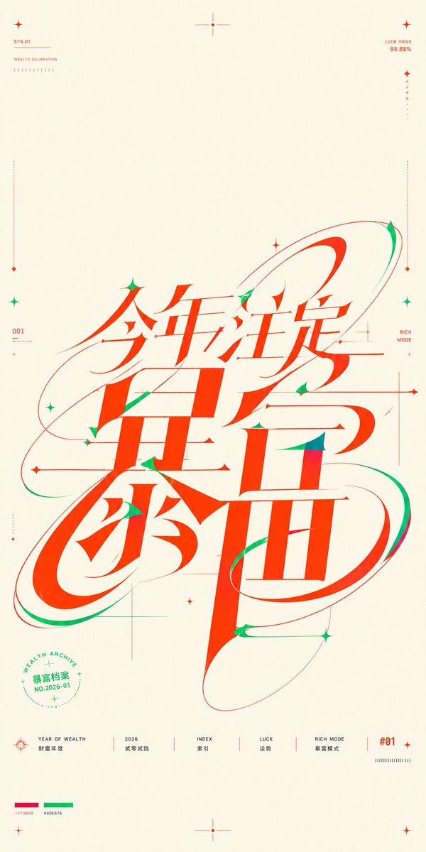
Goal: Create a near-square vertical typographic poster about {argument name="theme text" default="今年注定暴富"}, where the core message is not a normal headline but a huge custom continuous Chinese wordmark occupying the middle and lower center of the composition. The lettering should compress the phrase into one shared skeleton so the strokes feel simultaneously readable characters, motion trails, orbital paths, and precision graphic construction.

Canvas: Portrait poster, approximately 9:16 but close to a square-poster feel, warm ivory paper background with generous empty margins. Use a clean editorial graphic-design layout with thin technical guide marks and lots of negative space.

Main wordmark: Place one massive red-orange Chinese calligraphic-mechanical logotype in the center, spanning most of the height from just below center to the lower third. Use extremely high contrast strokes: thick vertical slabs, sharp triangular cuts, thin hairline crossbars, soft elongated curves, and oval loop structures. The main visible phrase should read {argument name="theme text" default="今年注定暴富"}. Make the characters interlock and overlap as a single custom glyph, with sweeping red and green orbital ribbons wrapping around it. Add small green shadow strokes and accents inside cuts and terminals, especially on curves and pointed joints. The overall feeling should be lucky, wealthy, futuristic, energetic, and precise.

Color palette: Use exactly 3 dominant colors: warm ivory background, vivid fortune red-orange for the main typography and most linework, and emerald green for secondary accents. Include tiny printed palette swatches near the bottom left labeled with hex-like values, red {argument name="red color code" default="#FF3800"} and green {argument name="green color code" default="#00E676"}.

Decorative and technical elements: Include 12 small star/cross markers distributed around the poster: 1 at the upper left, 1 at the top center, 1 at the upper right, 2 along the left side, 2 along the right side, 3 around the central wordmark, 1 at the bottom center, and 1 at the lower right. Include 4 long thin dotted vertical calibration lines near the left and right margins, each ending with tiny diamond markers. Include several ultra-thin horizontal and vertical construction lines crossing behind the wordmark, like a design grid, but keep them subtle and airy. Add 3 large elliptical orbital paths around the wordmark: one sweeping from left middle to upper right, one wrapping the lower left loop, and one long tilted oval around the lower right character.

Top micro text: At the upper left, small red technical labels read “SYS.01” and “WEALTH CALIBRATION” with a short row of tiny tick marks below. At the upper right, small red text reads “LUCK INDEX” and “98.88%” with a vertical dotted measure line below. Keep these labels tiny and precise.

Side micro text: On the left side near the middle, add “001” with miniature unreadable calibration ticks beneath. On the right side near the middle, add “RICH MODE” in small red text, aligned near a fine vertical guide.

Circular seal: In the lower left quadrant, place a small green circular seal partly under the main typography. It contains the curved English text “WEALTH ARCHIVE”, the Chinese text {argument name="seal text" default="暴富档案"}, and “NO.2026-01”, plus tiny stars and dotted ring marks.

Bottom information row: Along the bottom, create exactly 6 separated footer items with thin red dividers: 1) a target/crosshair icon with “YEAR OF WEALTH” and Chinese text “财富年度”; 2) “2026” with Chinese text “财富新船”; 3) “INDEX” with Chinese text “索引”; 4) “LUCK” with Chinese text “运势”; 5) “RICH MODE” with Chinese text “暴富模式”; 6) a red “#01” label with a small tick barcode beneath. Keep all footer text small, crisp, and aligned on a baseline.

Style constraints: High-end Chinese experimental typography poster, vector-sharp, no photography, no gradients except very subtle paper warmth, no shadows, no realistic objects. Keep the main wordmark legible enough to read while prioritizing sculptural custom lettering, extreme stroke contrast, smooth motion trails, and sparse technical-poster precision.
Translations
中式“暴富”主题排版海报
enGoal: Create a near-square vertical typographic poster about {argument name="theme text" default="今年注定暴富"}, where the core message is not a normal headline but a huge custom continuous Chinese wordmark occupying the middle and lower center of the composition. The lettering should compress the phrase into one shared skeleton so the strokes feel simultaneously readable characters, motion trails, orbital paths, and precision graphic construction. Canvas: Portrait poster, approximately 9:16 but close to a square-poster feel, warm ivory paper background with generous empty margins. Use a clean editorial graphic-design layout with thin technical guide marks and lots of negative space. Main wordmark: Place one massive red-orange Chinese calligraphic-mechanical logotype in the center, spanning most of the height from just below center to the lower third. Use extremely high contrast strokes: thick vertical slabs, sharp triangular cuts, thin hairline crossbars, soft elongated curves, and oval loop structures. The main visible phrase should read {argument name="theme text" default="今年注定暴富"}. Make the characters interlock and overlap as a single custom glyph, with sweeping red and green orbital ribbons wrapping around it. Add small green shadow strokes and accents inside cuts and terminals, especially on curves and pointed joints. The overall feeling should be lucky, wealthy, futuristic, energetic, and precise. Color palette: Use exactly 3 dominant colors: warm ivory background, vivid fortune red-orange for the main typography and most linework, and emerald green for secondary accents. Include tiny printed palette swatches near the bottom left labeled with hex-like values, red {argument name="red color code" default="#FF3800"} and green {argument name="green color code" default="#00E676"}. Decorative and technical elements: Include 12 small star/cross markers distributed around the poster: 1 at the upper left, 1 at the top center, 1 at the upper right, 2 along the left side, 2 along the right side, 3 around the central wordmark, 1 at the bottom center, and 1 at the lower right. Include 4 long thin dotted vertical calibration lines near the left and right margins, each ending with tiny diamond markers. Include several ultra-thin horizontal and vertical construction lines crossing behind the wordmark, like a design grid, but keep them subtle and airy. Add 3 large elliptical orbital paths around the wordmark: one sweeping from left middle to upper right, one wrapping the lower left loop, and one long tilted oval around the lower right character. Top micro text: At the upper left, small red technical labels read “SYS.01” and “WEALTH CALIBRATION” with a short row of tiny tick marks below. At the upper right, small red text reads “LUCK INDEX” and “98.88%” with a vertical dotted measure line below. Keep these labels tiny and precise. Side micro text: On the left side near the middle, add “001” with miniature unreadable calibration ticks beneath. On the right side near the middle, add “RICH MODE” in small red text, aligned near a fine vertical guide. Circular seal: In the lower left quadrant, place a small green circular seal partly under the main typography. It contains the curved English text “WEALTH ARCHIVE”, the Chinese text {argument name="seal text" default="暴富档案"}, and “NO.2026-01”, plus tiny stars and dotted ring marks. Bottom information row: Along the bottom, create exactly 6 separated footer items with thin red dividers: 1) a target/crosshair icon with “YEAR OF WEALTH” and Chinese text “财富年度”; 2) “2026” with Chinese text “财富新船”; 3) “INDEX” with Chinese text “索引”; 4) “LUCK” with Chinese text “运势”; 5) “RICH MODE” with Chinese text “暴富模式”; 6) a red “#01” label with a small tick barcode beneath. Keep all footer text small, crisp, and aligned on a baseline. Style constraints: High-end Chinese experimental typography poster, vector-sharp, no photography, no gradients except very subtle paper warmth, no shadows, no realistic objects. Keep the main wordmark legible enough to read while prioritizing sculptural custom lettering, extreme stroke contrast, smooth motion trails, and sparse technical-poster precision.
中式“暴富”主题排版海报
zh-CN目标:创作一张近乎正方形的竖版排版海报,主题为 {argument name="theme text" default="今年注定暴富"}。核心信息并非普通的标题,而是一个巨大的、连续的定制化中文字标,占据构图的中下部。字形应将短语压缩为一个共享骨架,使笔画在视觉上既是可读字符,又呈现出运动轨迹、轨道路径和精密图形结构的质感。 画布:竖版海报,比例约为 9:16 但接近正方形海报的视觉感,采用暖象牙色纸张背景,留有充足的空白边距。使用简洁的编辑排版布局,配以纤细的技术引导标记和大量的负空间。 主字标:在中心位置放置一个巨大的红橙色中式书法机械风格字标,跨度从中心下方延伸至下三分之一处。使用极高对比度的笔画:粗壮的垂直板状笔画、锐利的三角形切口、纤细的发丝状横杠、柔和的拉长曲线以及椭圆形的环状结构。主要可见短语应为 {argument name="theme text" default="今年注定暴富"}。让字符相互交错重叠,形成一个统一的定制字形,并伴有扫过的红绿轨道丝带环绕。在切口和末端添加微小的绿色阴影笔画和装饰,特别是在曲线和尖锐连接处。整体氛围应体现出幸运、富有、未来感、活力与精准。 配色方案:精确使用 3 种主色:暖象牙色背景、用于主字体及大部分线条的鲜艳财富红橙色,以及用于次要装饰的翡翠绿色。在左下角附近包含微小的印刷色板,并标注类似十六进制的值,红色为 {argument name="red color code" default="#FF3800"},绿色为 {argument name="green color code" default="#00E676"}。 装饰与技术元素:在海报周围分布 12 个小型星形/十字标记:左上角 1 个,顶部中心 1 个,右上角 1 个,左侧 2 个,右侧 2 个,主字标周围 3 个,底部中心 1 个,右下角 1 个。在左右边距附近包含 4 条长而细的虚线垂直校准线,每条线末端带有微小的菱形标记。在字标后方添加几条超细的水平和垂直构造线,如同设计网格,但保持其微妙且通透。在字标周围添加 3 条大型椭圆形轨道路径:一条从左中扫向右上,一条环绕左下方的环,另一条长椭圆环绕右下方的字符。 顶部微型文字:左上角的小型红色技术标签显示“SYS.01”和“WEALTH CALIBRATION”,下方有一排短小的刻度标记。右上角的小型红色文字显示“LUCK INDEX”和“98.88%”,下方有一条垂直虚线测量线。保持这些标签微小且精准。 侧边微型文字:在左侧中部附近,添加“001”以及下方微小的不可读校准刻度。在右侧中部附近,添加小型红色文字“RICH MODE”,并与一条精细的垂直引导线对齐。 圆形印章:在左下象限放置一个绿色小圆印,部分位于主字体下方。印章内包含弯曲的英文文本“WEALTH ARCHIVE”、中文字符 {argument name="seal text" default="暴富档案"} 以及“NO.2026-01”,并配有微小的星星和圆点环标记。 底部信息栏:沿底部创建 6 个由细红线分隔的页脚项:1) 一个带有“YEAR OF WEALTH”和中文“财富年度”的目标/十字准星图标;2) “2026”及中文“财富新船”;3) “INDEX”及中文“索引”;4) “LUCK”及中文“运势”;5) “RICH MODE”及中文“暴富模式”;6) 一个带有下方微小刻度条形码的红色“#01”标签。保持所有页脚文字小巧、清晰,并对齐在同一基线上。 风格限制:高端中式实验排版海报,矢量级锐度,无摄影元素,除极其微妙的纸张暖色外无渐变,无阴影,无写实物体。在优先考虑雕塑感定制字体、极致笔画对比、平滑运动轨迹和稀疏的技术海报精度前提下,确保主字标清晰可读。