
极简风格教育信息图设计
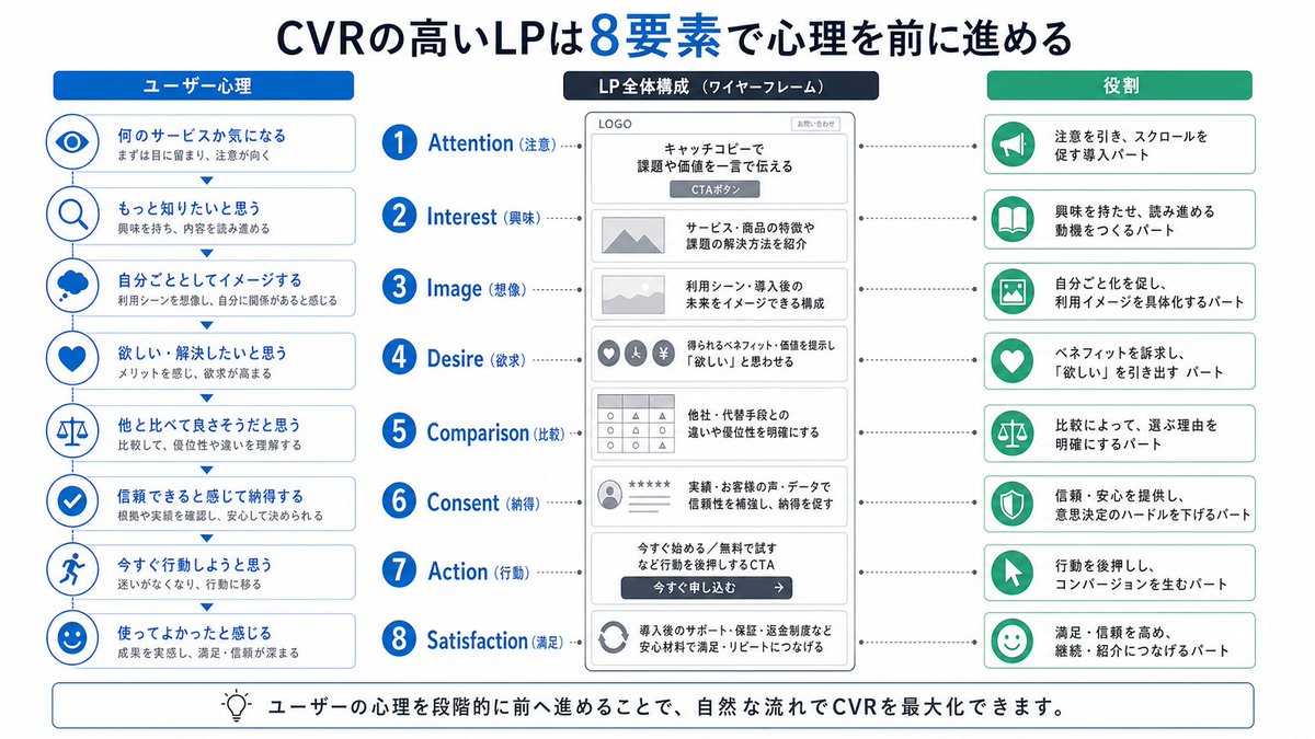
一张干净的教育类信息图海报,讲解「{知识主题}」, 【整体风格】 现代极简UI风格, 背景使用柔和浅色(如奶油色 #FAF7F2 / 浅灰蓝), 配色克制、舒适,适合长时间阅读, 【核心要求(关键)】 根据“知识主题”的信息结构,自然组织内容模块, 不要强制固定模块数量或顺序, 优先保证信息逻辑清晰,而不是形式对称, 【布局(自适应)】 - 使用网格布局(自动选择 2列 / 3列 / 不规则分布) - 卡片数量根据内容自动调整(通常 5–9 个) - 信息密度高的模块可适当放
- Category
- Charts & Infographics
- Model
- ChatGPT
- Creator
- @knowledgefxg
- Source language
- zh-CN
- Source ID
- 13867
- Published
- Apr 27, 2026
Full prompt
A clean educational infographic poster explaining "{Knowledge Topic}",

[Overall Style]
Modern minimalist UI style,
Background uses soft light colors (such as cream #FAF7F2 / light grayish blue),
Restrained and comfortable color scheme, suitable for long-time reading,

[Core Requirements (Key)]
Naturally organize content modules according to the information structure of the "Knowledge Topic",
Do not force a fixed number or order of modules,
Prioritize clear information logic rather than formal symmetry,

[Layout (Adaptive)]
- Use grid layout (automatically choose 2 columns / 3 columns / irregular distribution)
- Number of cards automatically adjusts according to content (usually 5–9)
- Modules with high information density can be appropriately enlarged (higher visual weight)
- Simple content modules can be shrunk or merged

[Card Design]
- White cards (#FFFFFF)
- Rounded corners + slight shadow (soft hierarchy)
- Maintain consistent spacing and alignment

[Each Information Module Contains]
- Concise illustrations (unified style)
- Clear titles (strong hierarchy)
- 1–3 sentences of core explanation (avoid verbosity)
- Provide examples / comparisons / summaries when necessary

[Content Organization Principles (Key Point)]
Automatically select the appropriate structure based on the topic, for example:
- Concept type → Definition + Principle + Characteristics + Example
- Comparison type → A vs B (contrast structure)
- Process type → Steps / Flowchart
- System type → Components + Relationships
- Skill type → Methods + Tips + Common misconceptions

[Visual Hierarchy]
- Title > Module title > Body text > Auxiliary information
- Important information can be emphasized with color or icons

[Color Suggestions]
- Primary color: Choose based on topic (Technology=Blue, Learning=Green, Warning=Orange)
- Secondary colors: 1–2 types are enough
- Avoid high saturation, avoid flashy

[Style Requirements]
- Plenty of white space, strong sense of breathing
- Unified icons (linear or flat)
- High readability priority
- Clear teaching orientation

[Extra Optimization (Optional)]
- Can add: Comparison blocks / Flow arrows / Structure diagrams
- Can have a "Core Summary" module as a visual ending
Translations
极简风格教育信息图设计
enA clean educational infographic poster explaining "{Knowledge Topic}", [Overall Style] Modern minimalist UI style, Background uses soft light colors (such as cream #FAF7F2 / light grayish blue), Restrained and comfortable color scheme, suitable for long-time reading, [Core Requirements (Key)] Naturally organize content modules according to the information structure of the "Knowledge Topic", Do not force a fixed number or order of modules, Prioritize clear information logic rather than formal symmetry, [Layout (Adaptive)] - Use grid layout (automatically choose 2 columns / 3 columns / irregular distribution) - Number of cards automatically adjusts according to content (usually 5–9) - Modules with high information density can be appropriately enlarged (higher visual weight) - Simple content modules can be shrunk or merged [Card Design] - White cards (#FFFFFF) - Rounded corners + slight shadow (soft hierarchy) - Maintain consistent spacing and alignment [Each Information Module Contains] - Concise illustrations (unified style) - Clear titles (strong hierarchy) - 1–3 sentences of core explanation (avoid verbosity) - Provide examples / comparisons / summaries when necessary [Content Organization Principles (Key Point)] Automatically select the appropriate structure based on the topic, for example: - Concept type → Definition + Principle + Characteristics + Example - Comparison type → A vs B (contrast structure) - Process type → Steps / Flowchart - System type → Components + Relationships - Skill type → Methods + Tips + Common misconceptions [Visual Hierarchy] - Title > Module title > Body text > Auxiliary information - Important information can be emphasized with color or icons [Color Suggestions] - Primary color: Choose based on topic (Technology=Blue, Learning=Green, Warning=Orange) - Secondary colors: 1–2 types are enough - Avoid high saturation, avoid flashy [Style Requirements] - Plenty of white space, strong sense of breathing - Unified icons (linear or flat) - High readability priority - Clear teaching orientation [Extra Optimization (Optional)] - Can add: Comparison blocks / Flow arrows / Structure diagrams - Can have a "Core Summary" module as a visual ending
极简风格教育信息图设计
zh-CN一张干净的教育类信息图海报,讲解「{知识主题}」, 【整体风格】 现代极简UI风格, 背景使用柔和浅色(如奶油色 #FAF7F2 / 浅灰蓝), 配色克制、舒适,适合长时间阅读, 【核心要求(关键)】 根据“知识主题”的信息结构,自然组织内容模块, 不要强制固定模块数量或顺序, 优先保证信息逻辑清晰,而不是形式对称, 【布局(自适应)】 - 使用网格布局(自动选择 2列 / 3列 / 不规则分布) - 卡片数量根据内容自动调整(通常 5–9 个) - 信息密度高的模块可适当放大(视觉权重更高) - 简单内容模块可缩小或合并 【卡片设计】 - 白色卡片(#FFFFFF) - 圆角 + 轻微阴影(柔和层级) - 保持统一间距和对齐 【每个信息模块包含】 - 简洁插图(统一风格) - 清晰标题(强层级) - 1–3句核心说明(避免冗长) - 必要时提供示例 / 对比 / 小结 【内容组织原则(重点)】 根据主题自动选择合适结构,例如: - 概念类 → 定义 + 原理 + 特点 + 示例 - 对比类 → A vs B(对照结构) - 流程类 → 步骤 / 流程图 - 系统类 → 组成部分 + 关系 - 技能类 → 方法 + 技巧 + 常见误区 【视觉层级】 - 标题 > 模块标题 > 正文 > 辅助信息 - 重要信息可用颜色或图标强调 【配色建议】 - 主色:根据主题选择(科技=蓝,学习=绿,警告=橙) - 辅色:1–2种即可 - 避免高饱和、避免花哨 【风格要求】 - 大量留白,呼吸感强 - 图标统一(线性或扁平) - 高可读性优先 - 教学导向清晰 【额外优化(可选)】 - 可以加入:对比块 / 流程箭头 / 结构图 - 可以有一个“核心总结”模块作为视觉收尾