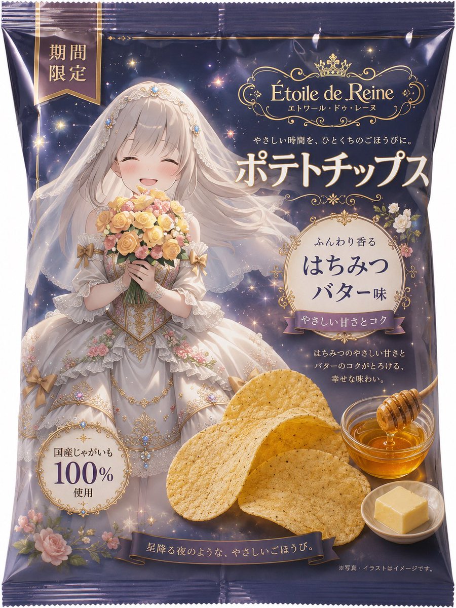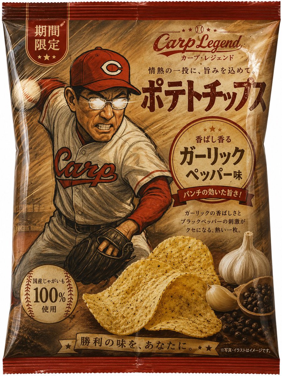
Royal Prince 薯片包装
一款高端日式薯片包装袋样机,特色包括白马王子角色插画、华丽的金色字体以及黄油清汤口味品牌设计。
- Category
- Charts & Infographics
- Model
- GPT Image 2
- Creator
- アシタ🩵
- Source language
- en
- Source ID
- 21222
- Published
- May 13, 2026
Full prompt
Goal: Create a premium Japanese potato chips package design based on an illustration-world concept, turning a royal character into a colorful snack bag advertisement.

Canvas: Front-facing vertical product package mockup, 3:4 aspect ratio, isolated on a clean white background. The bag should look like glossy crinkled plastic with sealed ridged edges at the top and bottom, subtle folds, highlights, shadows, and slight perspective bulging like a real snack bag.

Package design: Use an elegant white, burgundy, and metallic gold color palette. The top and bottom bands are deep burgundy with gold trim lines; the main center area is pale white/cream with a faint palace or marble-column background. Add ornate gold flourishes, crown motifs, and premium European royal styling.

Brand and main text: At the top center place a gold crown logo and the brand name {argument name="brand name" default="Reggbis"} with small Japanese reading beneath it. In the top-left corner add a vertical burgundy ribbon badge reading 「期間限定」. Across the upper center, add small copy reading 「白の王子様と味わう贅沢なひととき」. The largest central product name should read 「ポテトチップス」 in bold metallic-gold Japanese lettering. On the right, inside an ornate gold frame with a crown, write 「白の王子様の 焦がしバター コンソメ味」. Beneath it add smaller copy: 「芳醇なコクとバターの余韻が広がる、贅沢な味わい。」

Main subject: Show one elegant white prince character occupying the left and center of the package art. The prince has long pale-blond hair and wears a white military-style royal uniform with gold embroidery, epaulettes, decorative buttons, a high collar, lace cuffs, and a red cape draped over one shoulder. Pose him confidently with one hand on his hip and the other hand raised near his head. The face is intentionally covered by a plain rectangular censor-like beige blur, preserving the package aesthetic. Use {argument name="character theme" default="white prince"} as the core character concept.

Food elements: Show exactly 4 food items in the lower-right foreground: 2 golden potato chips, 1 small round bowl of glossy brown consommé sauce, and 1 pat of butter melting on a yellow puddle. Chips should look crisp, lightly speckled, and appetizing, overlapping the lower part of the character and package.

Badges and footer: Add one diamond-shaped burgundy-and-gold badge at the lower left reading 「国産じゃがいも 100% 使用」 with a small crown. Along the bottom burgundy band write “Premium Potato Chips” in elegant gold cursive. Add tiny Japanese disclaimer text at the bottom right, similar to product-package fine print.

Visual style: Realistic commercial snack packaging mockup mixed with polished anime/cosplay illustration art, high-detail glossy plastic, luxury Japanese limited-edition product design, warm gold lighting, sharp typography, premium supermarket snack aesthetic.

Constraints: Keep the design as a single potato chip bag only, no hands holding it, no extra products, no background scene outside the package, and make all Japanese text legible and positioned like authentic Japanese snack packaging.
Translations
Royal Prince 薯片包装
enGoal: Create a premium Japanese potato chips package design based on an illustration-world concept, turning a royal character into a colorful snack bag advertisement. Canvas: Front-facing vertical product package mockup, 3:4 aspect ratio, isolated on a clean white background. The bag should look like glossy crinkled plastic with sealed ridged edges at the top and bottom, subtle folds, highlights, shadows, and slight perspective bulging like a real snack bag. Package design: Use an elegant white, burgundy, and metallic gold color palette. The top and bottom bands are deep burgundy with gold trim lines; the main center area is pale white/cream with a faint palace or marble-column background. Add ornate gold flourishes, crown motifs, and premium European royal styling. Brand and main text: At the top center place a gold crown logo and the brand name {argument name="brand name" default="Reggbis"} with small Japanese reading beneath it. In the top-left corner add a vertical burgundy ribbon badge reading 「期間限定」. Across the upper center, add small copy reading 「白の王子様と味わう贅沢なひととき」. The largest central product name should read 「ポテトチップス」 in bold metallic-gold Japanese lettering. On the right, inside an ornate gold frame with a crown, write 「白の王子様の 焦がしバター コンソメ味」. Beneath it add smaller copy: 「芳醇なコクとバターの余韻が広がる、贅沢な味わい。」 Main subject: Show one elegant white prince character occupying the left and center of the package art. The prince has long pale-blond hair and wears a white military-style royal uniform with gold embroidery, epaulettes, decorative buttons, a high collar, lace cuffs, and a red cape draped over one shoulder. Pose him confidently with one hand on his hip and the other hand raised near his head. The face is intentionally covered by a plain rectangular censor-like beige blur, preserving the package aesthetic. Use {argument name="character theme" default="white prince"} as the core character concept. Food elements: Show exactly 4 food items in the lower-right foreground: 2 golden potato chips, 1 small round bowl of glossy brown consommé sauce, and 1 pat of butter melting on a yellow puddle. Chips should look crisp, lightly speckled, and appetizing, overlapping the lower part of the character and package. Badges and footer: Add one diamond-shaped burgundy-and-gold badge at the lower left reading 「国産じゃがいも 100% 使用」 with a small crown. Along the bottom burgundy band write “Premium Potato Chips” in elegant gold cursive. Add tiny Japanese disclaimer text at the bottom right, similar to product-package fine print. Visual style: Realistic commercial snack packaging mockup mixed with polished anime/cosplay illustration art, high-detail glossy plastic, luxury Japanese limited-edition product design, warm gold lighting, sharp typography, premium supermarket snack aesthetic. Constraints: Keep the design as a single potato chip bag only, no hands holding it, no extra products, no background scene outside the package, and make all Japanese text legible and positioned like authentic Japanese snack packaging.
Royal Prince 薯片包装
zh-CN目标:基于插画世界观创作一款高端日式薯片包装设计,将皇室角色转化为色彩鲜艳的零食袋广告。 画布:正面垂直产品包装样机,3:4 比例,置于干净的白色背景上。包装袋应呈现出带有光泽的褶皱塑料质感,顶部和底部有密封的脊状边缘,并带有细微的折痕、高光、阴影以及像真实零食袋一样的轻微膨胀感。 包装设计:采用优雅的白色、酒红色和金属金色调。顶部和底部色带为深酒红色,配有金色装饰线条;中心区域为淡白色/奶油色,背景带有淡淡的宫殿或大理石柱纹理。加入华丽的金色花纹、皇冠图案以及高端欧式皇室风格。 品牌与主文字:在顶部中心放置一个金色皇冠标志和品牌名称 {argument name="brand name" default="Reggbis"},下方配有小型日文读音。在左上角添加一个垂直的酒红色丝带徽章,写着「期間限定」。在上方中心处,添加一行小字「白の王子様と味わう贅沢なひととき」。中央最大的产品名称应为粗体金属金色日文字体「ポテトチップス」。在右侧,一个带有皇冠的华丽金色边框内,写上「白の王子様の 焦がしバター コンソメ味」。下方添加较小的文案:「芳醇なコクとバターの余韻が広がる、贅沢な味わい。」 主体:展示一位优雅的白马王子角色,占据包装艺术的左侧和中心。王子留着长长的浅金色头发,身穿带有金色刺绣、肩章、装饰纽扣、高领、蕾丝袖口的白色军装风格皇室制服,肩上披着红色斗篷。他自信地摆出姿势,一只手叉腰,另一只手举在头部附近。面部特意用一个简单的矩形米色模糊块遮挡,以保持包装的整体美感。使用 {argument name="character theme" default="white prince"} 作为核心角色概念。 食物元素:在右下角前景展示 4 种食物元素:2 片金黄色的薯片、1 个盛有光泽棕色清汤酱的小圆碗,以及 1 块融化在黄色油渍上的黄油。薯片应看起来酥脆、带有轻微斑点且诱人,覆盖在角色和包装的下部。 徽章与页脚:在左下角添加一个菱形的酒红色与金色徽章,写着「国産じゃがいも 100% 使用」,并配有一个小皇冠。沿底部酒红色带用优雅的金色草书写上“Premium Potato Chips”。在右下角添加细小的日文免责声明文本,类似于产品包装上的小字说明。 视觉风格:写实的商业零食包装样机,融合精致的动漫/Cosplay 插画艺术,高细节光泽塑料质感,高端日式限量版产品设计,温暖的金色灯光,清晰的排版,高端超市零食美学。 限制:设计仅限单个薯片包装袋,不要有人手持拿,不要有额外产品,包装外不要有背景场景,确保所有日文文本清晰易读,并像地道的日式零食包装一样进行排版。