手绘风 Yuru-kyara T 恤样机
一份高度详细的提示词,用于创建具有手绘、摇晃铅笔质感的 T 恤产品样机。包含关于 Logo 位置、对话气泡以及 Yuru-kyara 风格角色简化的说明。
- Category
- Charts & Infographics
- Model
- GPT Image 2
- Creator
- 輪廻タヲ ☯ AI Artist
- Source language
- en
- Source ID
- 22145
- Published
- May 23, 2026
Full prompt
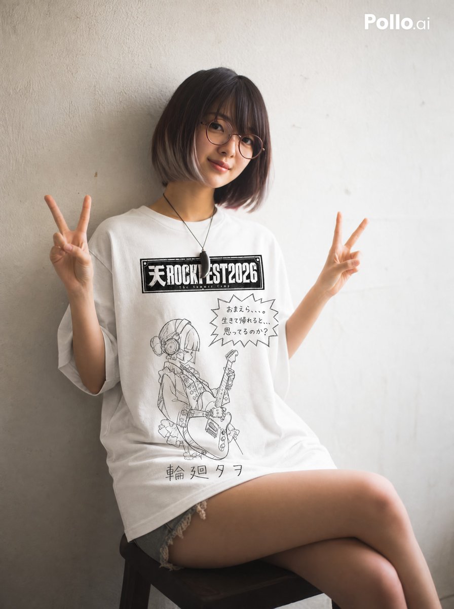
Create a white t-shirt product mockup (flat lay, front view, plain white background).

The t-shirt design uses black line art only. No color fill. No shading. White shirt throughout.

Illustration style: hand-drawn with a soft pencil or crayon. Lines are slightly wobbly and uneven, with inconsistent pressure — some strokes faint, some darker. Outlines do not always close perfectly. The overall impression is a casual, childlike sketch — imperfect but charming. Minimal detail. No clean vector lines. No digital precision.

The t-shirt has four printed zones:

TOP CENTER: Reproduce the festival logo from the first attached image exactly as-is — do not alter the font, layout, or graphic style in any way. Place it prominently at the top center of the shirt. Make it large enough to read clearly. Do NOT apply the hand-drawn or yuru-kyara style to this logo.

TOP RIGHT: A hand-drawn jagged speech bubble (spiky, explosive edges — like a shouting manga effect), slightly smaller than the character illustration. Inside the bubble, write "{argument name="dialogue" default="【ここにセリフを入力】"}" in clumsy, uneven hand-lettered characters. The bubble and text should feel comic and energetic.

MIDDLE: Redraw the character from the attached image in a loose, casual, yuru-kyara style — simplified, childlike, charmingly imperfect. Use the attached image as the sole reference for pose, expression, and content. Draw the character smaller — occupying no more than 40% of the shirt's height. Leave generous white space around the figure. The speech bubble may overlap with the top portion of the character illustration. Do not shrink the character to avoid overlap.

BOTTOM: The artist name "{argument name="artist name" default="【ここにアーティスト名を入力】"}" hand-lettered in uneven, shaky characters — as if written slowly and clumsily by hand with a pencil.

Keep all elements well-spaced and balanced. Clean, minimal, no background decoration.
Translations
手绘风 Yuru-kyara T 恤样机
enCreate a white t-shirt product mockup (flat lay, front view, plain white background). The t-shirt design uses black line art only. No color fill. No shading. White shirt throughout. Illustration style: hand-drawn with a soft pencil or crayon. Lines are slightly wobbly and uneven, with inconsistent pressure — some strokes faint, some darker. Outlines do not always close perfectly. The overall impression is a casual, childlike sketch — imperfect but charming. Minimal detail. No clean vector lines. No digital precision. The t-shirt has four printed zones: TOP CENTER: Reproduce the festival logo from the first attached image exactly as-is — do not alter the font, layout, or graphic style in any way. Place it prominently at the top center of the shirt. Make it large enough to read clearly. Do NOT apply the hand-drawn or yuru-kyara style to this logo. TOP RIGHT: A hand-drawn jagged speech bubble (spiky, explosive edges — like a shouting manga effect), slightly smaller than the character illustration. Inside the bubble, write "{argument name="dialogue" default="【ここにセリフを入力】"}" in clumsy, uneven hand-lettered characters. The bubble and text should feel comic and energetic. MIDDLE: Redraw the character from the attached image in a loose, casual, yuru-kyara style — simplified, childlike, charmingly imperfect. Use the attached image as the sole reference for pose, expression, and content. Draw the character smaller — occupying no more than 40% of the shirt's height. Leave generous white space around the figure. The speech bubble may overlap with the top portion of the character illustration. Do not shrink the character to avoid overlap. BOTTOM: The artist name "{argument name="artist name" default="【ここにアーティスト名を入力】"}" hand-lettered in uneven, shaky characters — as if written slowly and clumsily by hand with a pencil. Keep all elements well-spaced and balanced. Clean, minimal, no background decoration.
手绘风 Yuru-kyara T 恤样机
zh-CN创建一个白色 T 恤产品样机(平铺,正面视角,纯白背景)。 T 恤设计仅使用黑色线条艺术。无颜色填充。无阴影。整体为白色 T 恤。 插画风格:使用软铅笔或蜡笔手绘。线条略显摇晃且不均匀,笔触力度不一——有些笔画较淡,有些较深。轮廓并不总是完美闭合。整体观感为随性、稚拙的素描——不完美但充满魅力。细节极简。没有干净的矢量线条。没有数字化的精确感。 T 恤上有四个印刷区域: 顶部中心:完全按照第一张附件图片中的节日 Logo 进行复刻——不得以任何方式更改字体、布局或图形样式。将其醒目地放置在 T 恤的顶部中心。确保其足够大,以便清晰阅读。请勿将手绘或 Yuru-kyara 风格应用于此 Logo。 右上角:一个手绘的锯齿状对话气泡(尖锐、爆炸式的边缘——类似于漫画中的呐喊效果),比角色插画略小。在气泡内,用笨拙、不均匀的手写字体写上 "{argument name="dialogue" default="[在此处插入对话]"}"。气泡和文字应具有漫画感和活力。 中间:将附件图片中的角色重新绘制为随性、休闲的 Yuru-kyara 风格——简化、稚拙、带有迷人的不完美感。仅以附件图片作为姿势、表情和内容的参考。将角色画得小一些——占据 T 恤高度不超过 40%。在人物周围留出充足的留白。对话气泡可以与角色插画的顶部重叠。不要为了避免重叠而缩小角色。 底部:艺术家姓名 "{argument name="artist name" default="[在此处插入艺术家姓名]"}",用不均匀、颤抖的字符手写——就像是用铅笔缓慢而笨拙地手写出来的一样。 保持所有元素间距合理且平衡。简洁、极简,无背景装饰。