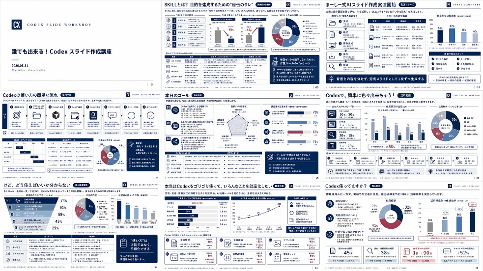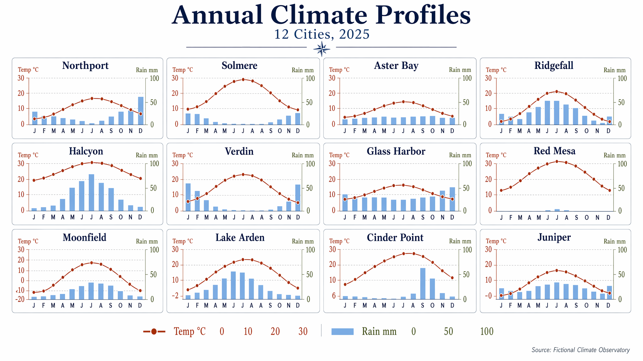
AI 生成的项目报告 Slides
一张精致的日式企业演示 Slides,以简洁的咨询风格布局展示了 12 个由 AI 创建的执行报告缩略图。
- Category
- Charts & Infographics
- Model
- GPT Image 2
- Creator
- 三浦慶介 | 『AI時代に仕事と呼べるもの』発売中
- Source language
- en
- Source ID
- 21757
- Published
- May 20, 2026
Full prompt
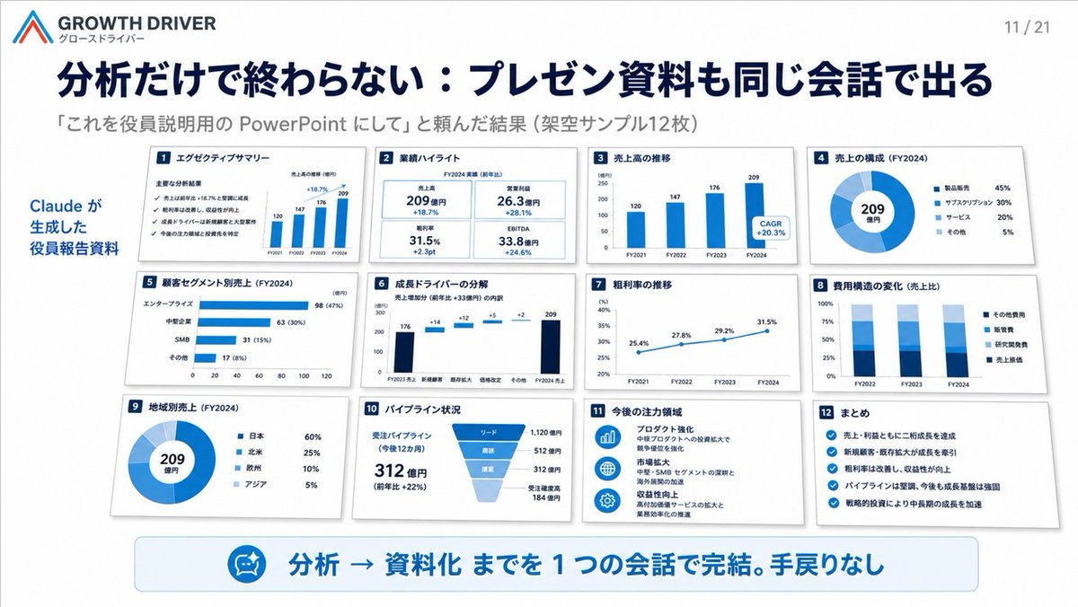
Goal: Create a clean Japanese corporate presentation slide for {argument name="company name" default="GROWTH DRIVER"}, showing that an AI tool can convert analysis into board/executive PowerPoint materials in one conversation.

Canvas: 16:9 widescreen slide, white background, polished consulting-deck style with navy and bright blue accents, subtle shadows, precise grid alignment, crisp vector charts, realistic miniature slide thumbnails.

Header: Top left contains a simple angular red-and-blue logo mark, the brand text “GROWTH DRIVER” and small Japanese subtitle “グロースドライバー”. Top right shows page number “11 / 21”. Large bold navy Japanese headline: {argument name="headline text" default="分析だけで終わらない:プレゼン資料も同じ会話で出る"}. Under it, smaller gray subheading: {argument name="subheading text" default="「これを役員説明用の PowerPoint にして」と頼んだ結果(架空サンプル12枚)"}.

Layout: Left side has a vertical blue annotation reading “Claude が生成した 役員報告資料”. The main area contains exactly 12 small white slide cards arranged in a 4-column by 3-row grid, each with a small navy numbered square in the top-left corner, a Japanese title, chart content, and light gray drop shadow. Use consistent blue chart styling and dense but readable board-report visuals.

The 12 slide cards, counted and labeled exactly:
1. “エグゼクティブサマリー” — checklist-style executive summary with four checkmarks and a tiny bar chart showing FY2021–FY2024 values 120, 147, 176, 209.
2. “業績ハイライト” — four KPI tiles: 売上高 209億円 +18.7%, 営業利益 26.3億円 +28.1%, 粗利率 31.5% +2.3pt, EBITDA 33.8億円 +24.6%.
3. “売上高の推移” — blue vertical bar chart FY2021 120, FY2022 147, FY2023 176, FY2024 209, with a callout “CAGR +20.3%”.
4. “売上の構成(FY2024)” — donut chart with center “209 億円” and legend: 製品販売 45%, サブスクリプション 30%, サービス 20%, その他 5%.
5. “顧客セグメント別売上(FY2024)” — horizontal bar chart: エンタープライズ 98 (47%), 中堅企業 63 (30%), SMB 31 (15%), その他 17 (8%).
6. “成長ドライバーの分解” — waterfall chart from FY2023売上 176 through increments +14, +12, +5, +2 to FY2024売上 209.
7. “粗利率の推移” — line chart from FY2021 25.4%, FY2022 27.8%, FY2023 29.2%, FY2024 31.5%.
8. “費用構造の変化(売上比)” — stacked column chart for FY2022, FY2023, FY2024 with legend: その他費用, 販管費, 研究開発費, 売上原価.
9. “地域別売上(FY2024)” — donut chart with center “209 億円” and legend: 日本 60%, 北米 25%, 欧州 10%, アジア 5%.
10. “パイプライン状況” — funnel chart plus text: 受注パイプライン(今後12カ月)312億円(前年比 +22%), stages リード 1,120億円, 商談 512億円, 提案 312億円, 受注確度高 184億円.
11. “今後の注力領域” — three blue circular icons with short Japanese strategy notes: プロダクト強化, 市場拡大, 収益性向上.
12. “まとめ” — checklist with five blue check icons summarizing growth, new customers, margin improvement, strong pipeline, and strategic investment.

Bottom callout: A wide rounded pale-blue banner spans the lower slide. On the left of the banner is a small circular blue icon resembling an AI assistant/robot face. Large bold blue Japanese text reads: {argument name="bottom message" default="分析 → 資料化 までを 1 つの会話で完結。手戻りなし"}.

Visual style: Executive SaaS/consulting presentation aesthetic, minimal, high information density, strong hierarchy, navy typography, white cards, blue charts, subtle gray borders and shadows. Keep all 12 cards visible and evenly spaced. No people, no photos, no decorative clutter, no watermark.
Translations
AI 生成的项目报告 Slides
enGoal: Create a clean Japanese corporate presentation slide for {argument name="company name" default="GROWTH DRIVER"}, showing that an AI tool can convert analysis into board/executive PowerPoint materials in one conversation. Canvas: 16:9 widescreen slide, white background, polished consulting-deck style with navy and bright blue accents, subtle shadows, precise grid alignment, crisp vector charts, realistic miniature slide thumbnails. Header: Top left contains a simple angular red-and-blue logo mark, the brand text “GROWTH DRIVER” and small Japanese subtitle “グロースドライバー”. Top right shows page number “11 / 21”. Large bold navy Japanese headline: {argument name="headline text" default="分析だけで終わらない:プレゼン資料も同じ会話で出る"}. Under it, smaller gray subheading: {argument name="subheading text" default="「これを役員説明用の PowerPoint にして」と頼んだ結果(架空サンプル12枚)"}. Layout: Left side has a vertical blue annotation reading “Claude が生成した 役員報告資料”. The main area contains exactly 12 small white slide cards arranged in a 4-column by 3-row grid, each with a small navy numbered square in the top-left corner, a Japanese title, chart content, and light gray drop shadow. Use consistent blue chart styling and dense but readable board-report visuals. The 12 slide cards, counted and labeled exactly: 1. “エグゼクティブサマリー” — checklist-style executive summary with four checkmarks and a tiny bar chart showing FY2021–FY2024 values 120, 147, 176, 209. 2. “業績ハイライト” — four KPI tiles: 売上高 209億円 +18.7%, 営業利益 26.3億円 +28.1%, 粗利率 31.5% +2.3pt, EBITDA 33.8億円 +24.6%. 3. “売上高の推移” — blue vertical bar chart FY2021 120, FY2022 147, FY2023 176, FY2024 209, with a callout “CAGR +20.3%”. 4. “売上の構成(FY2024)” — donut chart with center “209 億円” and legend: 製品販売 45%, サブスクリプション 30%, サービス 20%, その他 5%. 5. “顧客セグメント別売上(FY2024)” — horizontal bar chart: エンタープライズ 98 (47%), 中堅企業 63 (30%), SMB 31 (15%), その他 17 (8%). 6. “成長ドライバーの分解” — waterfall chart from FY2023売上 176 through increments +14, +12, +5, +2 to FY2024売上 209. 7. “粗利率の推移” — line chart from FY2021 25.4%, FY2022 27.8%, FY2023 29.2%, FY2024 31.5%. 8. “費用構造の変化(売上比)” — stacked column chart for FY2022, FY2023, FY2024 with legend: その他費用, 販管費, 研究開発費, 売上原価. 9. “地域別売上(FY2024)” — donut chart with center “209 億円” and legend: 日本 60%, 北米 25%, 欧州 10%, アジア 5%. 10. “パイプライン状況” — funnel chart plus text: 受注パイプライン(今後12カ月)312億円(前年比 +22%), stages リード 1,120億円, 商談 512億円, 提案 312億円, 受注確度高 184億円. 11. “今後の注力領域” — three blue circular icons with short Japanese strategy notes: プロダクト強化, 市場拡大, 収益性向上. 12. “まとめ” — checklist with five blue check icons summarizing growth, new customers, margin improvement, strong pipeline, and strategic investment. Bottom callout: A wide rounded pale-blue banner spans the lower slide. On the left of the banner is a small circular blue icon resembling an AI assistant/robot face. Large bold blue Japanese text reads: {argument name="bottom message" default="分析 → 資料化 までを 1 つの会話で完結。手戻りなし"}. Visual style: Executive SaaS/consulting presentation aesthetic, minimal, high information density, strong hierarchy, navy typography, white cards, blue charts, subtle gray borders and shadows. Keep all 12 cards visible and evenly spaced. No people, no photos, no decorative clutter, no watermark.
AI 生成的项目报告 Slides
zh-CN目标:为 {argument name="company name" default="GROWTH DRIVER"} 创建一张简洁的日式企业演示 Slides,展示 AI 工具如何通过一次对话将分析结果转化为项目/执行层 PowerPoint 材料。 画布:16:9 宽屏 Slides,白色背景,精致的咨询风格,配有海军蓝和亮蓝色点缀,带有柔和阴影、精确的网格对齐、清晰的矢量图表以及逼真的微缩 Slides 缩略图。 页眉:左上角包含一个简单的红蓝角标 Logo,品牌文字“GROWTH DRIVER”及小型日文副标题“グロースドライバー”。右上角显示页码“11 / 21”。左侧为醒目的海军蓝日文大标题:{argument name="headline text" default="分析だけで終わらない:プレゼン資料も同じ会話で出る"}。下方为较小的灰色副标题:{argument name="subheading text" default="「これを役員説明用の PowerPoint にして」と頼んだ結果(架空サンプル12枚)"}。 布局:左侧有一条蓝色竖向标注,写着“Claude が生成した 役員報告資料”。主要区域包含 12 张排列整齐的白色 Slides 卡片(4 列 3 行),每张卡片的左上角都有一个海军蓝色的数字方块、日文标题、图表内容及浅灰色投影。使用统一的蓝色图表样式,呈现密集但易读的项目报告视觉效果。 12 张 Slides 卡片,精确计数并标注如下: 1. “エグゼクティブサマリー” — 清单式执行摘要,包含四个勾选标记,以及一个显示 FY2021–FY2024 数值(120, 147, 176, 209)的小型柱状图。 2. “業績ハイライト” — 四个 KPI 磁贴:売上高 209 億円 +18.7%, 営業利益 26.3 億円 +28.1%, 粗利率 31.5% +2.3pt, EBITDA 33.8 億円 +24.6%。 3. “売上高の推移” — 蓝色垂直柱状图,FY2021 120, FY2022 147, FY2023 176, FY2024 209,并附有标注“CAGR +20.3%”。 4. “売上の構成(FY2024)” — 环形图,中心显示“209 億円”,图例:製品販売 45%, サブスクリプション 30%, サービス 20%, その他 5%。 5. “顧客セグメント別売上(FY2024)” — 水平柱状图:エンタープライズ 98 (47%), 中堅企業 63 (30%), SMB 31 (15%), その他 17 (8%)。 6. “成長ドライバーの分解” — 瀑布图,从 FY2023 売上 176 经过 +14, +12, +5, +2 的增量,达到 FY2024 売上 209。 7. “粗利率の推移” — 折线图,从 FY2021 25.4%, FY2022 27.8%, FY2023 29.2%, FY2024 31.5%。 8. “費用構造の変化(売上比)” — FY2022, FY2023, FY2024 的堆叠柱状图,图例:その他費用, 販管費, 研究開発費, 売上原価。 9. “地域別売上(FY2024)” — 环形图,中心显示“209 億円”,图例:日本 60%, 北米 25%, 欧州 10%, アジア 5%。 10. “パイプライン状況” — 漏斗图及文字:受注パイプライン(今後12カ月)312 億円(前年比 +22%),阶段包括:リード 1,120 億円, 商談 512 億円, 提案 312 億円, 受注確度高 184 億円。 11. “今後の注力領域” — 三个蓝色圆形图标,配有简短的日文战略说明:プロダクト強化, 市場拡大, 収益性向上。 12. “まとめ” — 带有五个蓝色勾选图标的清单,总结了增长、新客户、利润率提升、强劲的管道及战略投资。 底部标注:一个宽大的圆角浅蓝色横幅横跨 Slides 底部。横幅左侧是一个类似 AI Agent/机器人脸部的小型圆形蓝色图标。醒目的蓝色日文大字写着:{argument name="bottom message" default="分析 → 資料化 までを 1 つの会話で完結。手戻りなし"}。 视觉风格:执行级 SaaS/咨询演示美学,极简,高信息密度,强层级感,海军蓝排版,白色卡片,蓝色图表,细微的灰色边框和阴影。保持所有 12 张卡片可见且间距均匀。无人物,无照片,无装饰性杂乱元素,无水印。