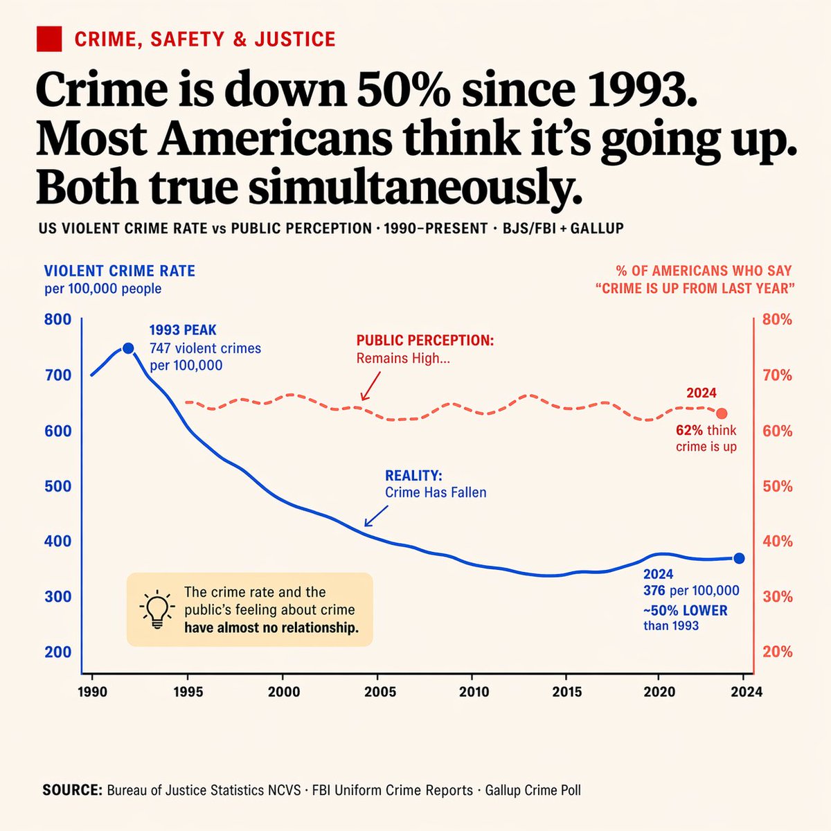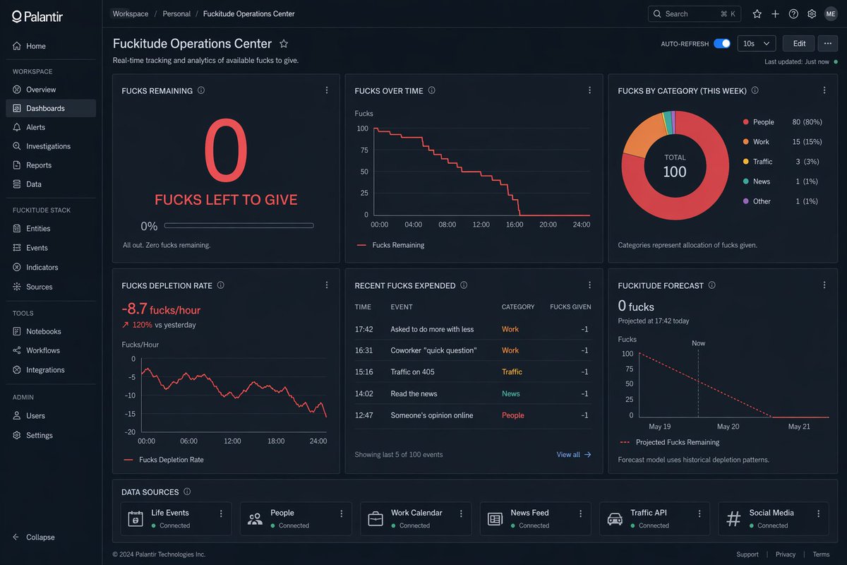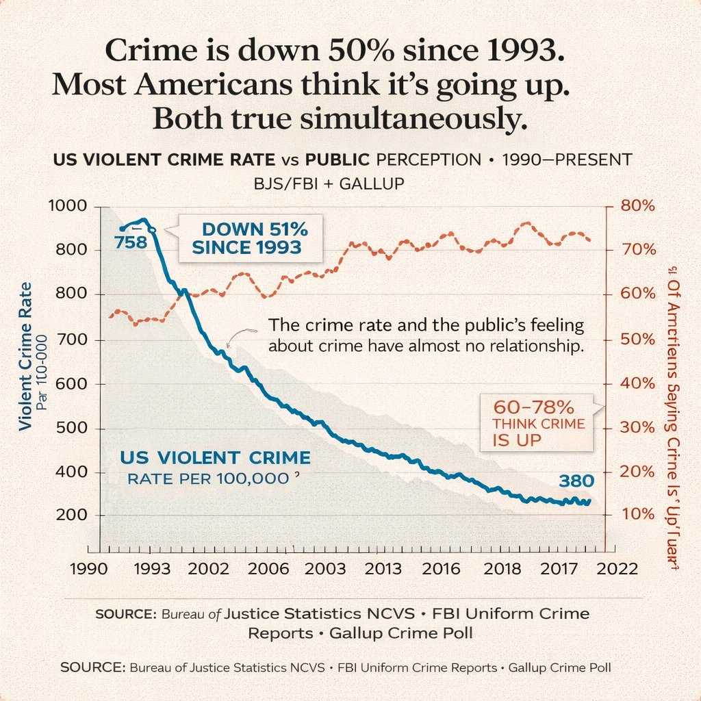
社论式双轴折线图信息图
生成一种报纸风格的数据可视化图表,通过注释和双轴对比展示两种截然不同的趋势随时间的变化。
- Category
- Charts & Infographics
- Model
- GPT Image 2
- Creator
- Aditya Panchal
- Source language
- en
- Source ID
- 13656
- Published
- Apr 15, 2026
Full prompt
{
  "type": "dual-axis line chart infographic",
  "style": "editorial data visualization, matte paper texture background, clean journalistic design",
  "typography": {
    "headline": "serif font, bold, centered",
    "labels": "sans-serif, clean, uppercase and sentence case mix"
  },
  "layout": {
    "header": {
      "main_title": "{argument name=\"main headline\" default=\"Crime is down 50% since 1993. Most Americans think it's going up. Both true simultaneously.\"}",
      "subtitle": "US VIOLENT CRIME RATE vs PUBLIC PERCEPTION • 1990–PRESENT BJS/FBI + GALLUP"
    },
    "chart_area": {
      "background": "light beige with faint horizontal grid lines",
      "axes": {
        "x_axis": {
          "label": "Years",
          "ticks": ["1990", "1993", "2002", "2006", "2003", "2013", "2016", "2018", "2017", "2022"]
        },
        "y_axis_left": {
          "label": "{argument name=\"left axis label\" default=\"Violent Crime Rate Par 100-000\"}",
          "scale": ["200", "400", "500", "600", "700", "800", "800", "1000"],
          "color": "black"
        },
        "y_axis_right": {
          "label": "{argument name=\"right axis label\" default=\"% Of Americans Saying Crime Is 'Up'\"}",
          "scale": ["10%", "20%", "30%", "40%", "50%", "60%", "70%", "80%"],
          "color": "dark red"
        }
      },
      "data_series": [
        {
          "name": "Violent Crime Rate",
          "style": "thick solid blue line with light grey shading underneath",
          "trend": "starts high, drops sharply, then steadily declines",
          "data_labels": ["758", "380"]
        },
        {
          "name": "Public Perception",
          "style": "dashed dark red/orange line with small circle markers",
          "trend": "fluctuates but generally trends upwards, staying high"
        }
      ],
      "annotations": [
        {
          "text": "{argument name=\"blue line annotation\" default=\"DOWN 51% SINCE 1993\"}",
          "style": "callout box with pointer, blue text",
          "position": "top left, pointing to the blue line drop"
        },
        {
          "text": "60-78% THINK CRIME IS UP",
          "style": "callout box with pointer, red text",
          "position": "mid right, pointing to the dashed red line"
        },
        {
          "text": "{argument name=\"center insight text\" default=\"The crime rate and the public's feeling about crime have almost no relationship.\"}",
          "style": "floating text with a small squiggly arrow",
          "position": "center, between the two lines"
        }
      ]
    },
    "footer": {
      "source_text": "SOURCE: Bureau of Justice Statistics NCVS • FBI Uniform Crime Reports • Gallup Crime Poll",
      "repetition": "text is repeated twice at the bottom"
    }
  }
}
Translations
社论式双轴折线图信息图
en{ "type": "dual-axis line chart infographic", "style": "editorial data visualization, matte paper texture background, clean journalistic design", "typography": { "headline": "serif font, bold, centered", "labels": "sans-serif, clean, uppercase and sentence case mix" }, "layout": { "header": { "main_title": "{argument name=\"main headline\" default=\"Crime is down 50% since 1993. Most Americans think it's going up. Both true simultaneously.\"}", "subtitle": "US VIOLENT CRIME RATE vs PUBLIC PERCEPTION • 1990–PRESENT BJS/FBI + GALLUP" }, "chart_area": { "background": "light beige with faint horizontal grid lines", "axes": { "x_axis": { "label": "Years", "ticks": ["1990", "1993", "2002", "2006", "2003", "2013", "2016", "2018", "2017", "2022"] }, "y_axis_left": { "label": "{argument name=\"left axis label\" default=\"Violent Crime Rate Par 100-000\"}", "scale": ["200", "400", "500", "600", "700", "800", "800", "1000"], "color": "black" }, "y_axis_right": { "label": "{argument name=\"right axis label\" default=\"% Of Americans Saying Crime Is 'Up'\"}", "scale": ["10%", "20%", "30%", "40%", "50%", "60%", "70%", "80%"], "color": "dark red" } }, "data_series": [ { "name": "Violent Crime Rate", "style": "thick solid blue line with light grey shading underneath", "trend": "starts high, drops sharply, then steadily declines", "data_labels": ["758", "380"] }, { "name": "Public Perception", "style": "dashed dark red/orange line with small circle markers", "trend": "fluctuates but generally trends upwards, staying high" } ], "annotations": [ { "text": "{argument name=\"blue line annotation\" default=\"DOWN 51% SINCE 1993\"}", "style": "callout box with pointer, blue text", "position": "top left, pointing to the blue line drop" }, { "text": "60-78% THINK CRIME IS UP", "style": "callout box with pointer, red text", "position": "mid right, pointing to the dashed red line" }, { "text": "{argument name=\"center insight text\" default=\"The crime rate and the public's feeling about crime have almost no relationship.\"}", "style": "floating text with a small squiggly arrow", "position": "center, between the two lines" } ] }, "footer": { "source_text": "SOURCE: Bureau of Justice Statistics NCVS • FBI Uniform Crime Reports • Gallup Crime Poll", "repetition": "text is repeated twice at the bottom" } } }
社论式双轴折线图信息图
zh-CN{ "type": "社论式数据可视化图表", "style": "报纸信息图风格,纹理米色背景,衬线字体标题,无衬线字体图表文本", "header": { "title": "{argument name=\"main title\" default=\"自 1993 年以来,犯罪率下降了 50%。大多数美国人却认为犯罪率在上升。两者同时为真。\"}", "subtitle": "美国暴力犯罪率 vs 公众认知 • 1990 年至今 BJS/FBI + GALLUP" }, "chart": { "type": "双轴折线图", "axes": { "x_axis": "1990 年至 2022 年的时间轴,带有刻度标记", "y_axis_left": { "label": "{argument name=\"left axis label\" default=\"每 10 万人暴力犯罪率\"}", "scale": "200 至 1000" }, "y_axis_right": { "label": "{argument name=\"right axis label\" default=\"认为犯罪率‘上升’的美国人百分比\"}", "scale": "10% 至 80%" } }, "data_series": [ { "description": "呈下降趋势的实心粗蓝线", "start_value": "758", "end_value": "380", "label": "每 10 万人美国暴力犯罪率" }, { "description": "水平波动的橙红色虚线", "range": "60% 至 80%" } ], "annotations": [ { "type": "标注框", "text": "自 1993 年以来下降 51%", "pointer": "指向蓝色线条峰值" }, { "type": "浮动文本", "text": "{argument name=\"central annotation\" default=\"犯罪率与公众对犯罪的感受几乎没有关联。\"}" }, { "type": "标注框", "text": "60-78% 的人认为犯罪率在上升", "pointer": "指向红色虚线" } ] }, "footer": { "text": "{argument name=\"footer source text\" default=\"来源:司法统计局 NCVS • FBI 统一犯罪报告 • 盖洛普犯罪民意调查\"}", "repetition": "文本在底部打印两次" } }