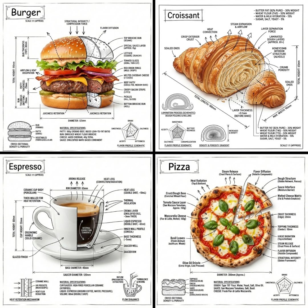
Microsoft 365 模型对比信息图
创建一个四象限 PowerPoint 风格的对比信息图,展示按图像生成模型标注的 Microsoft 365 生态系统图表。
- Category
- Charts & Infographics
- Model
- GPT Image 2
- Creator
- Ota Hirofumi 📖 Copilot 踏み込み活用術
- Source language
- en
- Source ID
- 20598
- Published
- May 15, 2026
Full prompt
Using the provided reference image as a rough inspiration for an official explanatory slide/infographic, create a clean comparison image showing the same Microsoft 365 ecosystem concept generated in four different model styles.
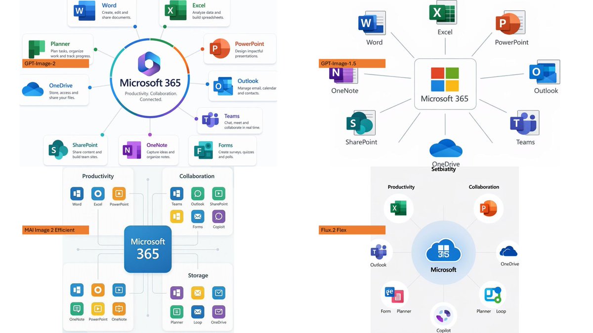
Canvas and layout: 16:9 white slide, divided into exactly 4 quadrants in a 2×2 grid with generous whitespace and no hard divider lines.
Subject: Each quadrant should show a Microsoft 365 hub-and-spoke or app ecosystem diagram centered on {argument name="main product name" default="Microsoft 365"}, with surrounding Microsoft app icons and short English labels.
Quadrants and visible orange model tags: Include exactly 4 orange labels, one per quadrant:
1. Top-left: {argument name="first model label" default="GPT-Image-2"} — polished circular Microsoft 365 hub diagram with multiple app cards around it.
2. Top-right: {argument name="second model label" default="GPT-Image-1.5"} — simpler radial hub diagram with icons around a central Microsoft 365 box.
3. Bottom-left: {argument name="third model label" default="MAI Image 2 Efficient"} — structured dashboard-like diagram with grouped sections such as Productivity, Collaboration, and Storage.
4. Bottom-right: {argument name="fourth model label" default="Flux.2 Flex"} — soft circular diagram with icons orbiting a central Microsoft cloud-style mark.
Apps to include across the diagrams: Word, Excel, PowerPoint, Outlook, Teams, OneDrive, SharePoint, OneNote, Planner, Forms, Loop, and Copilot where appropriate. Use recognizable Microsoft-style colored app icons, but keep everything as a generated infographic rather than a screenshot.
Style: Modern corporate PowerPoint infographic style, crisp readable English text, flat vector icons, subtle shadows, light gray connector lines, mostly white background, Microsoft blue/green/orange/purple palette. Keep the overall image clean and presentation-ready.Translations
Microsoft 365 模型对比信息图
enUsing the provided reference image as a rough inspiration for an official explanatory slide/infographic, create a clean comparison image showing the same Microsoft 365 ecosystem concept generated in four different model styles. Canvas and layout: 16:9 white slide, divided into exactly 4 quadrants in a 2×2 grid with generous whitespace and no hard divider lines. Subject: Each quadrant should show a Microsoft 365 hub-and-spoke or app ecosystem diagram centered on {argument name="main product name" default="Microsoft 365"}, with surrounding Microsoft app icons and short English labels. Quadrants and visible orange model tags: Include exactly 4 orange labels, one per quadrant: 1. Top-left: {argument name="first model label" default="GPT-Image-2"} — polished circular Microsoft 365 hub diagram with multiple app cards around it. 2. Top-right: {argument name="second model label" default="GPT-Image-1.5"} — simpler radial hub diagram with icons around a central Microsoft 365 box. 3. Bottom-left: {argument name="third model label" default="MAI Image 2 Efficient"} — structured dashboard-like diagram with grouped sections such as Productivity, Collaboration, and Storage. 4. Bottom-right: {argument name="fourth model label" default="Flux.2 Flex"} — soft circular diagram with icons orbiting a central Microsoft cloud-style mark. Apps to include across the diagrams: Word, Excel, PowerPoint, Outlook, Teams, OneDrive, SharePoint, OneNote, Planner, Forms, Loop, and Copilot where appropriate. Use recognizable Microsoft-style colored app icons, but keep everything as a generated infographic rather than a screenshot. Style: Modern corporate PowerPoint infographic style, crisp readable English text, flat vector icons, subtle shadows, light gray connector lines, mostly white background, Microsoft blue/green/orange/purple palette. Keep the overall image clean and presentation-ready.
Microsoft 365 模型对比信息图
zh-CN以提供的参考图像作为官方说明性 Slides/信息图的初步灵感,创建一个清晰的对比图像,展示在四种不同模型风格下生成的相同 Microsoft 365 生态系统概念。 画布与布局:16:9 白色 Slides,以 2×2 网格精确划分为 4 个象限,留有充足的留白,且无明显的分割线。 主题:每个象限应展示一个以 {argument name="main product name" default="Microsoft 365"} 为中心的 Microsoft 365 中心辐射型或应用生态系统图,周围环绕 Microsoft 应用图标及简短的英文标签。 象限与可见的橙色模型标签:包含 4 个橙色标签,每个象限一个: 1. 左上:{argument name="first model label" default="GPT-Image-2"} — 精致的圆形 Microsoft 365 中心图,周围环绕多个应用卡片。 2. 右上:{argument name="second model label" default="GPT-Image-1.5"} — 围绕中心 Microsoft 365 方框的简约放射状中心图。 3. 左下:{argument name="third model label" default="MAI Image 2 Efficient"} — 结构化的仪表盘式图表,包含生产力、协作和存储等分组板块。 4. 右下:{argument name="fourth model label" default="Flux.2 Flex"} — 柔和的圆形图表,图标围绕中心 Microsoft 云风格标志旋转。 图中包含的应用:Word、Excel、PowerPoint、Outlook、Teams、OneDrive、SharePoint、OneNote、Planner、Forms、Loop 以及适用的 Copilot。请使用可识别的 Microsoft 风格彩色应用图标,但保持整体为生成的图表,而非截图。 风格:现代企业级 PowerPoint 信息图风格,清晰易读的英文文本,扁平化矢量图标,细腻的阴影,浅灰色连接线,以白色为主的背景,采用 Microsoft 蓝/绿/橙/紫配色方案。保持整体图像整洁,并达到演示就绪状态。