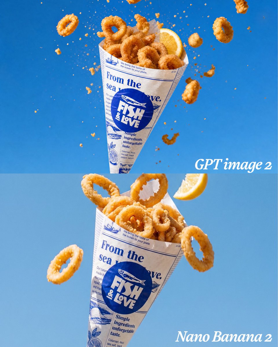
Calamari Cone 模型对比
一张分屏式食品广告图片,对比了两种在明亮蓝色摄影棚背景下呈现的酥脆鱿鱼圈纸筒效果。
- 分类
- 图表信息图
- 模型
- GPT Image 2
- 来源作者
- Klee Agency
- 原始语言
- en
- 来源 ID
- 21551
- 发布时间
- 2026年5月19日
完整提示词
目标:创建一张垂直对比图,将同一个诱人的炸鱿鱼圈纸筒以两个堆叠面板的形式呈现,类似于并排模型对比,但采用上下排列方式。

画布:1:1 正方形图片,768 x 768 构图风格,水平分割为 2 个完全相等的面板。使用干净明亮的 {argument name="background color" default="vivid ocean blue"} 摄影棚背景,并带有微妙的渐变效果;顶部面板颜色略深,底部面板颜色略浅。

布局:顶部面板包含一个悬浮的炸鱿鱼圈纸筒,位于中心偏左位置,直立倾斜,周围环绕着飞舞的碎屑和鱿鱼圈。底部面板包含同样的纸筒,但尺寸更大且更靠近镜头,位于中心偏左位置,配有少量飞舞的鱿鱼圈和一片柠檬。在顶部面板右下角附近添加一个白色的斜体衬线标签,文字为 {argument name="top label" default="GPT image 2"};在底部面板右下角添加另一个白色的斜体衬线标签,文字为 {argument name="bottom label" default="Nano Banana 2"}。

主体细节:食物为金黄酥脆的炸鱿鱼圈,表面有粗糙的脆皮,采用高速食品广告摄影风格。总共使用 2 片柠檬:1 片塞在顶部纸筒的右上角,1 片悬浮在底部面板的右上角附近。总共使用 34 个明显的鱿鱼圈:顶部面板 18 个,其中 10 个堆叠在纸筒内,8 个在周围飞舞;底部面板 16 个,其中 13 个堆叠在纸筒内,3 个在外部飞舞。添加许多细小的橙色面包屑颗粒和少量悬浮在空中的碎面糊,顶部纸筒周围尤为密集。

包装:每个纸筒均由印有蓝色油墨的米白色仿报纸纸张制成。纸筒上的主圆形徽标文字为 {argument name="brand logo text" default="FISH & LOVE"},上方有一个小鱼插图。包装纸上的大型蓝色报纸标题文字为 {argument name="wrapper headline" default="From the sea to love."}。包含较小的装饰性海鲜报纸细节、细蓝色标尺线、细小的填充文本列、简单的鱼和柠檬插图,以及包装上的短语“Simple ingredients, unforgettable taste.”。顶部纸筒略小,碎屑飞溅效果更具戏剧性;底部纸筒更大、更精致,包装上的文字更清晰。

视觉风格:超写实商业食品摄影,质感清晰,鱿鱼圈焦点锐利,高速定格动作,明亮的自然高光,饱和蓝色背景下的诱人暖橙金色食物,浅景深,干净的广告构图,无人像,无餐盘,无多余物品,无水印。
多语言版本
Calamari Cone 模型对比
enGoal: Create a vertical comparison image showing the same appetizing fried calamari cone rendered in two stacked panels, like a side-by-side model comparison but arranged top and bottom. Canvas: Square 1:1 image, 768 x 768 style composition, split horizontally into exactly 2 equal panels. Use a clean bright {argument name="background color" default="vivid ocean blue"} studio background with a subtle gradient; the top panel is slightly deeper blue and the bottom panel slightly lighter blue. Layout: Top panel contains one floating paper cone of fried calamari centered slightly left, tilted upright, surrounded by airborne crumbs and flying calamari rings. Bottom panel contains the same paper cone larger and closer to camera, centered slightly left, with a few flying rings and a lemon wedge. Add a white italic serif label reading {argument name="top label" default="GPT image 2"} near the lower-right of the top panel, and another white italic serif label reading {argument name="bottom label" default="Nano Banana 2"} in the lower-right corner of the bottom panel. Subject details: The food is golden crispy fried calamari rings with rough crunchy breading, photographed as high-speed food advertising. Use exactly 2 lemon wedges total: 1 tucked into the top cone at the upper right, and 1 floating near the upper-right of the bottom panel. Use exactly 34 prominent calamari rings total: in the top panel, 18 rings, with 10 piled inside the cone and 8 flying around it; in the bottom panel, 16 rings, with 13 piled inside the cone and 3 flying outside it. Add many tiny orange breadcrumb particles and a few broken batter fragments suspended in midair, especially dense around the top cone. Packaging: Each cone is made from off-white faux newspaper paper printed in blue ink. The main circular logo on the cone reads {argument name="brand logo text" default="FISH & LOVE"} with a small fish illustration above it. Large blue newspaper headline text on the wrapper reads {argument name="wrapper headline" default="From the sea to love."}. Include smaller decorative seafood-newspaper details, thin blue rule lines, tiny columns of filler text, simple fish and lemon illustrations, and the phrase "Simple ingredients, unforgettable taste." on the wrapper. The top cone is slightly smaller with more dramatic exploding crumbs; the bottom cone is larger, more polished, and has clearer wrapper text. Visual style: Ultra-realistic commercial food photography, crisp texture, sharp focus on calamari, high-speed freeze-frame motion, bright natural highlights, appetizing warm orange-gold food color against saturated blue, shallow depth of field, clean advertising composition, no people, no plates, no extra objects, no watermark.
Calamari Cone 模型对比
zh-CN目标:创建一张垂直对比图,将同一个诱人的炸鱿鱼圈纸筒以两个堆叠面板的形式呈现,类似于并排模型对比,但采用上下排列方式。 画布:1:1 正方形图片,768 x 768 构图风格,水平分割为 2 个完全相等的面板。使用干净明亮的 {argument name="background color" default="vivid ocean blue"} 摄影棚背景,并带有微妙的渐变效果;顶部面板颜色略深,底部面板颜色略浅。 布局:顶部面板包含一个悬浮的炸鱿鱼圈纸筒,位于中心偏左位置,直立倾斜,周围环绕着飞舞的碎屑和鱿鱼圈。底部面板包含同样的纸筒,但尺寸更大且更靠近镜头,位于中心偏左位置,配有少量飞舞的鱿鱼圈和一片柠檬。在顶部面板右下角附近添加一个白色的斜体衬线标签,文字为 {argument name="top label" default="GPT image 2"};在底部面板右下角添加另一个白色的斜体衬线标签,文字为 {argument name="bottom label" default="Nano Banana 2"}。 主体细节:食物为金黄酥脆的炸鱿鱼圈,表面有粗糙的脆皮,采用高速食品广告摄影风格。总共使用 2 片柠檬:1 片塞在顶部纸筒的右上角,1 片悬浮在底部面板的右上角附近。总共使用 34 个明显的鱿鱼圈:顶部面板 18 个,其中 10 个堆叠在纸筒内,8 个在周围飞舞;底部面板 16 个,其中 13 个堆叠在纸筒内,3 个在外部飞舞。添加许多细小的橙色面包屑颗粒和少量悬浮在空中的碎面糊,顶部纸筒周围尤为密集。 包装:每个纸筒均由印有蓝色油墨的米白色仿报纸纸张制成。纸筒上的主圆形徽标文字为 {argument name="brand logo text" default="FISH & LOVE"},上方有一个小鱼插图。包装纸上的大型蓝色报纸标题文字为 {argument name="wrapper headline" default="From the sea to love."}。包含较小的装饰性海鲜报纸细节、细蓝色标尺线、细小的填充文本列、简单的鱼和柠檬插图,以及包装上的短语“Simple ingredients, unforgettable taste.”。顶部纸筒略小,碎屑飞溅效果更具戏剧性;底部纸筒更大、更精致,包装上的文字更清晰。 视觉风格:超写实商业食品摄影,质感清晰,鱿鱼圈焦点锐利,高速定格动作,明亮的自然高光,饱和蓝色背景下的诱人暖橙金色食物,浅景深,干净的广告构图,无人像,无餐盘,无多余物品,无水印。