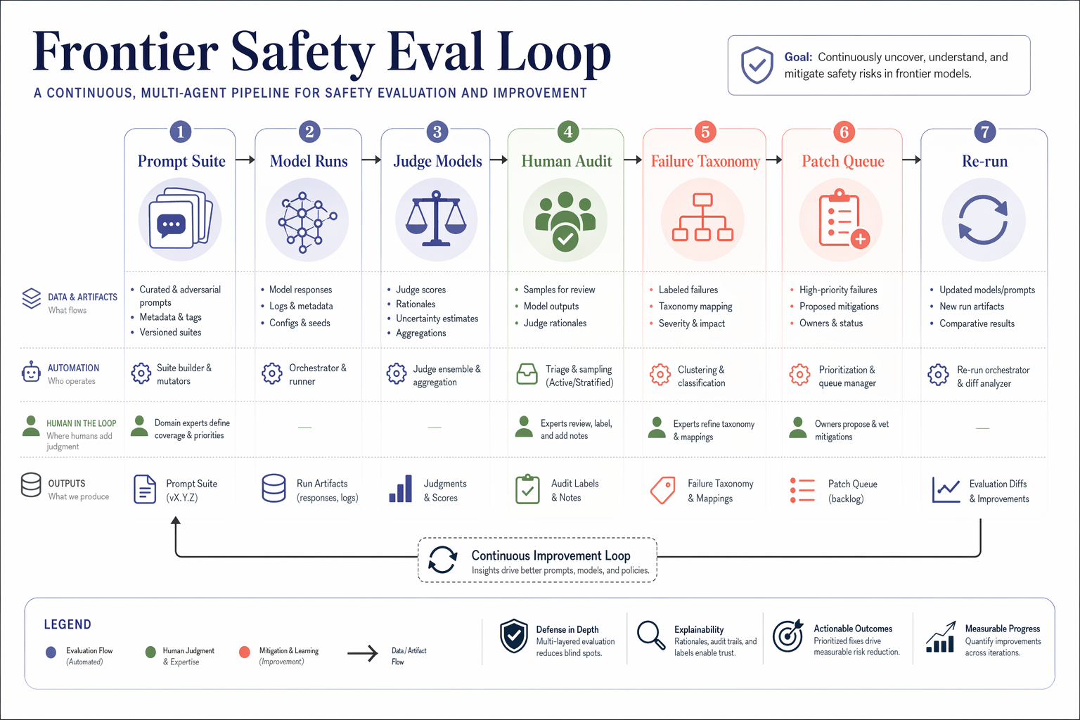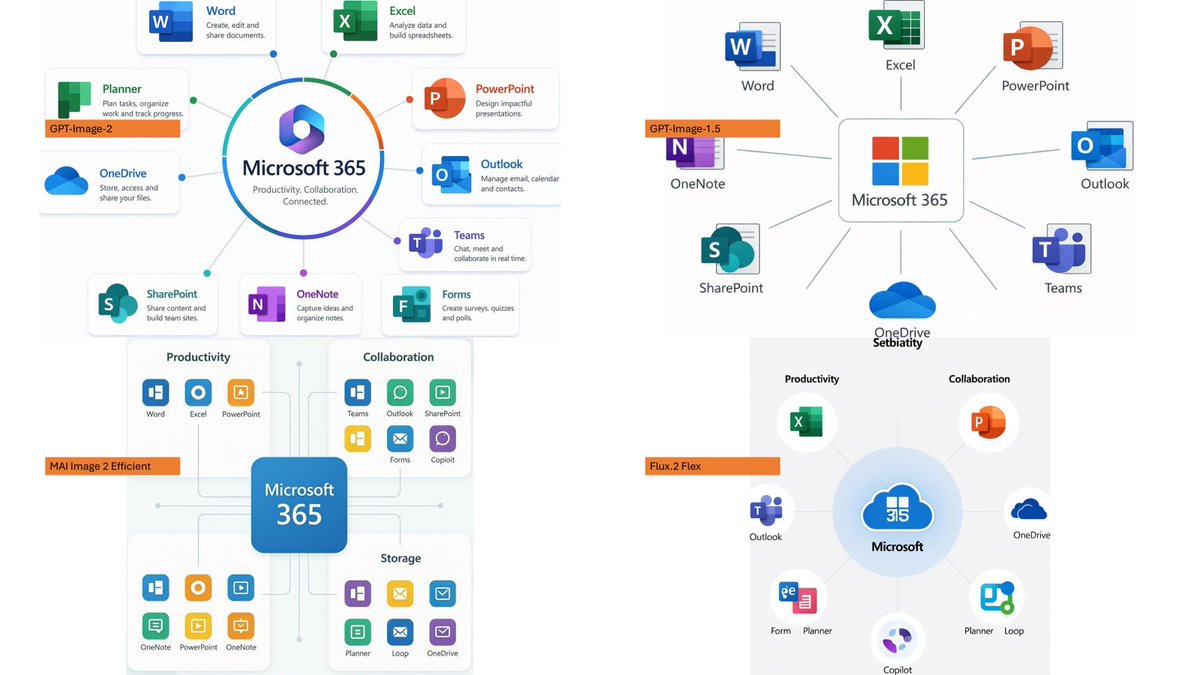
Microsoft 365 模型对比信息图
生成一张四格对比 Slides,展示不同图像模型渲染 Microsoft 365 生态系统信息图的效果。
- Category
- Charts & Infographics
- Model
- GPT Image 2
- Creator
- そうい|AI活用術 × 明日から使えるPowerBI分析
- Source language
- en
- Source ID
- 20617
- Published
- May 15, 2026
Full prompt
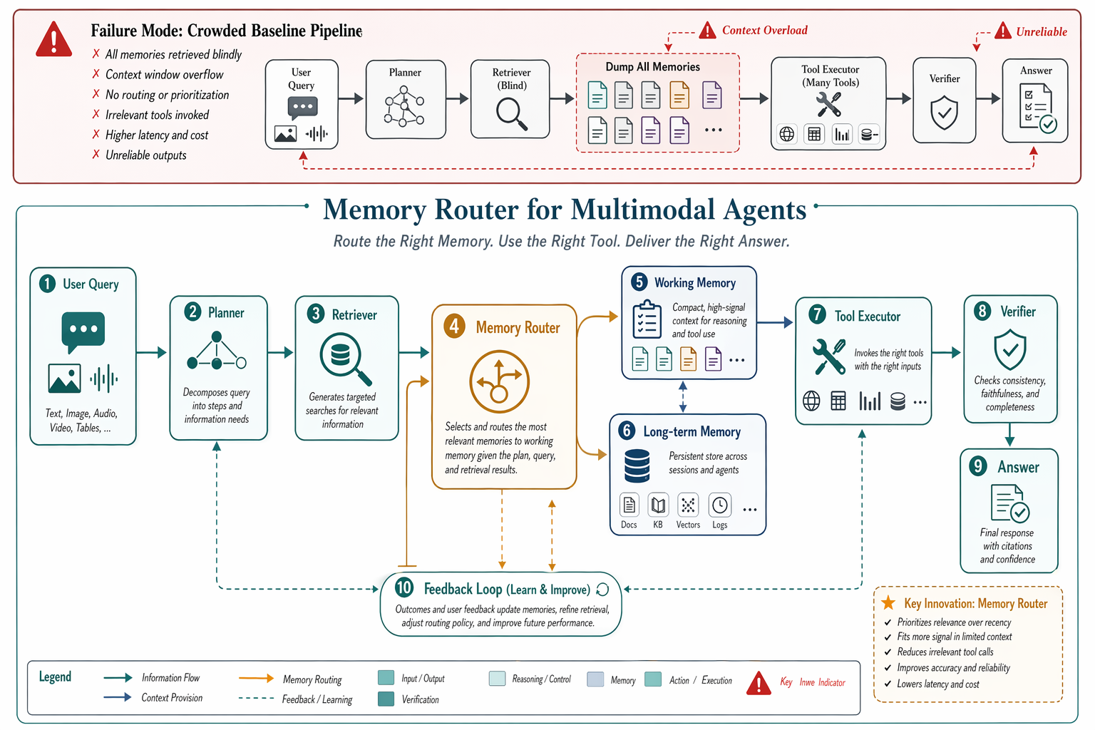
Using the provided reference image as a benchmark for a clean, readable business infographic style, create a 16:9 comparison slide that demonstrates how different image generation models render an infographic about {argument name="topic" default="Microsoft 365"}. Replace the Japanese DX report content with four separate sample infographic outputs arranged in a 2×2 grid on a white background.

Layout: Use exactly 4 panels, each showing a different Microsoft 365 ecosystem diagram, with a small horizontal orange model label near the left side of that panel. The four labels must be: 1) {argument name="top left model label" default="GPT-Image-2"}, 2) {argument name="top right model label" default="GPT-Image-1.5"}, 3) {argument name="bottom left model label" default="MAI Image 2 Efficient"}, and 4) {argument name="bottom right model label" default="Flux.2 Flex"}.

Panel content: Each panel should visualize Microsoft 365 at the center with surrounding app icons and labels. Include recognizable Microsoft-style app tiles/icons such as Word, Excel, PowerPoint, Outlook, Teams, OneDrive, SharePoint, OneNote, Forms, Planner, Loop, and Copilot where appropriate. Make the top-left panel the most polished and text-readable, with a circular hub-and-spoke diagram and concise app descriptions. Make the top-right panel simpler, with icons connected to a central Microsoft 365 box. Make the bottom-left panel look like a structured category chart with Productivity, Collaboration, and Storage sections. Make the bottom-right panel look like a softer radial diagram with category headings and some imperfect or slightly inconsistent labels to imply model comparison.

Style: Clean corporate SaaS infographic aesthetic, lots of white space, thin gray connector lines, Microsoft-like blue/green/orange/purple icon colors, crisp readable English text. Preserve the reference image’s practical business-document feel, but do not recreate its Japanese government-report layout, red warning sections, arrows, or original text.

Constraints: Show exactly four model comparison examples, no extra title banner, no watermark, no Japanese text, and keep all text legible enough to compare model performance.
Translations
Microsoft 365 模型对比信息图
enUsing the provided reference image as a benchmark for a clean, readable business infographic style, create a 16:9 comparison slide that demonstrates how different image generation models render an infographic about {argument name="topic" default="Microsoft 365"}. Replace the Japanese DX report content with four separate sample infographic outputs arranged in a 2×2 grid on a white background. Layout: Use exactly 4 panels, each showing a different Microsoft 365 ecosystem diagram, with a small horizontal orange model label near the left side of that panel. The four labels must be: 1) {argument name="top left model label" default="GPT-Image-2"}, 2) {argument name="top right model label" default="GPT-Image-1.5"}, 3) {argument name="bottom left model label" default="MAI Image 2 Efficient"}, and 4) {argument name="bottom right model label" default="Flux.2 Flex"}. Panel content: Each panel should visualize Microsoft 365 at the center with surrounding app icons and labels. Include recognizable Microsoft-style app tiles/icons such as Word, Excel, PowerPoint, Outlook, Teams, OneDrive, SharePoint, OneNote, Forms, Planner, Loop, and Copilot where appropriate. Make the top-left panel the most polished and text-readable, with a circular hub-and-spoke diagram and concise app descriptions. Make the top-right panel simpler, with icons connected to a central Microsoft 365 box. Make the bottom-left panel look like a structured category chart with Productivity, Collaboration, and Storage sections. Make the bottom-right panel look like a softer radial diagram with category headings and some imperfect or slightly inconsistent labels to imply model comparison. Style: Clean corporate SaaS infographic aesthetic, lots of white space, thin gray connector lines, Microsoft-like blue/green/orange/purple icon colors, crisp readable English text. Preserve the reference image’s practical business-document feel, but do not recreate its Japanese government-report layout, red warning sections, arrows, or original text. Constraints: Show exactly four model comparison examples, no extra title banner, no watermark, no Japanese text, and keep all text legible enough to compare model performance.
Microsoft 365 模型对比信息图
zh-CN以提供的参考图像为基准,采用简洁、易读的商业信息图风格,创建一个 16:9 的对比 Slides,展示不同图像生成模型如何渲染关于 {argument name="topic" default="Microsoft 365"} 的信息图。将原有的日本 DX 报告内容替换为四个独立的示例信息图输出,并以 2×2 的网格形式排列在白色背景上。 布局:使用 4 个面板,每个面板展示不同的 Microsoft 365 生态系统图,并在面板左侧附近放置一个小的水平橙色模型标签。四个标签必须为:1) {argument name="top left model label" default="GPT-Image-2"},2) {argument name="top right model label" default="GPT-Image-1.5"},3) {argument name="bottom left model label" default="MAI Image 2 Efficient"},以及 4) {argument name="bottom right model label" default="Flux.2 Flex"}。 面板内容:每个面板应以 Microsoft 365 为中心,周围环绕应用程序图标和标签。在适当位置包含可识别的 Microsoft 风格应用磁贴/图标,例如 Word、Excel、PowerPoint、Outlook、Teams、OneDrive、SharePoint、OneNote、Forms、Planner、Loop 和 Copilot。左上角面板应最为精致且文字清晰,采用圆形中心辐射图和简洁的应用描述。右上角面板应更简洁,图标连接至中央的 Microsoft 365 方框。左下角面板应呈现为结构化的类别图表,包含生产力、协作和存储部分。右下角面板应呈现为较柔和的径向图,带有类别标题,并包含一些不完美或略有不一致的标签,以体现模型对比效果。 风格:简洁的 SaaS 企业信息图美学,留白充足,细灰色连接线,Microsoft 风格的蓝/绿/橙/紫色图标,清晰易读的英文文本。保留参考图像的实用商业文档质感,但不要重现其日本政府报告的布局、红色警告部分、箭头或原始文本。 约束:仅展示四个模型对比示例,不含额外的标题横幅,无水印,无日文文本,并确保所有文本清晰度足以对比模型性能。