Brand Identity Moodboard System
Full-blown brand identity system [BRAND NAME] — Brand Identity Moodboard STEP 1 — DECODE THE BRAND Extract from real brand guidelines only: - Colors: full official palette (primary
- 分类
- UI 与界面
- 模型
- GPT Image 2
- 来源作者
- EvoLinkAI
- 原始语言
- en
- 来源 ID
- ui-144
完整提示词
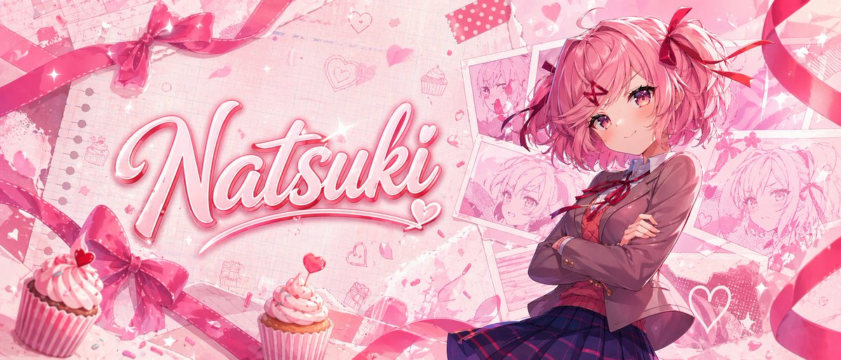
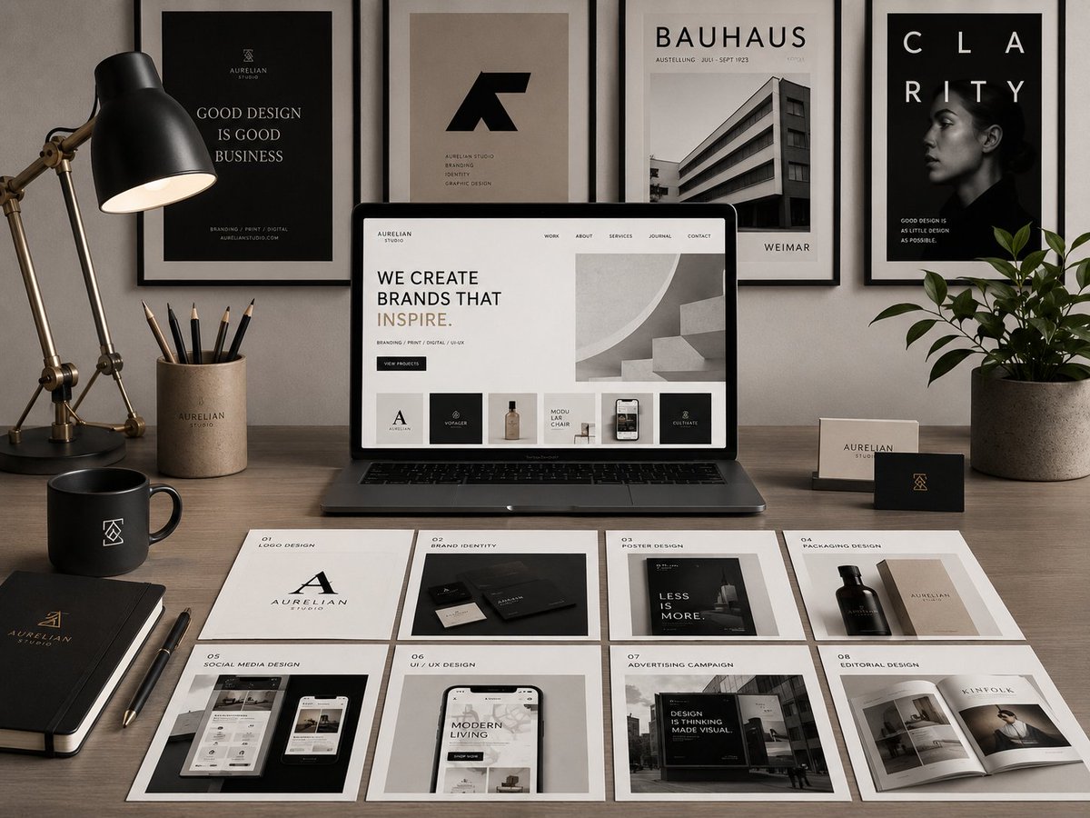
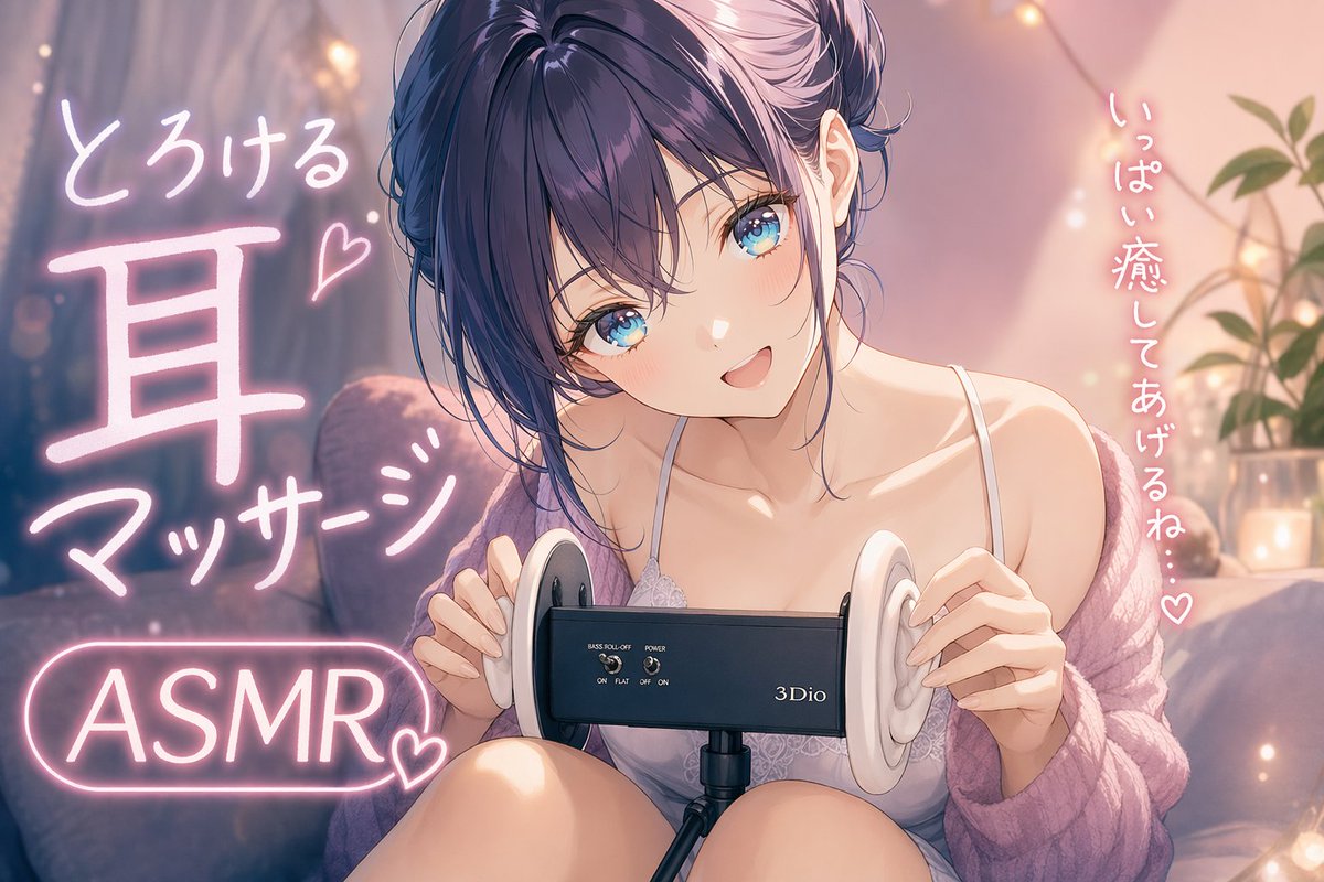
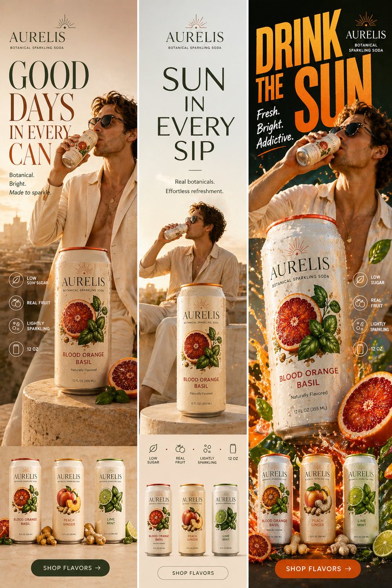
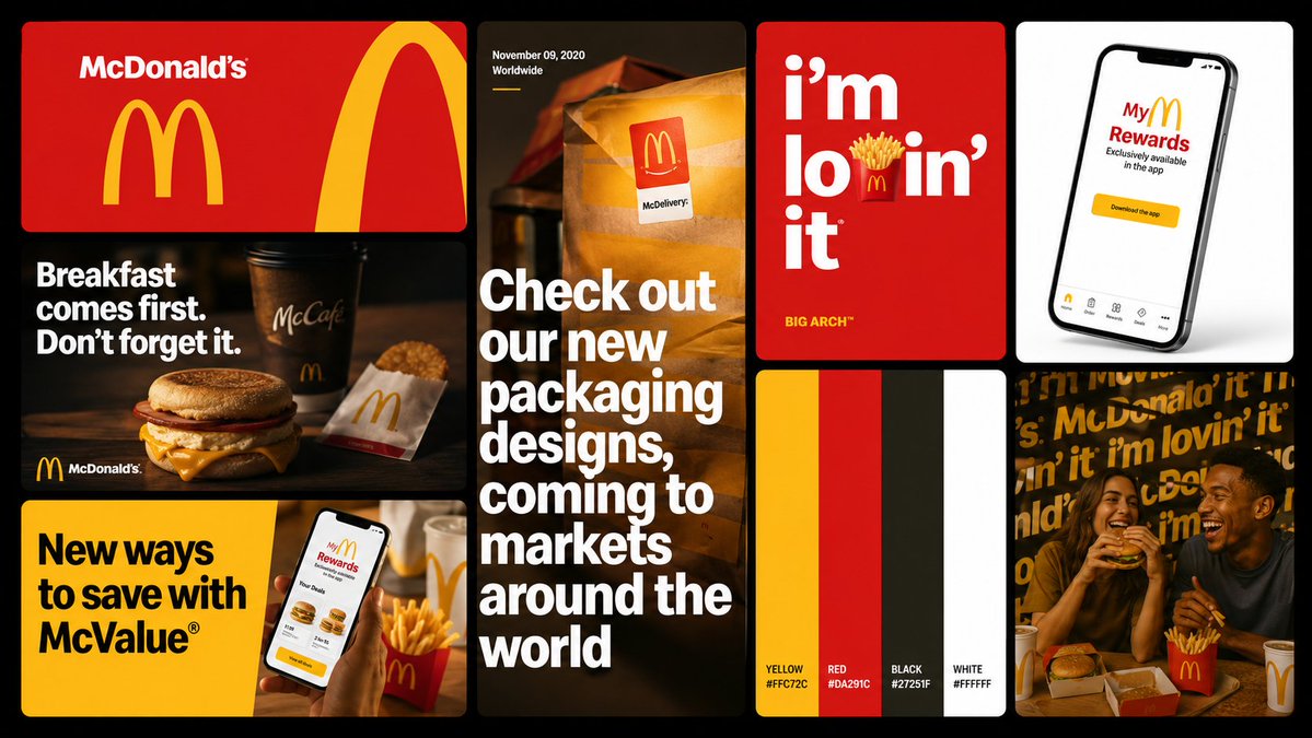
Full-blown brand identity system [BRAND NAME] — Brand Identity Moodboard STEP 1 — DECODE THE BRAND Extract from real brand guidelines only: - Colors: full official palette (primary, secondary, neutrals, accents) — exact, no approximations - Type: weight, width, tracking, capitalization character — applied identically across all cards - Copy: real slogans, campaigns, product names, manifesto phrases — zero invented text - World: the domain (sport / tech / fashion / music / etc.) — all imagery stays inside it STEP 2 — OUTPUT Single 16:9 flat image. Black (#000–#0A0A0A) background. 8 cards in an asymmetric 3-column grid. Uniform 8–12px gaps. Rounded corners 8–12px. Every card uses only Step 1 colors, type, and copy. CARDS — in order: 1. LOGO LOCKUP (wide, top-left) — brand color BG, official logo/wordmark, oversized cropped logo mark as structural graphic. No photo. 2. EDITORIAL PHOTO (mid-left) — dark photo from brand world, manifesto headline in brand type over image, wordmark small at bottom. 3. CAMPAIGN BANNER (wide, bottom-left) — flat accent color BG, real event/campaign headline bold-condensed left side, action photo cropped into right side. 4. STORY FORMAT (tall, center full-height) — full-bleed photo, oversized display type partially cropped by edges, date/location detail top. Mobile story proportions. 5. TYPOGRAPHIC POSTER (upper center-right) — vivid accent BG, campaign headline with one letter replaced by a real brand-world object, edition tag below. 6. COLOR PALETTE (center-right) — vertical equal stripes, one per brand color, color name labeled bottom each stripe. No photo. Zero decoration. 7. PRODUCT MOCKUP (upper right) — studio photo of real brand product or branded device/interface, neutral BG, accurate logo/color/type placement. 8. TYPE PATTERN (lower right) — brand name/slogan repeated as all-over pattern at varied sizes/angles, editorial photo overlaid and color-treated to integrate. RULE: A person who knows this brand must immediately confirm every card belongs to it. Output quality: Behance brand identity case study / agency pitch deck.
多语言版本
Brand Identity Moodboard System
deFull-blown brand identity system [BRAND NAME] — Brand Identity Moodboard STEP 1 — DECODE THE BRAND Extract from real brand guidelines only: - Colors: full official palette (primary, secondary, neutrals, accents) — exact, no approximations - Type: weight, width, tracking, capitalization character — applied identically across all cards - Copy: real slogans, campaigns, product names, manifesto phrases — zero invented text - World: the domain (sport / tech / fashion / music / etc.) — all imagery stays inside it STEP 2 — OUTPUT Single 16:9 flat image. Black (#000–#0A0A0A) background. 8 cards in an asymmetric 3-column grid. Uniform 8–12px gaps. Rounded corners 8–12px. Every card uses only Step 1 colors, type, and copy. CARDS — in order: 1. LOGO LOCKUP (wide, top-left) — brand color BG, official logo/wordmark, oversized cropped logo mark as structural graphic. No photo. 2. EDITORIAL PHOTO (mid-left) — dark photo from brand world, manifesto headline in brand type over image, wordmark small at bottom. 3. CAMPAIGN BANNER (wide, bottom-left) — flat accent color BG, real event/campaign headline bold-condensed left side, action photo cropped into right side. 4. STORY FORMAT (tall, center full-height) — full-bleed photo, oversized display type partially cropped by edges, date/location detail top. Mobile story proportions. 5. TYPOGRAPHIC POSTER (upper center-right) — vivid accent BG, campaign headline with one letter replaced by a real brand-world object, edition tag below. 6. COLOR PALETTE (center-right) — vertical equal stripes, one per brand color, color name labeled bottom each stripe. No photo. Zero decoration. 7. PRODUCT MOCKUP (upper right) — studio photo of real brand product or branded device/interface, neutral BG, accurate logo/color/type placement. 8. TYPE PATTERN (lower right) — brand name/slogan repeated as all-over pattern at varied sizes/angles, editorial photo overlaid and color-treated to integrate. RULE: A person who knows this brand must immediately confirm every card belongs to it. Output quality: Behance brand identity case study / agency pitch deck.
Brand Identity Moodboard System
enFull-blown brand identity system [BRAND NAME] — Brand Identity Moodboard STEP 1 — DECODE THE BRAND Extract from real brand guidelines only: - Colors: full official palette (primary, secondary, neutrals, accents) — exact, no approximations - Type: weight, width, tracking, capitalization character — applied identically across all cards - Copy: real slogans, campaigns, product names, manifesto phrases — zero invented text - World: the domain (sport / tech / fashion / music / etc.) — all imagery stays inside it STEP 2 — OUTPUT Single 16:9 flat image. Black (#000–#0A0A0A) background. 8 cards in an asymmetric 3-column grid. Uniform 8–12px gaps. Rounded corners 8–12px. Every card uses only Step 1 colors, type, and copy. CARDS — in order: 1. LOGO LOCKUP (wide, top-left) — brand color BG, official logo/wordmark, oversized cropped logo mark as structural graphic. No photo. 2. EDITORIAL PHOTO (mid-left) — dark photo from brand world, manifesto headline in brand type over image, wordmark small at bottom. 3. CAMPAIGN BANNER (wide, bottom-left) — flat accent color BG, real event/campaign headline bold-condensed left side, action photo cropped into right side. 4. STORY FORMAT (tall, center full-height) — full-bleed photo, oversized display type partially cropped by edges, date/location detail top. Mobile story proportions. 5. TYPOGRAPHIC POSTER (upper center-right) — vivid accent BG, campaign headline with one letter replaced by a real brand-world object, edition tag below. 6. COLOR PALETTE (center-right) — vertical equal stripes, one per brand color, color name labeled bottom each stripe. No photo. Zero decoration. 7. PRODUCT MOCKUP (upper right) — studio photo of real brand product or branded device/interface, neutral BG, accurate logo/color/type placement. 8. TYPE PATTERN (lower right) — brand name/slogan repeated as all-over pattern at varied sizes/angles, editorial photo overlaid and color-treated to integrate. RULE: A person who knows this brand must immediately confirm every card belongs to it. Output quality: Behance brand identity case study / agency pitch deck.
Brand Identity Moodboard System
esFull-blown brand identity system [BRAND NAME] — Brand Identity Moodboard STEP 1 — DECODE THE BRAND Extract from real brand guidelines only: - Colors: full official palette (primary, secondary, neutrals, accents) — exact, no approximations - Type: weight, width, tracking, capitalization character — applied identically across all cards - Copy: real slogans, campaigns, product names, manifesto phrases — zero invented text - World: the domain (sport / tech / fashion / music / etc.) — all imagery stays inside it STEP 2 — OUTPUT Single 16:9 flat image. Black (#000–#0A0A0A) background. 8 cards in an asymmetric 3-column grid. Uniform 8–12px gaps. Rounded corners 8–12px. Every card uses only Step 1 colors, type, and copy. CARDS — in order: 1. LOGO LOCKUP (wide, top-left) — brand color BG, official logo/wordmark, oversized cropped logo mark as structural graphic. No photo. 2. EDITORIAL PHOTO (mid-left) — dark photo from brand world, manifesto headline in brand type over image, wordmark small at bottom. 3. CAMPAIGN BANNER (wide, bottom-left) — flat accent color BG, real event/campaign headline bold-condensed left side, action photo cropped into right side. 4. STORY FORMAT (tall, center full-height) — full-bleed photo, oversized display type partially cropped by edges, date/location detail top. Mobile story proportions. 5. TYPOGRAPHIC POSTER (upper center-right) — vivid accent BG, campaign headline with one letter replaced by a real brand-world object, edition tag below. 6. COLOR PALETTE (center-right) — vertical equal stripes, one per brand color, color name labeled bottom each stripe. No photo. Zero decoration. 7. PRODUCT MOCKUP (upper right) — studio photo of real brand product or branded device/interface, neutral BG, accurate logo/color/type placement. 8. TYPE PATTERN (lower right) — brand name/slogan repeated as all-over pattern at varied sizes/angles, editorial photo overlaid and color-treated to integrate. RULE: A person who knows this brand must immediately confirm every card belongs to it. Output quality: Behance brand identity case study / agency pitch deck.
Brand Identity Moodboard System
frFull-blown brand identity system [BRAND NAME] — Brand Identity Moodboard STEP 1 — DECODE THE BRAND Extract from real brand guidelines only: - Colors: full official palette (primary, secondary, neutrals, accents) — exact, no approximations - Type: weight, width, tracking, capitalization character — applied identically across all cards - Copy: real slogans, campaigns, product names, manifesto phrases — zero invented text - World: the domain (sport / tech / fashion / music / etc.) — all imagery stays inside it STEP 2 — OUTPUT Single 16:9 flat image. Black (#000–#0A0A0A) background. 8 cards in an asymmetric 3-column grid. Uniform 8–12px gaps. Rounded corners 8–12px. Every card uses only Step 1 colors, type, and copy. CARDS — in order: 1. LOGO LOCKUP (wide, top-left) — brand color BG, official logo/wordmark, oversized cropped logo mark as structural graphic. No photo. 2. EDITORIAL PHOTO (mid-left) — dark photo from brand world, manifesto headline in brand type over image, wordmark small at bottom. 3. CAMPAIGN BANNER (wide, bottom-left) — flat accent color BG, real event/campaign headline bold-condensed left side, action photo cropped into right side. 4. STORY FORMAT (tall, center full-height) — full-bleed photo, oversized display type partially cropped by edges, date/location detail top. Mobile story proportions. 5. TYPOGRAPHIC POSTER (upper center-right) — vivid accent BG, campaign headline with one letter replaced by a real brand-world object, edition tag below. 6. COLOR PALETTE (center-right) — vertical equal stripes, one per brand color, color name labeled bottom each stripe. No photo. Zero decoration. 7. PRODUCT MOCKUP (upper right) — studio photo of real brand product or branded device/interface, neutral BG, accurate logo/color/type placement. 8. TYPE PATTERN (lower right) — brand name/slogan repeated as all-over pattern at varied sizes/angles, editorial photo overlaid and color-treated to integrate. RULE: A person who knows this brand must immediately confirm every card belongs to it. Output quality: Behance brand identity case study / agency pitch deck.
Brand Identity Moodboard System
jaFull-blown brand identity system [BRAND NAME] — Brand Identity Moodboard STEP 1 — DECODE THE BRAND Extract from real brand guidelines only: - Colors: full official palette (primary, secondary, neutrals, accents) — exact, no approximations - Type: weight, width, tracking, capitalization character — applied identically across all cards - Copy: real slogans, campaigns, product names, manifesto phrases — zero invented text - World: the domain (sport / tech / fashion / music / etc.) — all imagery stays inside it STEP 2 — OUTPUT Single 16:9 flat image. Black (#000–#0A0A0A) background. 8 cards in an asymmetric 3-column grid. Uniform 8–12px gaps. Rounded corners 8–12px. Every card uses only Step 1 colors, type, and copy. CARDS — in order: 1. LOGO LOCKUP (wide, top-left) — brand color BG, official logo/wordmark, oversized cropped logo mark as structural graphic. No photo. 2. EDITORIAL PHOTO (mid-left) — dark photo from brand world, manifesto headline in brand type over image, wordmark small at bottom. 3. CAMPAIGN BANNER (wide, bottom-left) — flat accent color BG, real event/campaign headline bold-condensed left side, action photo cropped into right side. 4. STORY FORMAT (tall, center full-height) — full-bleed photo, oversized display type partially cropped by edges, date/location detail top. Mobile story proportions. 5. TYPOGRAPHIC POSTER (upper center-right) — vivid accent BG, campaign headline with one letter replaced by a real brand-world object, edition tag below. 6. COLOR PALETTE (center-right) — vertical equal stripes, one per brand color, color name labeled bottom each stripe. No photo. Zero decoration. 7. PRODUCT MOCKUP (upper right) — studio photo of real brand product or branded device/interface, neutral BG, accurate logo/color/type placement. 8. TYPE PATTERN (lower right) — brand name/slogan repeated as all-over pattern at varied sizes/angles, editorial photo overlaid and color-treated to integrate. RULE: A person who knows this brand must immediately confirm every card belongs to it. Output quality: Behance brand identity case study / agency pitch deck.
Brand Identity Moodboard System
koFull-blown brand identity system [BRAND NAME] — Brand Identity Moodboard STEP 1 — DECODE THE BRAND Extract from real brand guidelines only: - Colors: full official palette (primary, secondary, neutrals, accents) — exact, no approximations - Type: weight, width, tracking, capitalization character — applied identically across all cards - Copy: real slogans, campaigns, product names, manifesto phrases — zero invented text - World: the domain (sport / tech / fashion / music / etc.) — all imagery stays inside it STEP 2 — OUTPUT Single 16:9 flat image. Black (#000–#0A0A0A) background. 8 cards in an asymmetric 3-column grid. Uniform 8–12px gaps. Rounded corners 8–12px. Every card uses only Step 1 colors, type, and copy. CARDS — in order: 1. LOGO LOCKUP (wide, top-left) — brand color BG, official logo/wordmark, oversized cropped logo mark as structural graphic. No photo. 2. EDITORIAL PHOTO (mid-left) — dark photo from brand world, manifesto headline in brand type over image, wordmark small at bottom. 3. CAMPAIGN BANNER (wide, bottom-left) — flat accent color BG, real event/campaign headline bold-condensed left side, action photo cropped into right side. 4. STORY FORMAT (tall, center full-height) — full-bleed photo, oversized display type partially cropped by edges, date/location detail top. Mobile story proportions. 5. TYPOGRAPHIC POSTER (upper center-right) — vivid accent BG, campaign headline with one letter replaced by a real brand-world object, edition tag below. 6. COLOR PALETTE (center-right) — vertical equal stripes, one per brand color, color name labeled bottom each stripe. No photo. Zero decoration. 7. PRODUCT MOCKUP (upper right) — studio photo of real brand product or branded device/interface, neutral BG, accurate logo/color/type placement. 8. TYPE PATTERN (lower right) — brand name/slogan repeated as all-over pattern at varied sizes/angles, editorial photo overlaid and color-treated to integrate. RULE: A person who knows this brand must immediately confirm every card belongs to it. Output quality: Behance brand identity case study / agency pitch deck.
Brand Identity Moodboard System
ptFull-blown brand identity system [BRAND NAME] — Brand Identity Moodboard STEP 1 — DECODE THE BRAND Extract from real brand guidelines only: - Colors: full official palette (primary, secondary, neutrals, accents) — exact, no approximations - Type: weight, width, tracking, capitalization character — applied identically across all cards - Copy: real slogans, campaigns, product names, manifesto phrases — zero invented text - World: the domain (sport / tech / fashion / music / etc.) — all imagery stays inside it STEP 2 — OUTPUT Single 16:9 flat image. Black (#000–#0A0A0A) background. 8 cards in an asymmetric 3-column grid. Uniform 8–12px gaps. Rounded corners 8–12px. Every card uses only Step 1 colors, type, and copy. CARDS — in order: 1. LOGO LOCKUP (wide, top-left) — brand color BG, official logo/wordmark, oversized cropped logo mark as structural graphic. No photo. 2. EDITORIAL PHOTO (mid-left) — dark photo from brand world, manifesto headline in brand type over image, wordmark small at bottom. 3. CAMPAIGN BANNER (wide, bottom-left) — flat accent color BG, real event/campaign headline bold-condensed left side, action photo cropped into right side. 4. STORY FORMAT (tall, center full-height) — full-bleed photo, oversized display type partially cropped by edges, date/location detail top. Mobile story proportions. 5. TYPOGRAPHIC POSTER (upper center-right) — vivid accent BG, campaign headline with one letter replaced by a real brand-world object, edition tag below. 6. COLOR PALETTE (center-right) — vertical equal stripes, one per brand color, color name labeled bottom each stripe. No photo. Zero decoration. 7. PRODUCT MOCKUP (upper right) — studio photo of real brand product or branded device/interface, neutral BG, accurate logo/color/type placement. 8. TYPE PATTERN (lower right) — brand name/slogan repeated as all-over pattern at varied sizes/angles, editorial photo overlaid and color-treated to integrate. RULE: A person who knows this brand must immediately confirm every card belongs to it. Output quality: Behance brand identity case study / agency pitch deck.
Brand Identity Moodboard System
ruFull-blown brand identity system [BRAND NAME] — Brand Identity Moodboard STEP 1 — DECODE THE BRAND Extract from real brand guidelines only: - Colors: full official palette (primary, secondary, neutrals, accents) — exact, no approximations - Type: weight, width, tracking, capitalization character — applied identically across all cards - Copy: real slogans, campaigns, product names, manifesto phrases — zero invented text - World: the domain (sport / tech / fashion / music / etc.) — all imagery stays inside it STEP 2 — OUTPUT Single 16:9 flat image. Black (#000–#0A0A0A) background. 8 cards in an asymmetric 3-column grid. Uniform 8–12px gaps. Rounded corners 8–12px. Every card uses only Step 1 colors, type, and copy. CARDS — in order: 1. LOGO LOCKUP (wide, top-left) — brand color BG, official logo/wordmark, oversized cropped logo mark as structural graphic. No photo. 2. EDITORIAL PHOTO (mid-left) — dark photo from brand world, manifesto headline in brand type over image, wordmark small at bottom. 3. CAMPAIGN BANNER (wide, bottom-left) — flat accent color BG, real event/campaign headline bold-condensed left side, action photo cropped into right side. 4. STORY FORMAT (tall, center full-height) — full-bleed photo, oversized display type partially cropped by edges, date/location detail top. Mobile story proportions. 5. TYPOGRAPHIC POSTER (upper center-right) — vivid accent BG, campaign headline with one letter replaced by a real brand-world object, edition tag below. 6. COLOR PALETTE (center-right) — vertical equal stripes, one per brand color, color name labeled bottom each stripe. No photo. Zero decoration. 7. PRODUCT MOCKUP (upper right) — studio photo of real brand product or branded device/interface, neutral BG, accurate logo/color/type placement. 8. TYPE PATTERN (lower right) — brand name/slogan repeated as all-over pattern at varied sizes/angles, editorial photo overlaid and color-treated to integrate. RULE: A person who knows this brand must immediately confirm every card belongs to it. Output quality: Behance brand identity case study / agency pitch deck.
Brand Identity Moodboard System
trFull-blown brand identity system [BRAND NAME] — Brand Identity Moodboard STEP 1 — DECODE THE BRAND Extract from real brand guidelines only: - Colors: full official palette (primary, secondary, neutrals, accents) — exact, no approximations - Type: weight, width, tracking, capitalization character — applied identically across all cards - Copy: real slogans, campaigns, product names, manifesto phrases — zero invented text - World: the domain (sport / tech / fashion / music / etc.) — all imagery stays inside it STEP 2 — OUTPUT Single 16:9 flat image. Black (#000–#0A0A0A) background. 8 cards in an asymmetric 3-column grid. Uniform 8–12px gaps. Rounded corners 8–12px. Every card uses only Step 1 colors, type, and copy. CARDS — in order: 1. LOGO LOCKUP (wide, top-left) — brand color BG, official logo/wordmark, oversized cropped logo mark as structural graphic. No photo. 2. EDITORIAL PHOTO (mid-left) — dark photo from brand world, manifesto headline in brand type over image, wordmark small at bottom. 3. CAMPAIGN BANNER (wide, bottom-left) — flat accent color BG, real event/campaign headline bold-condensed left side, action photo cropped into right side. 4. STORY FORMAT (tall, center full-height) — full-bleed photo, oversized display type partially cropped by edges, date/location detail top. Mobile story proportions. 5. TYPOGRAPHIC POSTER (upper center-right) — vivid accent BG, campaign headline with one letter replaced by a real brand-world object, edition tag below. 6. COLOR PALETTE (center-right) — vertical equal stripes, one per brand color, color name labeled bottom each stripe. No photo. Zero decoration. 7. PRODUCT MOCKUP (upper right) — studio photo of real brand product or branded device/interface, neutral BG, accurate logo/color/type placement. 8. TYPE PATTERN (lower right) — brand name/slogan repeated as all-over pattern at varied sizes/angles, editorial photo overlaid and color-treated to integrate. RULE: A person who knows this brand must immediately confirm every card belongs to it. Output quality: Behance brand identity case study / agency pitch deck.
Brand Identity Moodboard System
zh-CNFull-blown brand identity system [BRAND NAME] — Brand Identity Moodboard STEP 1 — DECODE THE BRAND Extract from real brand guidelines only: - Colors: full official palette (primary, secondary, neutrals, accents) — exact, no approximations - Type: weight, width, tracking, capitalization character — applied identically across all cards - Copy: real slogans, campaigns, product names, manifesto phrases — zero invented text - World: the domain (sport / tech / fashion / music / etc.) — all imagery stays inside it STEP 2 — OUTPUT Single 16:9 flat image. Black (#000–#0A0A0A) background. 8 cards in an asymmetric 3-column grid. Uniform 8–12px gaps. Rounded corners 8–12px. Every card uses only Step 1 colors, type, and copy. CARDS — in order: 1. LOGO LOCKUP (wide, top-left) — brand color BG, official logo/wordmark, oversized cropped logo mark as structural graphic. No photo. 2. EDITORIAL PHOTO (mid-left) — dark photo from brand world, manifesto headline in brand type over image, wordmark small at bottom. 3. CAMPAIGN BANNER (wide, bottom-left) — flat accent color BG, real event/campaign headline bold-condensed left side, action photo cropped into right side. 4. STORY FORMAT (tall, center full-height) — full-bleed photo, oversized display type partially cropped by edges, date/location detail top. Mobile story proportions. 5. TYPOGRAPHIC POSTER (upper center-right) — vivid accent BG, campaign headline with one letter replaced by a real brand-world object, edition tag below. 6. COLOR PALETTE (center-right) — vertical equal stripes, one per brand color, color name labeled bottom each stripe. No photo. Zero decoration. 7. PRODUCT MOCKUP (upper right) — studio photo of real brand product or branded device/interface, neutral BG, accurate logo/color/type placement. 8. TYPE PATTERN (lower right) — brand name/slogan repeated as all-over pattern at varied sizes/angles, editorial photo overlaid and color-treated to integrate. RULE: A person who knows this brand must immediately confirm every card belongs to it. Output quality: Behance brand identity case study / agency pitch deck.
Brand Identity Moodboard System
zh-TWFull-blown brand identity system [BRAND NAME] — Brand Identity Moodboard STEP 1 — DECODE THE BRAND Extract from real brand guidelines only: - Colors: full official palette (primary, secondary, neutrals, accents) — exact, no approximations - Type: weight, width, tracking, capitalization character — applied identically across all cards - Copy: real slogans, campaigns, product names, manifesto phrases — zero invented text - World: the domain (sport / tech / fashion / music / etc.) — all imagery stays inside it STEP 2 — OUTPUT Single 16:9 flat image. Black (#000–#0A0A0A) background. 8 cards in an asymmetric 3-column grid. Uniform 8–12px gaps. Rounded corners 8–12px. Every card uses only Step 1 colors, type, and copy. CARDS — in order: 1. LOGO LOCKUP (wide, top-left) — brand color BG, official logo/wordmark, oversized cropped logo mark as structural graphic. No photo. 2. EDITORIAL PHOTO (mid-left) — dark photo from brand world, manifesto headline in brand type over image, wordmark small at bottom. 3. CAMPAIGN BANNER (wide, bottom-left) — flat accent color BG, real event/campaign headline bold-condensed left side, action photo cropped into right side. 4. STORY FORMAT (tall, center full-height) — full-bleed photo, oversized display type partially cropped by edges, date/location detail top. Mobile story proportions. 5. TYPOGRAPHIC POSTER (upper center-right) — vivid accent BG, campaign headline with one letter replaced by a real brand-world object, edition tag below. 6. COLOR PALETTE (center-right) — vertical equal stripes, one per brand color, color name labeled bottom each stripe. No photo. Zero decoration. 7. PRODUCT MOCKUP (upper right) — studio photo of real brand product or branded device/interface, neutral BG, accurate logo/color/type placement. 8. TYPE PATTERN (lower right) — brand name/slogan repeated as all-over pattern at varied sizes/angles, editorial photo overlaid and color-treated to integrate. RULE: A person who knows this brand must immediately confirm every card belongs to it. Output quality: Behance brand identity case study / agency pitch deck.