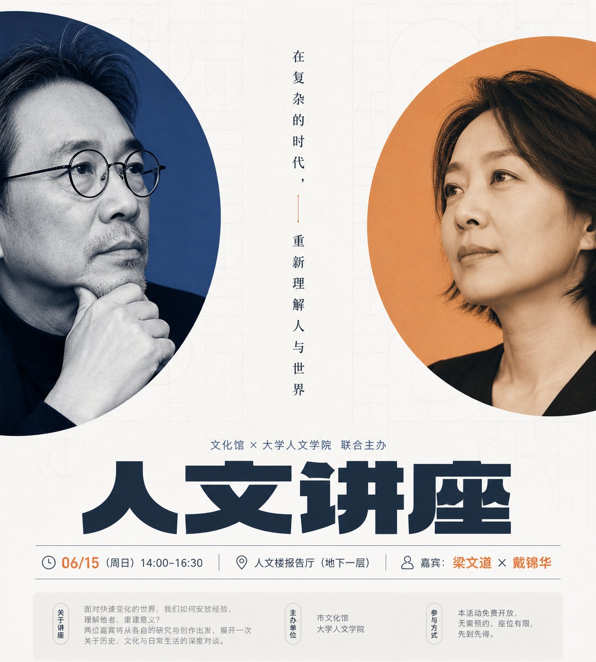
清透秩序感双焦点人文讲座海报设计
围绕任意主题对象生成一张清透、秩序感强的信息视觉:画面先读到中央两块高挑圆角色面,它们像被裁开的窗口,各自承载一个主题核心焦点,焦点可以从主题的人物、产品、符号或材料形态中提炼,采用近距离裁切与边缘露出的方式形成双焦点对话;两块窗口左右错位、大小接近但姿态不同,中间保留窄而安静的留白轴,放置少量细长竖排文字或短语,让信息像书脊一样把两个焦点连接起来。背景保持大面积明亮高键底色,加入极淡、低对比的重复几何纹理,纹理只提供文化感、秩序感和轻微纸面层次,不抢主体。标题区使用厚重、宽扁、紧密排列的粗体字,成为下方最强视觉重量,标题上方用中等字号建立活动或主题说明,标题下方用细条形信息带收纳副标题、时间、地点或补充说明,底部再以浅色信息栏承接次级资料,使阅读路径从双焦点到主标题再到细节。色彩从主题自身的材质、情绪和文化信号中提取,保留大面积明亮干净底色、少量饱和且边界清晰的强调色面、深色文字骨架和浅色信息托底的角色关系;整体应保持清透安静、明亮洁净、对比明确,强调色只集中在焦点窗口和关键信息处,避免脏灰、复古泛黄或过度装饰。成品应像克制的公共文化活动视觉,留白充足、层级精确、图像与文字互相嵌合,
- 分类
- 图表信息图
- 模型
- ChatGPT
- 来源作者
- @xiaoxiaodong01
- 原始语言
- zh-CN
- 来源 ID
- 17058
- 发布时间
- 2026年6月29日
完整提示词
围绕任意主题对象生成一张清透、秩序感强的信息视觉:画面先读到中央两块高挑圆角色面,它们像被裁开的窗口,各自承载一个主题核心焦点,焦点可以从主题的人物、产品、符号或材料形态中提炼,采用近距离裁切与边缘露出的方式形成双焦点对话;两块窗口左右错位、大小接近但姿态不同,中间保留窄而安静的留白轴,放置少量细长竖排文字或短语,让信息像书脊一样把两个焦点连接起来。背景保持大面积明亮高键底色,加入极淡、低对比的重复几何纹理,纹理只提供文化感、秩序感和轻微纸面层次,不抢主体。标题区使用厚重、宽扁、紧密排列的粗体字,成为下方最强视觉重量,标题上方用中等字号建立活动或主题说明,标题下方用细条形信息带收纳副标题、时间、地点或补充说明,底部再以浅色信息栏承接次级资料,使阅读路径从双焦点到主标题再到细节。色彩从主题自身的材质、情绪和文化信号中提取,保留大面积明亮干净底色、少量饱和且边界清晰的强调色面、深色文字骨架和浅色信息托底的角色关系;整体应保持清透安静、明亮洁净、对比明确,强调色只集中在焦点窗口和关键信息处,避免脏灰、复古泛黄或过度装饰。成品应像克制的公共文化活动视觉,留白充足、层级精确、图像与文字互相嵌合,而不是普通拼贴或拥挤宣传单。

——————
活动方向: 人文讲座或影人对谈海报,保留双人物窗口和中轴竖排短语
发布场景: 校园公众号、文化馆活动预告和现场导视都能直接使用
文字内容: 主标题写“人文讲座”,下方放时间、地点、嘉宾姓名
画幅尺寸: 竖版 9:10
多语言版本
清透秩序感双焦点人文讲座海报设计
enGenerate a clear, highly orderly visual information display centered around any subject. The image first reveals two tall, rounded rectangular color blocks in the center, acting like cropped windows, each carrying a core focus of the subject. These focuses can be extracted from the subject's characters, products, symbols, or material forms, using close-up cropping and edge exposure to create a dual-focal dialogue. The two windows are staggered left and right, similar in size but different in posture, with a narrow and quiet white space axis in the middle for a small amount of slender vertically aligned text or phrases, connecting the two focuses like a book spine. The background maintains a large area of bright high-key base color, incorporating extremely faint, low-contrast repetitive geometric textures that provide a sense of culture, order, and slight paper-like layering without overshadowing the main subject. The title area uses heavy, wide, and flat, tightly arranged bold fonts, becoming the strongest visual weight below. Above the title, use medium-sized fonts for event or theme descriptions; below the title, use thin information strips to house sub-headlines, time, location, or supplementary information. Finally, a light-colored information bar at the bottom holds secondary data, making the reading path flow from the dual focal points to the main title and then to the details. Colors are extracted from the materials, emotions, and cultural signals of the subject itself, maintaining a relationship between a large bright clean base color, a small amount of saturated and clearly bounded accent colors, a dark text skeleton, and light information backings. The overall feeling should be clear, quiet, bright, clean, and sharply contrasted, with accent colors concentrated only in the focal windows and key information, avoiding dirty grays, vintage yellowing, or excessive decoration. The final product should look like a restrained public cultural event visual, with ample white space, precise hierarchy, and an interlocking of images and text, rather than a simple collage or a crowded flyer. —————— Activity Direction: Humanities lecture or filmmaker dialogue poster, keeping the dual-character windows and the central axis vertical phrases. Publishing Scenes: Can be used directly for campus WeChat public accounts, cultural center event previews, and on-site guidance. Text Content: Main title says "Humanities Lecture", with time, location, and guest names placed below. Aspect Ratio: Vertical 9:10
清透秩序感双焦点人文讲座海报设计
zh-CN围绕任意主题对象生成一张清透、秩序感强的信息视觉:画面先读到中央两块高挑圆角色面,它们像被裁开的窗口,各自承载一个主题核心焦点,焦点可以从主题的人物、产品、符号或材料形态中提炼,采用近距离裁切与边缘露出的方式形成双焦点对话;两块窗口左右错位、大小接近但姿态不同,中间保留窄而安静的留白轴,放置少量细长竖排文字或短语,让信息像书脊一样把两个焦点连接起来。背景保持大面积明亮高键底色,加入极淡、低对比的重复几何纹理,纹理只提供文化感、秩序感和轻微纸面层次,不抢主体。标题区使用厚重、宽扁、紧密排列的粗体字,成为下方最强视觉重量,标题上方用中等字号建立活动或主题说明,标题下方用细条形信息带收纳副标题、时间、地点或补充说明,底部再以浅色信息栏承接次级资料,使阅读路径从双焦点到主标题再到细节。色彩从主题自身的材质、情绪和文化信号中提取,保留大面积明亮干净底色、少量饱和且边界清晰的强调色面、深色文字骨架和浅色信息托底的角色关系;整体应保持清透安静、明亮洁净、对比明确,强调色只集中在焦点窗口和关键信息处,避免脏灰、复古泛黄或过度装饰。成品应像克制的公共文化活动视觉,留白充足、层级精确、图像与文字互相嵌合,而不是普通拼贴或拥挤宣传单。 —————— 活动方向: 人文讲座或影人对谈海报,保留双人物窗口和中轴竖排短语 发布场景: 校园公众号、文化馆活动预告和现场导视都能直接使用 文字内容: 主标题写“人文讲座”,下方放时间、地点、嘉宾姓名 画幅尺寸: 竖版 9:10