日式库存管理 App 宣传海报
一张精致的日式移动端 App 营销视觉图,展示了用于家庭库存追踪的智能手机 UI,非常适合落地页、应用商店截图及社交媒体推广。
- 分类
- 图表信息图
- 模型
- GPT Image 2
- 来源作者
- 夜な夜ナ#個人開発
- 原始语言
- en
- 来源 ID
- 17167
- 发布时间
- 2026年4月29日
完整提示词
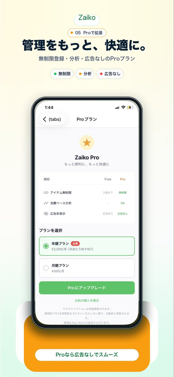
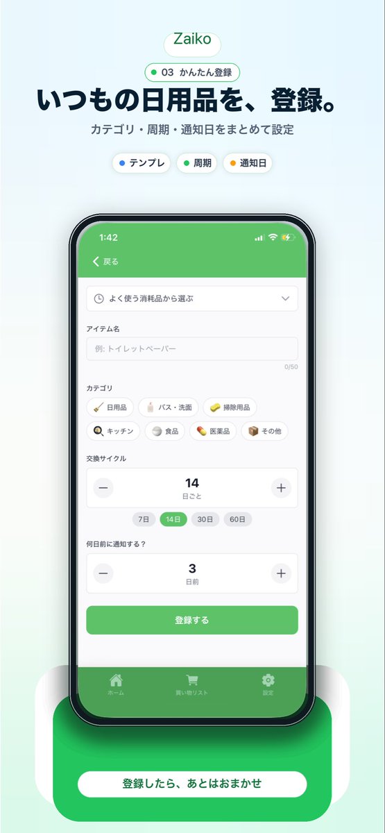
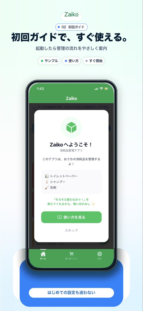
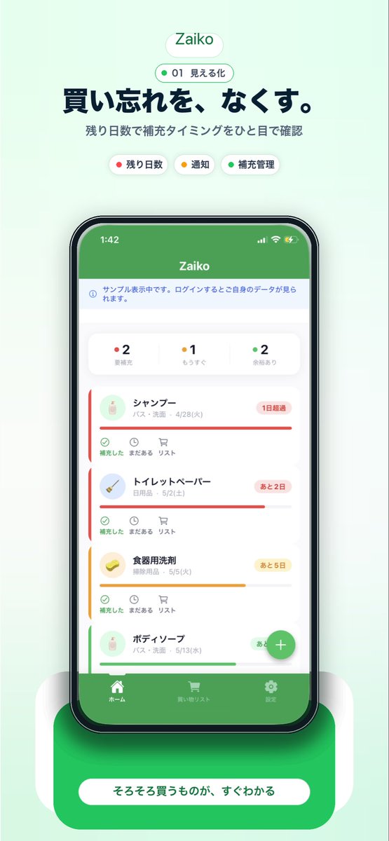
一张简洁的移动端 App 宣传海报,采用柔和的薄荷绿背景,构图居中且呈垂直分布,用于宣传名为 {argument name="app name" default="Zaiko"} 的库存管理 App。顶部放置一个圆角白色胶囊状 Logo,内含绿色的 App 名称;下方是一个较小的轮廓胶囊,包含一个绿点、数字 01 以及日文文本“見える化”。在下方添加一行深海军蓝色的加粗日文大标题:{argument name="headline text" default="買い忘れを、なくす。"},随后是较小的灰色日文副标题:残り日数で補充タイミングをひと目で確認。在副标题下方,横向排列 3 个圆角分类标签:一个带有红点的白色标签,标注为“残り日数”;一个带有黄点的白色标签,标注为“通知”;以及一个带有绿点的白色标签,标注为“補充管理”。在中心位置,展示一个正面的黑色边框智能手机模型,屏幕显示杂货与家庭库存追踪 App 的界面。手机屏幕顶部应有一个纯绿色状态栏,显示 App 名称;下方是一个浅色信息条;接着是一行包含 3 个状态计数器的摘要卡片:红点“2 要補充”、黄点“1 もうすぐ”以及绿点“2 余裕あり”。下方显示一个垂直滚动的列表,包含 4 张带有圆角、细微阴影和彩色紧急状态条的库存物品卡片:1) シャンプー,配有红色状态条和写着“1日超過”的红色徽章;2) トイレットペーパー,配有红色状态条和写着“あと2日”的红色徽章;3) 食器用洗剤,配有黄色状态条和写着“あと5日”的黄色徽章;4) ボディーソープ,配有绿色状态条和写着“あと10日”的绿色徽章。每张卡片左侧包含一个小圆形产品图标、日文物品名称及分类/日期文本,底部操作栏包含 3 个小控件,分别标注为“補充した”、“まだある”和“リスト”。在手机屏幕右下角附近添加一个悬浮的绿色圆形加号按钮。在 App UI 底部,包含一个绿色标签栏,内含 3 个导航项及图标:ホーム、買い物リスト 和 設定。将手机放置在一个带有柔和白色侧支撑和明显柔和阴影的亮面圆角绿色底座上,并在底座上添加一个大型圆角白色行动呼吁(CTA)胶囊,内含日文文本 {argument name="button text" default="そろそろ買うものが、すぐわかる"}。整体风格:精致的初创公司落地页模型、iOS App 截图美学、柔和渐变、极简日式 UI 设计、清晰的排版、居中构图、柔和的环境阴影、优质的应用商店营销视觉图。多语言版本
日式库存管理 App 宣传海报
enA clean mobile app promotional poster on a soft mint-green background, centered and vertically composed, advertising an inventory management app called {argument name="app name" default="Zaiko"}. At the top, place a rounded white pill logo with the app name in green, then a smaller outlined pill beneath it containing a green dot, the number 01, and the Japanese text 見える化. Below that, add a large bold Japanese headline in dark navy: {argument name="headline text" default="買い忘れを、なくす。"}, followed by a smaller gray Japanese subheading: 残り日数で補充タイミングをひと目で確認. Under the subheading, show exactly 3 rounded category chips in one row: a white chip with a red dot and the label 残り日数, a white chip with a yellow dot and the label 通知, and a white chip with a green dot and the label 補充管理. In the center, display a realistic black-bezel smartphone mockup in front view with a grocery and household stock tracking app screen. The phone screen should have a solid green top bar with the app name, a pale information strip below it, then a summary card row with exactly 3 status counters: red-dot 2 要補充, yellow-dot 1 もうすぐ, and green-dot 2 余裕あり. Beneath that, show a vertically scrolling list of exactly 4 inventory item cards with soft rounded corners, subtle shadows, and colored urgency bars: 1) シャンプー with a red status bar and a red badge reading 1日超過, 2) トイレットペーパー with a red status bar and a red badge reading あと2日, 3) 食器用洗剤 with a yellow status bar and a yellow badge reading あと5日, 4) ボディーソープ with a green status bar and a green badge reading あと10日. Each card includes a small circular product icon on the left, Japanese item name and category/date text, and a lower action row with 3 small controls labeled 補充した, まだある, and リスト. Add a floating green circular plus button near the lower right of the phone screen. At the bottom of the app UI, include a green tab bar with exactly 3 navigation items and icons: ホーム, 買い物リスト, and 設定. Place the phone on a glossy rounded green pedestal with soft white side supports and a strong soft shadow, then add a large rounded white call-to-action pill on the pedestal with the Japanese text {argument name="button text" default="そろそろ買うものが、すぐわかる"}. Overall style: polished startup landing-page mockup, iOS app screenshot aesthetic, soft gradients, minimal Japanese UI design, crisp typography, centered composition, gentle ambient shadows, premium app store marketing visual.
日式库存管理 App 宣传海报
zh-CN一张简洁的移动端 App 宣传海报,采用柔和的薄荷绿背景,构图居中且呈垂直分布,用于宣传名为 {argument name="app name" default="Zaiko"} 的库存管理 App。顶部放置一个圆角白色胶囊状 Logo,内含绿色的 App 名称;下方是一个较小的轮廓胶囊,包含一个绿点、数字 01 以及日文文本“見える化”。在下方添加一行深海军蓝色的加粗日文大标题:{argument name="headline text" default="買い忘れを、なくす。"},随后是较小的灰色日文副标题:残り日数で補充タイミングをひと目で確認。在副标题下方,横向排列 3 个圆角分类标签:一个带有红点的白色标签,标注为“残り日数”;一个带有黄点的白色标签,标注为“通知”;以及一个带有绿点的白色标签,标注为“補充管理”。在中心位置,展示一个正面的黑色边框智能手机模型,屏幕显示杂货与家庭库存追踪 App 的界面。手机屏幕顶部应有一个纯绿色状态栏,显示 App 名称;下方是一个浅色信息条;接着是一行包含 3 个状态计数器的摘要卡片:红点“2 要補充”、黄点“1 もうすぐ”以及绿点“2 余裕あり”。下方显示一个垂直滚动的列表,包含 4 张带有圆角、细微阴影和彩色紧急状态条的库存物品卡片:1) シャンプー,配有红色状态条和写着“1日超過”的红色徽章;2) トイレットペーパー,配有红色状态条和写着“あと2日”的红色徽章;3) 食器用洗剤,配有黄色状态条和写着“あと5日”的黄色徽章;4) ボディーソープ,配有绿色状态条和写着“あと10日”的绿色徽章。每张卡片左侧包含一个小圆形产品图标、日文物品名称及分类/日期文本,底部操作栏包含 3 个小控件,分别标注为“補充した”、“まだある”和“リスト”。在手机屏幕右下角附近添加一个悬浮的绿色圆形加号按钮。在 App UI 底部,包含一个绿色标签栏,内含 3 个导航项及图标:ホーム、買い物リスト 和 設定。将手机放置在一个带有柔和白色侧支撑和明显柔和阴影的亮面圆角绿色底座上,并在底座上添加一个大型圆角白色行动呼吁(CTA)胶囊,内含日文文本 {argument name="button text" default="そろそろ買うものが、すぐわかる"}。整体风格:精致的初创公司落地页模型、iOS App 截图美学、柔和渐变、极简日式 UI 设计、清晰的排版、居中构图、柔和的环境阴影、优质的应用商店营销视觉图。