户外品牌工具包概念项目
一个结构化的提示词,用于生成完整的阿尔卑斯户外服装品牌工具包演示项目,包含 Logo 变体、图标、样机、广告、App UI 和社交媒体视觉素材。
- 分类
- 图表信息图
- 模型
- GPT Image 2
- 来源作者
- Antonio Romero
- 原始语言
- en
- 来源 ID
- 20860
- 发布时间
- 2026年5月16日
完整提示词
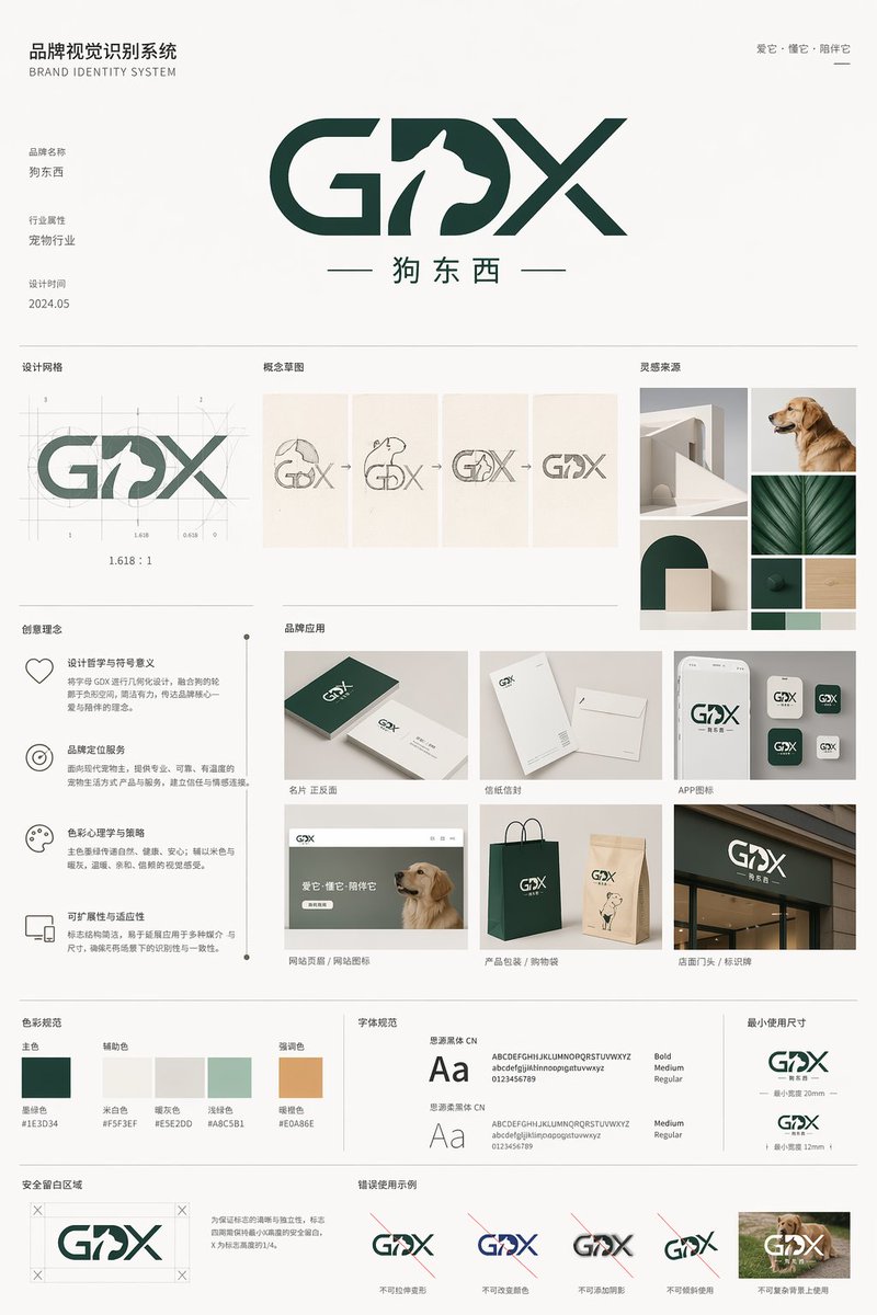
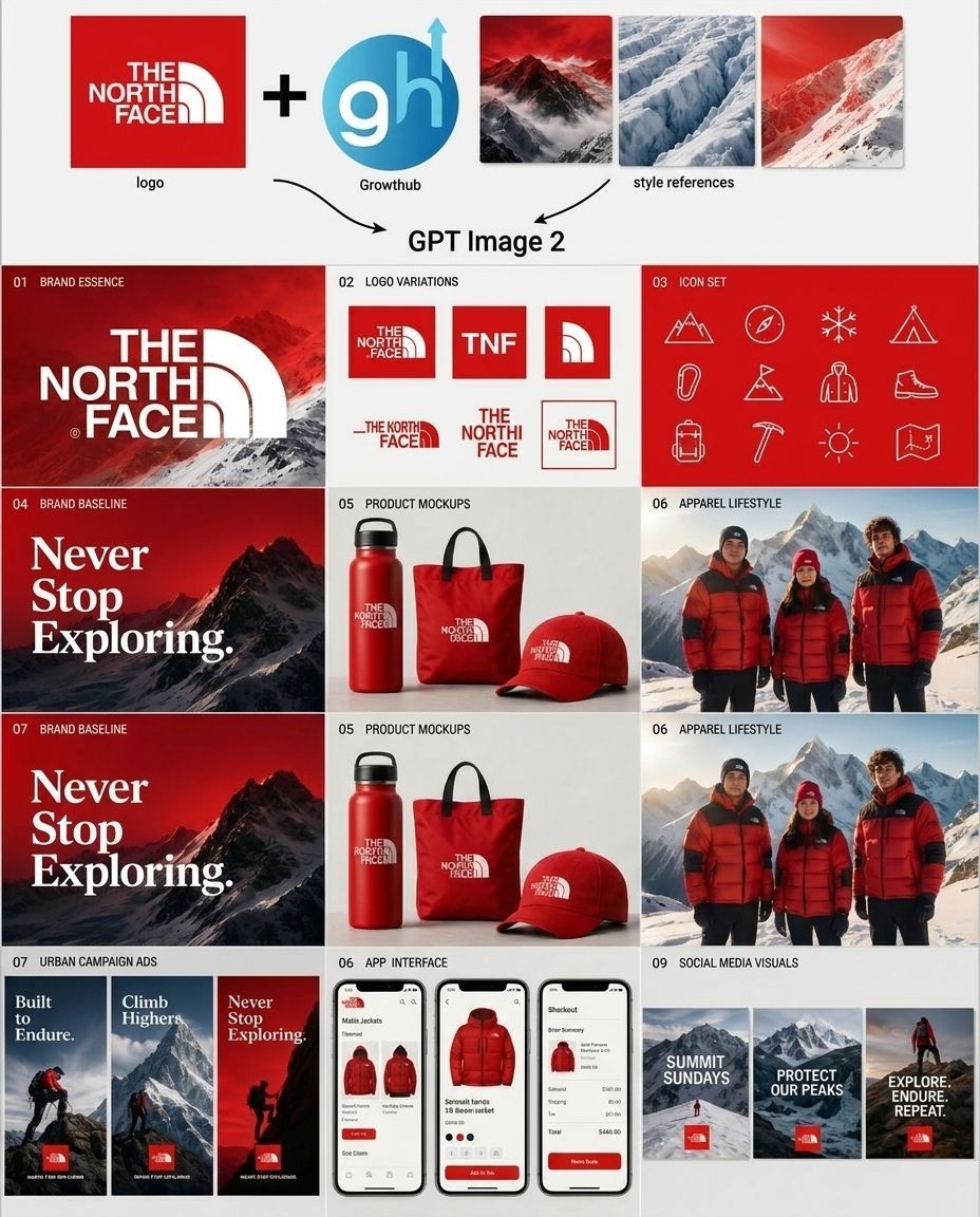
目标:创建一个精致的品牌概念项目,展示 GPT Image 2 如何为 {argument name="brand name" default="The North Face"} 生成完整的户外服装品牌工具包,将现有的 Logo、代理商标志和风格参考组合成一个交付物网格。

画布:浅灰色背景上的 4:3 方形演示项目,简洁的现代提案风格,面板之间有细白间隙,高分辨率样机美学。

顶部工作流条:从左到右排列 5 个独立元素:1) 一个带有白色文字/Logo“THE NORTH FACE”的红色方形 Logo 磁贴,标注为“logo”;2) 一个大的黑色加号;3) 一个圆形的蓝色“gh” Growthhub 标志,带有向上箭头,标注为“Growthhub”;4) 三个红、冰蓝、红雪色调的矩形山地风格参考缩略图;5) 两个指向中心文字“GPT Image 2”的弯曲黑色箭头。

主要布局:在工作流条下方,创建一个 3 列的品牌工具包磁贴网格,并配有小号大写黑色文字编号说明。使用 {argument name="primary color" default="深红色"}、白色、黑色、雪灰色和山地摄影作为主导色调。品牌感应高端、粗犷、高山、冒险且具备电商准备。

部分及精确可见数量:
- 01 品牌精髓:1 个宽幅红色山地横幅,在壮观的雪山上方带有巨大的白色“THE NORTH FACE” Logo。
- 02 Logo 变体:精确 6 个 Logo 变体磁贴:1 个红色方形完整 Logo,1 个红色方形“TNF”字母组合,1 个红色方形裁剪半圆顶图标,1 个水平红色文字/半圆顶组合,1 个堆叠式红色文字,以及 1 个带轮廓的红色方形组合。
- 03 图标集:红色面板上的精确 12 个细白线条图标:山峰、指南针、雪花、帐篷、登山扣、山地路径旗帜、登山夹克/人物、登山靴、背包、冰镐、太阳和折叠地图。
- 04 品牌基准:1 个红黑相间的山地海报,带有巨大的白色衬线文字“Never Stop Exploring.”。
- 05 产品样机:浅色背景上的精确 3 个红色商品:1 个保温瓶、1 个手提袋和 1 顶棒球帽,每件商品都有一个小白色品牌 Logo。
- 06 服装生活方式:1 个高山生活方式照片面板,展示精确 3 个人在雪山前穿着红色羽绒服。
- 07 品牌基准:再次重复山地海报概念,同样带有白色衬线短语“Never Stop Exploring.”。
- 05 产品样机:再次重复 3 个产品样机:瓶子、手提袋、帽子。
- 06 服装生活方式:再次重复 3 人红色夹克山地生活方式面板。
- 07 城市营销广告:精确 3 个垂直广告卡片,带有山地/徒步者图像和红色 Logo 标签,标题分别为“Built to Endure.”、“Climb Higher.”和“Never Stop Exploring.”。
- 06 App 界面:精确 3 个智能手机屏幕,展示红色夹克移动购物 App:产品网格、产品详情页和结账/订单摘要。
- 09 社交媒体视觉:精确 3 个垂直社交卡片,带有雪山图像和红色 Logo 标签,标题分别为“SUMMIT SUNDAYS”、“PROTECT OUR PEAKS”和“EXPLORE. ENDURE. REPEAT.”。

排版:标签和 UI 文字使用粗体无衬线字体,保持真实外观的白色品牌 Logo 样式,营销标语“Never Stop Exploring.”使用优雅的粗体衬线字体。保持所有文字清晰易读。

图像风格:逼真的产品样机和生活方式摄影,混合矢量 Logo 系统元素;电影级高山光影,雪山背景,高端品牌演示,简洁的代理商案例研究布局。

约束:保留显示的精确部分编号,包括重复的 05、06 和 07 标签。使用上述列出的精确数量。不要添加额外的面板、额外的图标、额外的产品、水印或装饰性文字。
多语言版本
户外品牌工具包概念项目
enGoal: Create a polished branding concept board showing how GPT Image 2 generates a complete outdoor apparel brand kit for {argument name="brand name" default="The North Face"}, combining an existing logo, an agency mark, and style references into a grid of deliverables. Canvas: Square 4:3-ish presentation board on a light gray background, clean modern pitch-deck style, thin white gutters between panels, high-resolution mockup aesthetic. Top workflow strip: Show 5 discrete elements arranged left to right: 1) a red square logo tile with the white text/logo “THE NORTH FACE” labeled “logo”; 2) a large black plus sign; 3) a circular blue “gh” Growthhub mark with an upward arrow labeled “Growthhub”; 4) three rectangular mountain style-reference thumbnails in red, icy blue, and red snowy tones; 5) two curved black arrows pointing down toward centered text reading “GPT Image 2”. Main layout: Below the workflow strip, create a 3-column grid of brand-kit tiles with numbered captions in small uppercase black text. Use a dominant palette of {argument name="primary color" default="deep red"}, white, black, snow gray, and mountain photography. The brand feels premium, rugged, alpine, adventurous, and eCommerce-ready. Sections and exact visible counts: - 01 Brand Essence: 1 wide red mountain banner with large white “THE NORTH FACE” logo over dramatic snowy mountains. - 02 Logo Variations: exactly 6 logo variation tiles: 1 red square full logo, 1 red square “TNF” monogram, 1 red square cropped half-dome icon, 1 horizontal red wordmark/half-dome lockup, 1 stacked red wordmark, and 1 outlined red square lockup. - 03 Icon Set: exactly 12 thin white line icons on a red panel: mountain, compass, snowflake, tent, carabiner, trail flag on mountain, hiker jacket/person, hiking boot, backpack, ice axe, sun, and folded map. - 04 Brand Baseline: 1 red-and-black mountain poster with large white serif text “Never Stop Exploring.” - 05 Product Mockups: exactly 3 red merchandise items on a light background: 1 insulated bottle, 1 tote bag, and 1 baseball cap, each with a small white brand logo. - 06 Apparel Lifestyle: 1 alpine lifestyle photo panel showing exactly 3 people wearing red puffer jackets in front of snowy mountains. - 07 Brand Baseline: repeat the mountain poster concept once more, again with the white serif phrase “Never Stop Exploring.” - 05 Product Mockups: repeat the 3 product mockups once more: bottle, tote, cap. - 06 Apparel Lifestyle: repeat the 3-person red jacket mountain lifestyle panel once more. - 07 Urban Campaign Ads: exactly 3 vertical ad cards with mountain/hiker imagery and red logo tags, with headlines “Built to Endure.”, “Climb Higher.”, and “Never Stop Exploring.” - 06 App Interface: exactly 3 smartphone screens showing a mobile shopping app for red jackets: product grid, product detail page, and checkout/order summary. - 09 Social Media Visuals: exactly 3 vertical social cards with snowy mountain imagery and red logo tags, with headlines “SUMMIT SUNDAYS”, “PROTECT OUR PEAKS”, and “EXPLORE. ENDURE. REPEAT.” Typography: Use bold sans-serif for labels and UI text, the authentic-looking white brand logo styling, and an elegant bold serif for the “Never Stop Exploring.” campaign line. Keep all text crisp and readable. Image style: Realistic product mockups and lifestyle photography mixed with vector logo-system elements; cinematic alpine lighting, snowy mountain backgrounds, premium brand presentation, clean agency case-study layout. Constraints: Preserve the exact section numbering shown, including the repeated 05, 06, and 07 labels. Use exactly the counts listed above. Do not add extra panels, extra icons, extra products, watermarks, or decorative text.
户外品牌工具包概念项目
zh-CN目标:创建一个精致的品牌概念项目,展示 GPT Image 2 如何为 {argument name="brand name" default="The North Face"} 生成完整的户外服装品牌工具包,将现有的 Logo、代理商标志和风格参考组合成一个交付物网格。 画布:浅灰色背景上的 4:3 方形演示项目,简洁的现代提案风格,面板之间有细白间隙,高分辨率样机美学。 顶部工作流条:从左到右排列 5 个独立元素:1) 一个带有白色文字/Logo“THE NORTH FACE”的红色方形 Logo 磁贴,标注为“logo”;2) 一个大的黑色加号;3) 一个圆形的蓝色“gh” Growthhub 标志,带有向上箭头,标注为“Growthhub”;4) 三个红、冰蓝、红雪色调的矩形山地风格参考缩略图;5) 两个指向中心文字“GPT Image 2”的弯曲黑色箭头。 主要布局:在工作流条下方,创建一个 3 列的品牌工具包磁贴网格,并配有小号大写黑色文字编号说明。使用 {argument name="primary color" default="深红色"}、白色、黑色、雪灰色和山地摄影作为主导色调。品牌感应高端、粗犷、高山、冒险且具备电商准备。 部分及精确可见数量: - 01 品牌精髓:1 个宽幅红色山地横幅,在壮观的雪山上方带有巨大的白色“THE NORTH FACE” Logo。 - 02 Logo 变体:精确 6 个 Logo 变体磁贴:1 个红色方形完整 Logo,1 个红色方形“TNF”字母组合,1 个红色方形裁剪半圆顶图标,1 个水平红色文字/半圆顶组合,1 个堆叠式红色文字,以及 1 个带轮廓的红色方形组合。 - 03 图标集:红色面板上的精确 12 个细白线条图标:山峰、指南针、雪花、帐篷、登山扣、山地路径旗帜、登山夹克/人物、登山靴、背包、冰镐、太阳和折叠地图。 - 04 品牌基准:1 个红黑相间的山地海报,带有巨大的白色衬线文字“Never Stop Exploring.”。 - 05 产品样机:浅色背景上的精确 3 个红色商品:1 个保温瓶、1 个手提袋和 1 顶棒球帽,每件商品都有一个小白色品牌 Logo。 - 06 服装生活方式:1 个高山生活方式照片面板,展示精确 3 个人在雪山前穿着红色羽绒服。 - 07 品牌基准:再次重复山地海报概念,同样带有白色衬线短语“Never Stop Exploring.”。 - 05 产品样机:再次重复 3 个产品样机:瓶子、手提袋、帽子。 - 06 服装生活方式:再次重复 3 人红色夹克山地生活方式面板。 - 07 城市营销广告:精确 3 个垂直广告卡片,带有山地/徒步者图像和红色 Logo 标签,标题分别为“Built to Endure.”、“Climb Higher.”和“Never Stop Exploring.”。 - 06 App 界面:精确 3 个智能手机屏幕,展示红色夹克移动购物 App:产品网格、产品详情页和结账/订单摘要。 - 09 社交媒体视觉:精确 3 个垂直社交卡片,带有雪山图像和红色 Logo 标签,标题分别为“SUMMIT SUNDAYS”、“PROTECT OUR PEAKS”和“EXPLORE. ENDURE. REPEAT.”。 排版:标签和 UI 文字使用粗体无衬线字体,保持真实外观的白色品牌 Logo 样式,营销标语“Never Stop Exploring.”使用优雅的粗体衬线字体。保持所有文字清晰易读。 图像风格:逼真的产品样机和生活方式摄影,混合矢量 Logo 系统元素;电影级高山光影,雪山背景,高端品牌演示,简洁的代理商案例研究布局。 约束:保留显示的精确部分编号,包括重复的 05、06 和 07 标签。使用上述列出的精确数量。不要添加额外的面板、额外的图标、额外的产品、水印或装饰性文字。