华丽的日式塔罗占卜证书
生成一份奢华的日式 AI 占卜证书,包含塔罗牌、罗盘符号、华丽玫瑰以及结构化的运势解读板块。
- 分类
- 图表信息图
- 模型
- GPT Image 2
- 来源作者
- みゆ|50歳主婦がAIマンガでKindle出版に挑戦
- 原始语言
- en
- 来源 ID
- 20891
- 发布时间
- 2026年5月16日
完整提示词
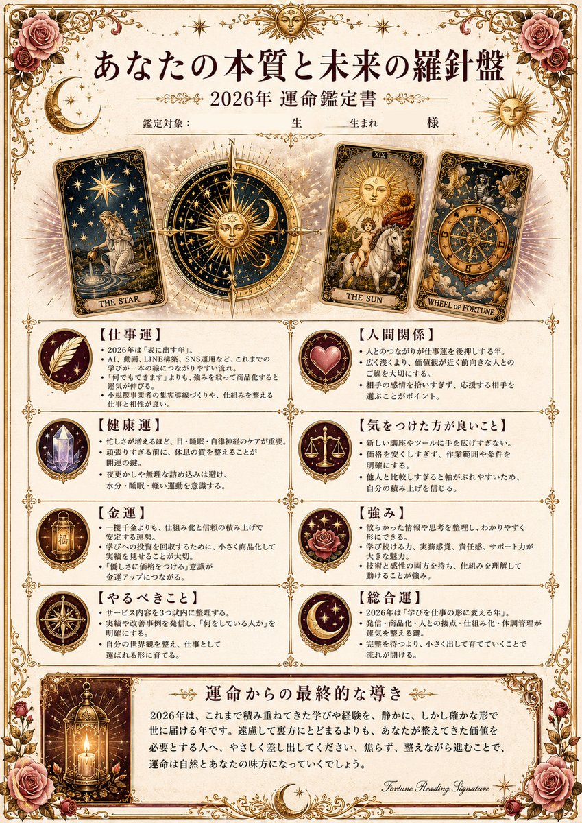
目标:为 AI 占卜结果创建一份华丽的日式运势解读证书,标题为「あなたの本質と未来の羅針盤」,风格仿照古董塔罗牌与占星术鑑定书。

画布:竖版 A4 页面,暖象牙色羊皮纸背景,细双线金边,四角饰有精致的维多利亚风格花丝,左上、右上、左下和右下角绘有玫瑰,并点缀着小星星、新月和金色装饰。采用奶油色、深褐色、古金色、酒红色、灰粉色和深海军蓝的奢华复古色调。

页眉:居中大号日文标题:{argument name="headline text" default="あなたの本質と未来の羅針盤"}。下方为较小的副标题:{argument name="year and subtitle" default="2026年 運命鑑定書"}。在此之下,包含一行精致的填空线,内容为「鑑定対象:    生    生まれ    様」,并配有装饰性分隔线。

主视觉区:在上半部分放置 3 张倾斜的塔罗牌以及 1 个中央罗盘。从左至右依次为:1) “THE STAR”牌,深海军蓝星空,水边跪着的女性,略微向左倾斜;2) 一个巨大的中央金色占星罗盘/罗盘玫瑰,中心发光并向外辐射光芒;3) “THE SUN”牌,白马上的孩童,向日葵,略微向右倾斜;4) “WHEEL OF FORTUNE”牌,华丽的黄道十二宫轮盘和天使形象,向右倾斜角度更大。在牌后添加淡淡的光晕。

正文布局:在塔罗牌区域下方,创建 8 个矩形解读板块,排列成整齐的 2 列 4 行网格。每个板块左侧为一个圆形徽章图标,右侧为日文标题及要点文本。8 个板块分别为:1) 「仕事運」(羽毛图标),2) 「人間関係」(心形图标),3) 「健康運」(水晶图标),4) 「気をつけた方が良いこと」(天平图标),5) 「金運」(金灯笼/护身符图标),6) 「強み」(玫瑰与星星图标),7) 「やるべきこと」(罗盘图标),8) 「総合運」(新月与星星图标)。每个方框内使用精简的日文要点;文本应看起来像一份个性化的运势报告,整洁易读,使用深棕色墨水和加粗的括号标题。

底部结论:添加一个独立的宽边框面板,标题为「運命からの最終的な導き」。左侧放置 1 张竖向插图,描绘一盏发光的古董灯笼,内含蜡烛,置于深金色边框的卡片中。右侧包含一段优美的日文段落,作为 {argument name="fortune year" default="2026年"} 的最终指引,内容提及积累的学习与经验将静谧而确切地传递给世界,珍视已建立的一切将引来志同道合的伙伴。结尾处附上一个小的连体英文签名“Fortune Reading Signature”。

装饰细节:页面四角包含 4 簇醒目的玫瑰,2 个新月图案,顶部附近有 3 个金色小太阳徽章,大量细小的星光闪烁,精致的金色分隔线,对称的卷轴花纹,营造出一种高级的神秘学/塔罗氛围。

文字风格:标题采用日文明朝体(Mincho),正文使用较小的日文衬线体,深棕色墨水,金色点缀。整体设计应呈现出一种人们乐于收到的高级印刷占卜证书质感。

约束条件:所有指定位置的文字必须使用日文,避免使用现代 UI 元素,塔罗牌插图之外不得出现写实人物,无水印,无二维码,除 3 张塔罗牌外不得增加额外卡牌,除列出的 8 个板块外不得增加额外正文区域。
多语言版本
华丽的日式塔罗占卜证书
enGoal: Create an ornate Japanese fortune-reading certificate titled 「あなたの本質と未来の羅針盤」 for an AI divination result, styled like an antique tarot and astrology鑑定書. Canvas: Vertical A4-style page, warm ivory parchment background, thin double-line gold border, elaborate Victorian filigree in all corners, roses in the top left, top right, bottom left, and bottom right, with small stars, crescent moons, and gold flourishes throughout. Use a luxurious vintage palette of cream, sepia, antique gold, burgundy, dusty rose, and deep navy. Header: Large centered Japanese headline: {argument name="headline text" default="あなたの本質と未来の羅針盤"}. Under it, smaller subtitle: {argument name="year and subtitle" default="2026年 運命鑑定書"}. Beneath that, include a delicate form line reading 「鑑定対象: 生 生まれ 様」 with ornamental dividers. Main visual area: Place exactly 3 tilted tarot cards across the upper half plus 1 central compass. From left to right: 1) “THE STAR” card, dark navy starry sky, kneeling woman by water, tilted slightly left; 2) a large central golden astrological compass/rose compass with a glowing center and radiating sunburst; 3) “THE SUN” card, child on white horse, sunflowers, tilted slightly right; 4) “WHEEL OF FORTUNE” card, ornate zodiac wheel and angelic figures, tilted more strongly right. Add halos of pale light behind the cards. Body layout: Below the tarot area, create exactly 8 rectangular reading sections arranged in a clean 2-column by 4-row grid, each with a circular medallion icon on the left and a Japanese heading plus bullet text on the right. The 8 sections are: 1) 「仕事運」 with a feather icon, 2) 「人間関係」 with a heart icon, 3) 「健康運」 with a crystal icon, 4) 「気をつけた方が良いこと」 with balance scales icon, 5) 「金運」 with a golden lantern/talisman icon, 6) 「強み」 with rose and stars icon, 7) 「やるべきこと」 with compass icon, 8) 「総合運」 with crescent moon and stars icon. Use small, dense Japanese bullet points in each box; the text should look like a personalized fortune report, neat and readable, with dark brown ink and bold bracketed headings. Bottom conclusion: Add a separate wide framed panel titled 「運命からの最終的な導き」. On its left place exactly 1 vertical illustration of a glowing antique lantern with a candle inside, set in a dark gold-framed card. On the right, include a polished Japanese paragraph of final guidance for {argument name="fortune year" default="2026年"}, saying that accumulated learning and experience will be delivered to the world quietly but surely, and that valuing what has been built will lead to natural allies. End with a small cursive English signature reading “Fortune Reading Signature”. Decorative details: Include exactly 4 prominent rose clusters at the page corners, 2 crescent moon motifs, 3 small gold sun medallions near the top, many tiny star sparkles, delicate gold separators, symmetrical scrollwork, and a refined occult/tarot atmosphere. Text style: Japanese Mincho-style serif for headings, smaller Japanese serif body copy, black-brown ink, gold accents. The overall design should look like a premium printed divination certificate someone would be happy to receive. Constraints: Keep all text in Japanese where specified, avoid modern UI elements, avoid photorealistic people outside the tarot illustrations, no watermark, no QR code, no extra cards beyond the 3 tarot cards, no extra body sections beyond the 8 listed sections.
华丽的日式塔罗占卜证书
zh-CN目标:为 AI 占卜结果创建一份华丽的日式运势解读证书,标题为「あなたの本質と未来の羅針盤」,风格仿照古董塔罗牌与占星术鑑定书。 画布:竖版 A4 页面,暖象牙色羊皮纸背景,细双线金边,四角饰有精致的维多利亚风格花丝,左上、右上、左下和右下角绘有玫瑰,并点缀着小星星、新月和金色装饰。采用奶油色、深褐色、古金色、酒红色、灰粉色和深海军蓝的奢华复古色调。 页眉:居中大号日文标题:{argument name="headline text" default="あなたの本質と未来の羅針盤"}。下方为较小的副标题:{argument name="year and subtitle" default="2026年 運命鑑定書"}。在此之下,包含一行精致的填空线,内容为「鑑定対象: 生 生まれ 様」,并配有装饰性分隔线。 主视觉区:在上半部分放置 3 张倾斜的塔罗牌以及 1 个中央罗盘。从左至右依次为:1) “THE STAR”牌,深海军蓝星空,水边跪着的女性,略微向左倾斜;2) 一个巨大的中央金色占星罗盘/罗盘玫瑰,中心发光并向外辐射光芒;3) “THE SUN”牌,白马上的孩童,向日葵,略微向右倾斜;4) “WHEEL OF FORTUNE”牌,华丽的黄道十二宫轮盘和天使形象,向右倾斜角度更大。在牌后添加淡淡的光晕。 正文布局:在塔罗牌区域下方,创建 8 个矩形解读板块,排列成整齐的 2 列 4 行网格。每个板块左侧为一个圆形徽章图标,右侧为日文标题及要点文本。8 个板块分别为:1) 「仕事運」(羽毛图标),2) 「人間関係」(心形图标),3) 「健康運」(水晶图标),4) 「気をつけた方が良いこと」(天平图标),5) 「金運」(金灯笼/护身符图标),6) 「強み」(玫瑰与星星图标),7) 「やるべきこと」(罗盘图标),8) 「総合運」(新月与星星图标)。每个方框内使用精简的日文要点;文本应看起来像一份个性化的运势报告,整洁易读,使用深棕色墨水和加粗的括号标题。 底部结论:添加一个独立的宽边框面板,标题为「運命からの最終的な導き」。左侧放置 1 张竖向插图,描绘一盏发光的古董灯笼,内含蜡烛,置于深金色边框的卡片中。右侧包含一段优美的日文段落,作为 {argument name="fortune year" default="2026年"} 的最终指引,内容提及积累的学习与经验将静谧而确切地传递给世界,珍视已建立的一切将引来志同道合的伙伴。结尾处附上一个小的连体英文签名“Fortune Reading Signature”。 装饰细节:页面四角包含 4 簇醒目的玫瑰,2 个新月图案,顶部附近有 3 个金色小太阳徽章,大量细小的星光闪烁,精致的金色分隔线,对称的卷轴花纹,营造出一种高级的神秘学/塔罗氛围。 文字风格:标题采用日文明朝体(Mincho),正文使用较小的日文衬线体,深棕色墨水,金色点缀。整体设计应呈现出一种人们乐于收到的高级印刷占卜证书质感。 约束条件:所有指定位置的文字必须使用日文,避免使用现代 UI 元素,塔罗牌插图之外不得出现写实人物,无水印,无二维码,除 3 张塔罗牌外不得增加额外卡牌,除列出的 8 个板块外不得增加额外正文区域。