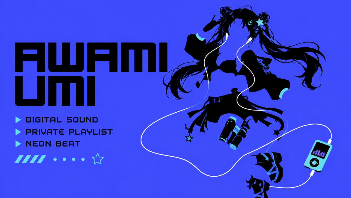
动漫风格回归发布横幅
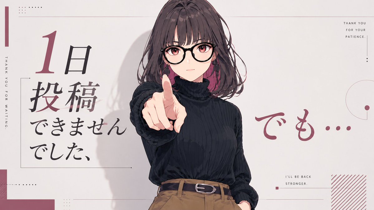
一张宽幅动漫风格社交媒体横幅,展示了一名女性向前指出的动作,并配有日语回归文案,用于表达休息一天后恢复发布。
- 分类
- 图表信息图
- 模型
- GPT Image 2
- 来源作者
- chi Okey
- 原始语言
- en
- 来源 ID
- 21190
- 发布时间
- 2026年5月16日
完整提示词
目标:创作一张简洁的 16:9 动漫风格社交媒体横幅,主题为休息一天后回归发布。

画布:宽幅横向画布,浅暖灰白色背景,极简主义杂志排版,带有柔和的酒红色点缀、细灰色线条、小型点阵网格以及大量留白。

主体:半身动漫插画,人物为 {argument name="character description" default="一位留着齐肩深棕色波浪卷发的年轻女性,身穿黑色罗纹高领毛衣,塞进高腰驼棕色长裤中,系着黑色腰带"}。将她放置在偏右中心的位置,面向观众。她的右臂向镜头方向伸出,食指直接指向前方,形成强烈的透视缩短效果。左手随意地插在裤兜里。在身后添加柔和的阴影,并在脸部周围添加细致的发丝。用一个位于中心的大型方形马赛克/模糊块遮盖上脸部区域,采用柔和的灰褐色,遮住面部,同时保留头发、耳朵、脖子和指向前方的手指。

排版与文字:使用 5 组主要文字。1) 左侧为大型竖排日语标题,采用毛笔书法风格,内容为 {argument name="left Japanese headline" default="1日投稿できませんでした、"},其中数字“1”较大且为酒红色,其余日语字符主要为黑色。2) 右侧为大型酒红色手写体日语文字 {argument name="right Japanese phrase" default="でも…"}。3) 最左侧边缘为小型竖排大写英文字符:“THANK YOU FOR WAITING.” 4) 右上角为小型堆叠大写英文字符:“THANK YOU / FOR YOUR / PATIENCE.” 5) 右下区域为小型大写英文字符:“I’LL BE BACK / STRONGER.”

装饰元素:包含勾勒左侧标题的细矩形边框、最左侧的窄酒红色竖条、左上角和左下角的小型点状方形图案、顶部和中下部的细水平分割线、右下角说明文字附近的小型酒红色方块、右边缘的部分细圆环和圆点图案,以及右下角的酒红色斜线填充块。装饰需保持稀疏且精准。

视觉风格:精致的日本动漫插画与现代编辑排版相结合;采用灰白、黑、炭灰、驼棕和灰酒红的柔和色调。光线柔和,线条清晰,采用轻柔的赛璐珞阴影,非写实风格。

约束条件:保持相同的宽幅横幅构图,将角色保持在偏右中心并指向观众,包含列出的 5 组文字,避免出现额外字符、Logo、水印或其他可读文字。
多语言版本
动漫风格回归发布横幅
enGoal: Create a clean 16:9 anime-style social media banner about taking a one-day break from posting but returning anyway. Canvas: Wide landscape canvas, pale warm off-white background, minimalist editorial magazine layout with muted burgundy accents, thin gray lines, small dot grids, and lots of negative space. Main subject: A half-body anime illustration of {argument name="character description" default="a young woman with shoulder-length wavy dark brown hair, wearing a black ribbed turtleneck sweater tucked into high-waisted camel-brown trousers with a black belt"}. Place her slightly right of center, facing the viewer. Her right arm reaches forward toward the camera with her index finger pointing directly outward, creating strong perspective foreshortening. Her left hand rests casually in a trouser pocket. Add soft painted shadows behind her and subtle hair strands around the face. Cover the upper face area with a large centered square mosaic/blur block in muted taupe, obscuring the face while leaving hair, ears, neck, and pointing finger visible. Layout and text: Use exactly 5 main text groups. 1) On the left, a large vertical Japanese headline in brush-calligraphy style reading {argument name="left Japanese headline" default="1日投稿できませんでした、"}, with the numeral “1” large and burgundy and the remaining Japanese characters mostly black. 2) On the right side, large burgundy handwritten Japanese text reading {argument name="right Japanese phrase" default="でも…"}. 3) Along the far left edge, small vertical uppercase English text: “THANK YOU FOR WAITING.” 4) In the top-right corner, small stacked uppercase English text: “THANK YOU / FOR YOUR / PATIENCE.” 5) In the lower-right area, small uppercase English text: “I’LL BE BACK / STRONGER.” Decorative elements: Include thin rectangular outline framing the left headline, a narrow burgundy vertical bar at the far left, tiny dotted square patterns near the top-left and lower-left, thin horizontal divider lines across the top and lower middle, a small burgundy square near the lower-right caption, a partial thin circle and dot motif on the right edge, and a burgundy diagonal hatch block in the bottom-right corner. Keep all decorations sparse and precise. Visual style: Polished Japanese anime illustration mixed with modern editorial typography; muted palette of off-white, black, charcoal, camel brown, and dusty burgundy. Soft lighting, clean linework, gentle cel-shading, no photorealism. Constraints: Maintain the same wide banner composition, keep the character centered-right and pointing at the viewer, include exactly the 5 text groups listed, avoid extra characters, logos, watermarks, or additional readable text.
动漫风格回归发布横幅
zh-CN目标:创作一张简洁的 16:9 动漫风格社交媒体横幅,主题为休息一天后回归发布。 画布:宽幅横向画布,浅暖灰白色背景,极简主义杂志排版,带有柔和的酒红色点缀、细灰色线条、小型点阵网格以及大量留白。 主体:半身动漫插画,人物为 {argument name="character description" default="一位留着齐肩深棕色波浪卷发的年轻女性,身穿黑色罗纹高领毛衣,塞进高腰驼棕色长裤中,系着黑色腰带"}。将她放置在偏右中心的位置,面向观众。她的右臂向镜头方向伸出,食指直接指向前方,形成强烈的透视缩短效果。左手随意地插在裤兜里。在身后添加柔和的阴影,并在脸部周围添加细致的发丝。用一个位于中心的大型方形马赛克/模糊块遮盖上脸部区域,采用柔和的灰褐色,遮住面部,同时保留头发、耳朵、脖子和指向前方的手指。 排版与文字:使用 5 组主要文字。1) 左侧为大型竖排日语标题,采用毛笔书法风格,内容为 {argument name="left Japanese headline" default="1日投稿できませんでした、"},其中数字“1”较大且为酒红色,其余日语字符主要为黑色。2) 右侧为大型酒红色手写体日语文字 {argument name="right Japanese phrase" default="でも…"}。3) 最左侧边缘为小型竖排大写英文字符:“THANK YOU FOR WAITING.” 4) 右上角为小型堆叠大写英文字符:“THANK YOU / FOR YOUR / PATIENCE.” 5) 右下区域为小型大写英文字符:“I’LL BE BACK / STRONGER.” 装饰元素:包含勾勒左侧标题的细矩形边框、最左侧的窄酒红色竖条、左上角和左下角的小型点状方形图案、顶部和中下部的细水平分割线、右下角说明文字附近的小型酒红色方块、右边缘的部分细圆环和圆点图案,以及右下角的酒红色斜线填充块。装饰需保持稀疏且精准。 视觉风格:精致的日本动漫插画与现代编辑排版相结合;采用灰白、黑、炭灰、驼棕和灰酒红的柔和色调。光线柔和,线条清晰,采用轻柔的赛璐珞阴影,非写实风格。 约束条件:保持相同的宽幅横幅构图,将角色保持在偏右中心并指向观众,包含列出的 5 组文字,避免出现额外字符、Logo、水印或其他可读文字。