NOVALITH 移动端 SaaS 入门引导页
一款专为虚构数据分析 SaaS 设计的高级日式移动端入门引导页,适用于落地页或 App 概念设计稿。
- Category
- Charts & Infographics
- Model
- GPT Image 2
- Creator
- Masao.N
- Source language
- en
- Source ID
- 20104
- Published
- May 13, 2026
Full prompt
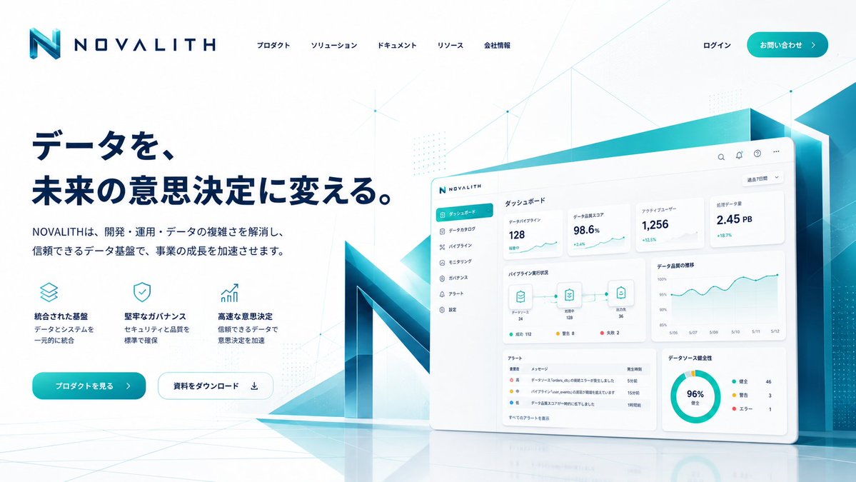
Goal: Create a polished mobile onboarding/top screen for a fictional B2B data platform named {argument name="brand name" default="NOVALITH"}, in a premium Japanese SaaS visual style.
Canvas: Vertical smartphone screenshot, 9:16 aspect ratio, white background, iOS status bar at the top showing 9:41 with signal, Wi-Fi, and battery icons. Use generous margins and a clean app-advertising composition.
Layout: Place the NOVALITH logo near the top left, with a geometric turquoise-blue “N” mark and wide-spaced navy wordmark. Below it, set a large bold Japanese headline in dark navy: {argument name="headline text" default="データを、未来の意思決定に変える。"}. Under the headline, add a smaller two-line Japanese description: {argument name="body text" default="開発・運用・データの複雑さを解消し、信頼できるデータ基盤で、事業の成長を加速させます。"}. On the lower left, show exactly 3 feature blurbs with thin cyan outline icons: 1) stacked layers icon, title “統合された基盤”, description “データとシステムを一元的に統合”; 2) shield check icon, title “堅牢なガバナンス”, description “セキュリティと品質を標準で確保”; 3) rising bar chart icon, title “高速な意思決定”, description “信頼できるデータで意思決定を加速”.
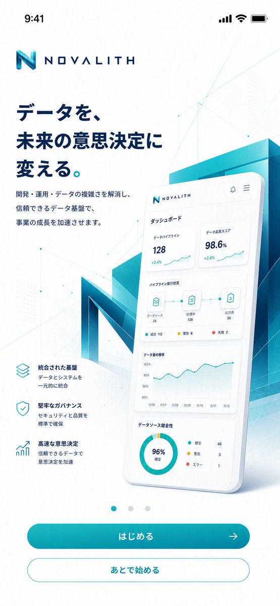
Hero visual: On the right half, create a large glossy 3D smartphone card tilted slightly backward, overlapping a translucent teal-blue architectural block and a giant faceted 3D letter N behind it. The phone screen shows a Japanese dashboard UI with exactly 4 dashboard sections: 1) top metric cards, with “データパイプライン 128 +2.4%” and “データ品質スコア 98.6% +2.4%”; 2) pipeline status row with three connected icons labeled “データソース 24”, “処理中 128”, and “出力先 36”, plus small status dots; 3) line chart titled “データ量の推移” with dates from 5/06 to 5/12; 4) donut chart titled “データソース健全性” showing “96% 健全” and a legend with “健全 46”, “警告 3”, “エラー 1”. Keep the dashboard text small but believable and neatly aligned.
Bottom navigation and actions: Center exactly 3 small carousel dots above the buttons; the first dot is teal and active, the other two are pale gray. Add exactly 2 rounded buttons at the bottom: a filled teal gradient primary button labeled {argument name="primary button label" default="はじめる"} with a right arrow icon, and a white secondary button with teal outline labeled {argument name="secondary button label" default="あとで始める"}.
Visual style: Futuristic enterprise data analytics, crisp vector UI mixed with soft 3D glassmorphism. Palette is white, deep navy, cyan, teal, and aqua gradients. Add subtle polygon network lines, tiny nodes, faint dotted patterns, and light geometric overlays across the background. Use soft shadows, clean Japanese typography, high contrast, and a premium App Store marketing feel. Avoid clutter, avoid extra buttons, avoid extra feature items, and do not add watermarks.Translations
NOVALITH 移动端 SaaS 入门引导页
enGoal: Create a polished mobile onboarding/top screen for a fictional B2B data platform named {argument name="brand name" default="NOVALITH"}, in a premium Japanese SaaS visual style. Canvas: Vertical smartphone screenshot, 9:16 aspect ratio, white background, iOS status bar at the top showing 9:41 with signal, Wi-Fi, and battery icons. Use generous margins and a clean app-advertising composition. Layout: Place the NOVALITH logo near the top left, with a geometric turquoise-blue “N” mark and wide-spaced navy wordmark. Below it, set a large bold Japanese headline in dark navy: {argument name="headline text" default="データを、未来の意思決定に変える。"}. Under the headline, add a smaller two-line Japanese description: {argument name="body text" default="開発・運用・データの複雑さを解消し、信頼できるデータ基盤で、事業の成長を加速させます。"}. On the lower left, show exactly 3 feature blurbs with thin cyan outline icons: 1) stacked layers icon, title “統合された基盤”, description “データとシステムを一元的に統合”; 2) shield check icon, title “堅牢なガバナンス”, description “セキュリティと品質を標準で確保”; 3) rising bar chart icon, title “高速な意思決定”, description “信頼できるデータで意思決定を加速”. Hero visual: On the right half, create a large glossy 3D smartphone card tilted slightly backward, overlapping a translucent teal-blue architectural block and a giant faceted 3D letter N behind it. The phone screen shows a Japanese dashboard UI with exactly 4 dashboard sections: 1) top metric cards, with “データパイプライン 128 +2.4%” and “データ品質スコア 98.6% +2.4%”; 2) pipeline status row with three connected icons labeled “データソース 24”, “処理中 128”, and “出力先 36”, plus small status dots; 3) line chart titled “データ量の推移” with dates from 5/06 to 5/12; 4) donut chart titled “データソース健全性” showing “96% 健全” and a legend with “健全 46”, “警告 3”, “エラー 1”. Keep the dashboard text small but believable and neatly aligned. Bottom navigation and actions: Center exactly 3 small carousel dots above the buttons; the first dot is teal and active, the other two are pale gray. Add exactly 2 rounded buttons at the bottom: a filled teal gradient primary button labeled {argument name="primary button label" default="はじめる"} with a right arrow icon, and a white secondary button with teal outline labeled {argument name="secondary button label" default="あとで始める"}. Visual style: Futuristic enterprise data analytics, crisp vector UI mixed with soft 3D glassmorphism. Palette is white, deep navy, cyan, teal, and aqua gradients. Add subtle polygon network lines, tiny nodes, faint dotted patterns, and light geometric overlays across the background. Use soft shadows, clean Japanese typography, high contrast, and a premium App Store marketing feel. Avoid clutter, avoid extra buttons, avoid extra feature items, and do not add watermarks.
NOVALITH 移动端 SaaS 入门引导页
zh-CN目标:为名为 {argument name="brand name" default="NOVALITH"} 的虚构 B2B 数据平台创建一个精致的移动端入门/首屏页面,采用高级日式 SaaS 视觉风格。 画布:竖屏智能手机截图,9:16 比例,白色背景,顶部 iOS 状态栏显示 9:41,包含信号、Wi-Fi 和电池图标。使用宽裕的边距和简洁的 App 广告排版。 布局:将 NOVALITH 标志放置在左上角附近,包含几何青蓝色“N”图标和宽间距的深蓝色文字标识。在下方设置一个深蓝色的大号加粗日文标题:{argument name="headline text" default="データを、未来の意思決定に変える。"}。在标题下方,添加一段较小的两行日文描述:{argument name="body text" default="開発・運用・データの複雑さを解消し、信頼できるデータ基盤で、事業の成長を加速させます。"}。在左下方,展示 3 个带有细青色轮廓图标的功能简介:1) 堆叠图层图标,标题“統合された基盤”,描述“データとシステムを一元的に統合”;2) 盾牌勾选图标,标题“堅牢なガバナンス”,描述“セキュリティと品質を標準で確保”;3) 上升柱状图图标,标题“高速な意思決定”,描述“信頼できるデータで意思決定を加速”。 主视觉:在右半部分,创建一个大型光泽 3D 智能手机卡片,略微向后倾斜,与半透明青蓝色建筑块以及后方巨大的多面 3D 字母 N 重叠。手机屏幕显示一个日文仪表盘 UI,包含 4 个仪表盘区域:1) 顶部指标卡片,显示“データパイプライン 128 +2.4%”和“データ品質スコア 98.6% +2.4%”;2) 管道状态行,带有三个连接的图标,分别标注“データソース 24”、“処理中 128”和“出力先 36”,并带有小状态点;3) 标题为“データ量の推移”的折线图,日期从 5/06 到 5/12;4) 标题为“データソース健全性”的环形图,显示“96% 健全”以及图例“健全 46”、“警告 3”、“エラー 1”。保持仪表盘文字精简且真实,对齐整齐。 底部导航与操作:在按钮上方居中放置 3 个小型轮播点;第一个点为青色且处于激活状态,其余两个为浅灰色。底部添加 2 个圆角按钮:一个填充青色渐变的主按钮,标注 {argument name="primary button label" default="はじめる"} 并带有向右箭头图标;以及一个带有青色轮廓的白色次要按钮,标注 {argument name="secondary button label" default="あとで始める"}。 视觉风格:未来感企业级数据分析,清晰的矢量 UI 结合柔和的 3D 玻璃拟态。调色板为白色、深海军蓝、青色、蓝绿色和水绿色渐变。在背景中添加细微的多边形网络线、微小节点、淡淡的圆点图案和轻盈的几何叠加层。使用柔和的阴影、整洁的日文字体、高对比度,营造高级的 App Store 营销感。避免杂乱,避免多余的按钮,避免多余的功能项,且不要添加水印。