NOVALITH SaaS 着陆页首屏
为一家虚构的数据分析平台生成优质的日本 B2B SaaS 着陆页首屏,包含导航、CTA、功能模块以及未来感仪表盘模型。
- Category
- Charts & Infographics
- Model
- GPT Image 2
- Creator
- Masao.N
- Source language
- en
- Source ID
- 20105
- Published
- May 13, 2026
Full prompt
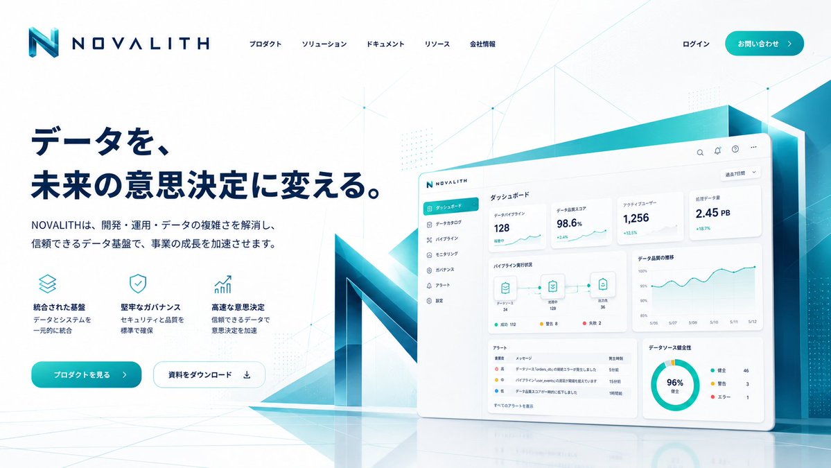
Goal: Create a polished fictional SaaS landing page hero for a data infrastructure and analytics platform named {argument name="brand name" default="NOVALITH"}, in a premium Japanese B2B technology style.
Canvas: Wide desktop web landing page, 16:9 aspect ratio, clean white background with pale cyan gradients, subtle network-line geometry, faint dot matrices, and glossy floor reflections. Use a futuristic corporate palette of deep navy, teal, cyan, and white.
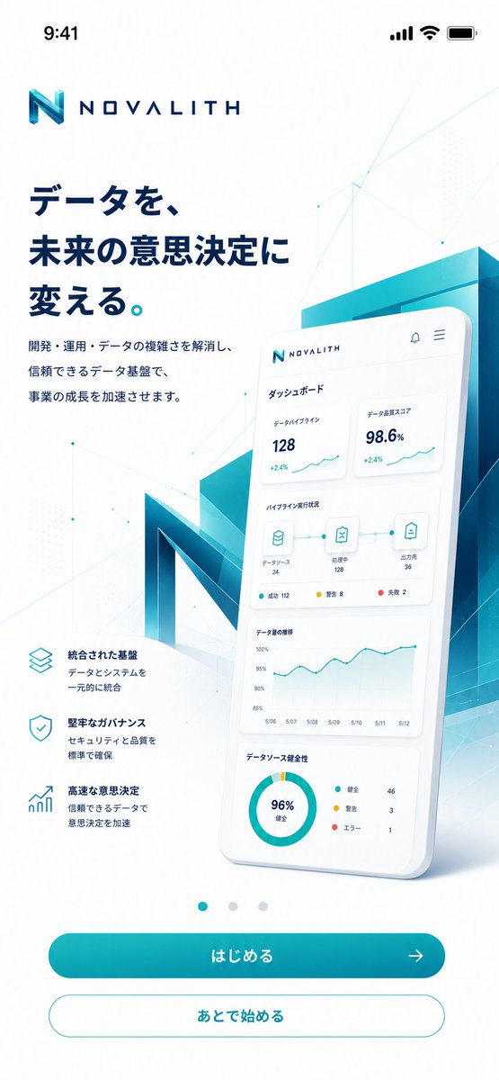
Header: Top-left logo with a large angular gradient cyan-to-navy “N” icon followed by spaced uppercase wordmark “NOVALITH”. Across the top center place exactly five Japanese navigation items: 「プロダクト」, 「ソリューション」, 「ドキュメント」, 「リソース」, 「会社情報」. Top-right has 「ログイン」 and a rounded teal CTA button labeled {argument name="contact button text" default="お問い合わせ"} with a right arrow.
Hero layout: Left side contains a large bold navy Japanese headline in two lines: {argument name="headline text" default="データを、未来の意思決定に変える。"}. Under it place a smaller Japanese subheadline: {argument name="subheadline text" default="NOVALITHは、開発・運用・データの複雑さを解消し、信頼できるデータ基盤で、事業の成長を加速させます。"}
Feature row: Beneath the subheadline show exactly three compact feature blocks, each with a thin teal line icon, bold Japanese title, and two-line description. The three blocks are: 1) stacked-layers icon, title 「統合された基盤」, description 「データとシステムを一元的に統合」; 2) shield-check icon, title 「堅牢なガバナンス」, description 「セキュリティと品質を標準で確保」; 3) rising chart arrow icon, title 「高速な意思決定」, description 「信頼できるデータで意思決定を加速」.
Hero buttons: Below the feature row place exactly two rounded buttons: a filled teal primary button labeled {argument name="primary cta text" default="プロダクトを見る"} with a right arrow, and a white outlined secondary button labeled 「資料をダウンロード」 with a download icon.
Right side visual: Create a large tilted floating dashboard panel with rounded corners, soft shadow, and a glossy white UI. Behind it place a monumental 3D translucent teal/navy “N” structure and angular cyan glass panels, extending off the right edge. The dashboard should show a sidebar, top utility icons, analytics cards, line charts, a pipeline diagram, an alert table, and a donut chart.
Dashboard details: Include exactly six sidebar menu items: 「ダッシュボード」 highlighted in teal, 「データカタログ」, 「パイプライン」, 「モニタリング」, 「ガバナンス」, 「アラート」. Include exactly four top statistic cards with labels and values: 「データパイプライン」 128, 「データ品質スコア」 98.6%, 「アクティブユーザー」 1,256, 「処理データ量」 2.45 PB. Include exactly three nodes in the pipeline diagram connected by lines, an alert table with exactly four rows, and a donut chart labeled 96% with a three-item legend.
Visual style: Crisp vector-like UI mixed with photorealistic 3D glass, airy spacing, premium startup landing page aesthetics, high readability, soft shadows, subtle cyan glow, accurate Japanese typography, no people, no clutter, no watermark.Translations
NOVALITH SaaS 着陆页首屏
enGoal: Create a polished fictional SaaS landing page hero for a data infrastructure and analytics platform named {argument name="brand name" default="NOVALITH"}, in a premium Japanese B2B technology style. Canvas: Wide desktop web landing page, 16:9 aspect ratio, clean white background with pale cyan gradients, subtle network-line geometry, faint dot matrices, and glossy floor reflections. Use a futuristic corporate palette of deep navy, teal, cyan, and white. Header: Top-left logo with a large angular gradient cyan-to-navy “N” icon followed by spaced uppercase wordmark “NOVALITH”. Across the top center place exactly five Japanese navigation items: 「プロダクト」, 「ソリューション」, 「ドキュメント」, 「リソース」, 「会社情報」. Top-right has 「ログイン」 and a rounded teal CTA button labeled {argument name="contact button text" default="お問い合わせ"} with a right arrow. Hero layout: Left side contains a large bold navy Japanese headline in two lines: {argument name="headline text" default="データを、未来の意思決定に変える。"}. Under it place a smaller Japanese subheadline: {argument name="subheadline text" default="NOVALITHは、開発・運用・データの複雑さを解消し、信頼できるデータ基盤で、事業の成長を加速させます。"} Feature row: Beneath the subheadline show exactly three compact feature blocks, each with a thin teal line icon, bold Japanese title, and two-line description. The three blocks are: 1) stacked-layers icon, title 「統合された基盤」, description 「データとシステムを一元的に統合」; 2) shield-check icon, title 「堅牢なガバナンス」, description 「セキュリティと品質を標準で確保」; 3) rising chart arrow icon, title 「高速な意思決定」, description 「信頼できるデータで意思決定を加速」. Hero buttons: Below the feature row place exactly two rounded buttons: a filled teal primary button labeled {argument name="primary cta text" default="プロダクトを見る"} with a right arrow, and a white outlined secondary button labeled 「資料をダウンロード」 with a download icon. Right side visual: Create a large tilted floating dashboard panel with rounded corners, soft shadow, and a glossy white UI. Behind it place a monumental 3D translucent teal/navy “N” structure and angular cyan glass panels, extending off the right edge. The dashboard should show a sidebar, top utility icons, analytics cards, line charts, a pipeline diagram, an alert table, and a donut chart. Dashboard details: Include exactly six sidebar menu items: 「ダッシュボード」 highlighted in teal, 「データカタログ」, 「パイプライン」, 「モニタリング」, 「ガバナンス」, 「アラート」. Include exactly four top statistic cards with labels and values: 「データパイプライン」 128, 「データ品質スコア」 98.6%, 「アクティブユーザー」 1,256, 「処理データ量」 2.45 PB. Include exactly three nodes in the pipeline diagram connected by lines, an alert table with exactly four rows, and a donut chart labeled 96% with a three-item legend. Visual style: Crisp vector-like UI mixed with photorealistic 3D glass, airy spacing, premium startup landing page aesthetics, high readability, soft shadows, subtle cyan glow, accurate Japanese typography, no people, no clutter, no watermark.
NOVALITH SaaS 着陆页首屏
zh-CN目标:为名为 {argument name="brand name" default="NOVALITH"} 的数据基础设施与分析平台,创建一个精致的虚构 SaaS 着陆页首屏,采用优质的日本 B2B 科技风格。 画布:宽屏桌面网页,16:9 比例,简洁的白色背景搭配淡青色渐变,辅以微妙的网格线条几何图形、浅淡的点阵以及光洁的地面反射。使用深蓝、青色、蓝绿色和白色的未来感企业配色方案。 页眉:左上角放置 Logo,包含一个大型棱角分明的青色至深蓝色渐变“N”图标,后接间距适中的大写字母商标“NOVALITH”。顶部中央放置五个日语导航项: 「プロダクト」、「ソリューション」、「ドキュメント」、「リソース」、「会社情報」。右上角设有 「ログイン」 以及一个圆角青色 CTA 按钮,标签为 {argument name="contact button text" default="お問い合わせ"},并带有向右箭头。 首屏布局:左侧包含两行醒目的深蓝色日语大标题: {argument name="headline text" default="データを、未来の意思決定に変える。"}。下方放置一行较小的日语副标题: {argument name="subheadline text" default="NOVALITHは、開発・運用・データの複雑さを解消し、信頼できるデータ基盤で、事業の成長を加速させます。"} 功能行:在副标题下方展示三个紧凑的功能模块,每个模块配有细青色线条图标、加粗的日语标题和两行描述。这三个模块分别为:1) 堆叠层图标,标题 「統合された基盤」,描述 「データとシステムを一元的に統合」;2) 盾牌勾选图标,标题 「堅牢なガバナンス」,描述 「セキュリティと品質を標準で確保」;3) 上升趋势图图标,标题 「高速な意思決定」,描述 「信頼できるデータで意思決定を加速」。 首屏按钮:在功能行下方放置两个圆角按钮:一个填充青色的主按钮,标签为 {argument name="primary cta text" default="プロダクトを見る"},并带有向右箭头;以及一个白色轮廓的次要按钮,标签为 「資料をダウンロード」,并带有下载图标。 右侧视觉:创建一个大型倾斜悬浮的仪表盘面板,具有圆角、柔和阴影和光洁的白色 UI。其后方放置一个巨大的 3D 半透明青色/深蓝色“N”结构和棱角分明的青色玻璃面板,延伸至右侧边缘。仪表盘应显示侧边栏、顶部实用图标、分析卡片、折线图、流水线图、警报表格和环形图。 仪表盘细节:包含六个侧边栏菜单项:以青色高亮的 「ダッシュボード」、「データカタログ」、「パイプライン」、「モニタリング」、「ガバナンス」、「アラート」。包含四个顶部统计卡片,带有标签和数值: 「データパイプライン」 128、「データ品質スコア」 98.6%、「アクティブユーザー」 1,256、「処理データ量」 2.45 PB。流水线图中包含三个由线条连接的节点,警报表格包含四行数据,环形图标注为 96% 并配有三项图例。 视觉风格:清晰的矢量风格 UI 结合写实的 3D 玻璃质感,布局通透,具备优质初创公司着陆页的美学特征,高可读性,柔和阴影,微妙的青色光晕,准确的日语排版,无人物,无杂乱元素,无水印。